Creating content for social media can feel not unlike riding a mechanical bull: just when you’ve finally got a grip on it, it wildly changes direction, flinging you and your message into an abyss of mediocrity. But great social media images are within your grasp—we promise.
We’ll walk you through the in and outs of creating fabulous social media images. Follow along and learn how to share like a champion.
1. Make your image the right size for each channel
One thing everyone can agree on when it comes to the internet is that it’s always changing. Social media sites in particular are a constantly moving target; yesterday’s crystal-clear image is tomorrow’s squishy mess. Keep up with the curve by staying abreast of your favorite social media sites’ sizing standards.
PicMonkey provides an up-to-date list of image sizes for social media giants like Facebook and Pinterest. Not only that, but we’ve got a number of custom sizes right in the Editor. Head to Crop and peruse our dropdown menu for options.

Pro tip: If our Editor’s crop size cuts out too much of your image, click Scale photo. Then you can expand and still preserve the aspect ratio. The final cropped image will be exactly the right size.
Of course, the dimensions above are always changing, but you can still maximize your image impact even if you can’t remember how big the ideal Facebook cover image should be. When creating social media images, just be aware which social media channels support specific image shapes over others.
For instance, Pinterest and Tumblr both have layouts that work stunningly with tall images. Google+ gives you a shot at taking up twice the space in users’ feeds when you choose a landscape image.
2. When possible, choose large images
Given the choice between a huge image and a smaller one, most professionals go for hugeness. That’s because scaling a large image down doesn’t compromise its quality. Meanwhile, scaling a smaller image up is a recipe for heartbreak and major blur. As in all things, exercise moderation: images that are too big will cause slow loading times and create a bad experience for your users.
Using big images becomes especially useful when you’re posting to multiple channels. Since each social media site has different rules for image sizing, which may necessitate some pretty serious cropping, gigantic humongo pictures are your best bet for cross-posting without loss of quality. Opt for a large image when sourcing photo content; then, when posting, keep it as large as they’ll let you.
Pro tip: Avoid the worst of image compression by sizing high. Facebook recommends images that are 2048 pixels wide, which can help diminish visible loss of quality when uploaded.
3. Pay attention to site-specific guidelines
What you don’t know can hurt you—if what you don’t know is a social media site’s rules for image content. For instance, if you’re sharing on Facebook, be careful of images containing text: a text content of 20% or higher risks your ad or post getting flagged.
4. Add tags to images on your blog or site
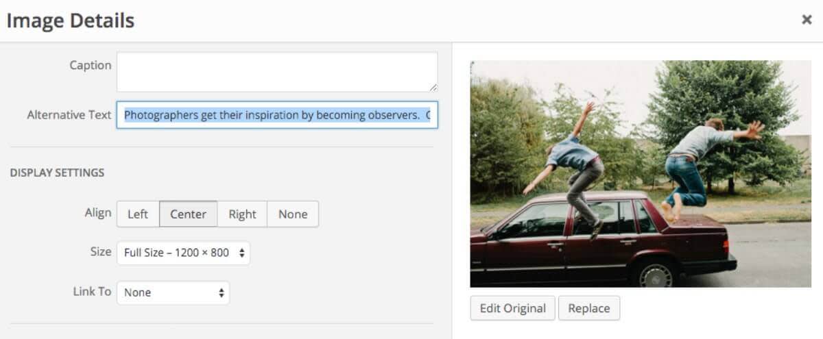
If you’re dropping your photo into a blog or professional site, you should add alternative text (alt text). In a nutshell, alt text serves two purposes. It describes images for visually impaired people using screen readers, and gives information to Google about the content of said images—and by extension, what your page is about.
Alt text is, therefore, a great place to include your page’s keywords. Think of alt text like a metadescription, but for individual images: you want alt text that is concise, catchy, and descriptive, both so that search engines will read it correctly and so all your users get the information they’re looking for.

Most blog- and web-hosting services allow you to select images to edit their attributes, including alt tags.
However, we live in a multi-channel world, so be aware that your alt text will pop up in unexpected places. For instance, the descriptions of Pinterest pins are pulled from your alt text. If you have an avid Pinterest-using following, you may want to balance purely descriptive alt text with catchy, pinnable alt text.
Pro tip: Don’t forget about title tags. They’re the text that users see when they hover over an image, so they’re a good place to add a call-to-action or another on-brand tidbit. However, title tags don’t appear in all browsers.
5. Follow your heart
It knows what’s shareable—or at least, your emotions do.
Recent studies show that when it comes to the images and articles we share the most, you gotta have heart. Despite the yellow-journalism sense we may have that disaster sells papers, The New York Times found that readers were most likely to share positive, long-form articles that evoked strong emotion—particularly, awe.

Some of the most shareable social media images evoke awe, like this shot of Earth rising.
Why might this be? At bottom, the most shareable content seems to tap into a user’s relationships (with themselves and others). Users want to share content that informs and enlightens, both to provide value to their friends and to say, “Hey, I’m a cool smart person. I like cool smart things.”
Of course, we don’t always decide what’s cool in a logical way. Researchers have found that highly shareable content evokes what they term action-provoking emotions: amusement, anger, and the aforementioned awe.
Make these trends in sharing work for you by creating content that inspires strong, stirring emotions, that provides information users will want to share with their friends. When it comes to social media images, make them think or make them laugh. Best of all, wow ‘em.
