Whether you realize it or not, every time you raise your camera to take a picture, you’re making decisions about composition. Composition is simply how you choose to frame your subject in the picture you are about to take and the stronger the composition, the stronger the final image will be.
Here are some composition rules to keep in mind.
The rule of thirds

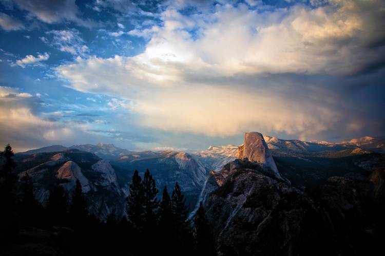
Frame your shot so interesting parts of the photo line up where “thirds” lines intersect.
The rule of thirds is one of the most-used techniques for composing a photograph. When you look through your camera’s viewfinder, imagine a tic-tac-toe board over the scene you are about to photograph.
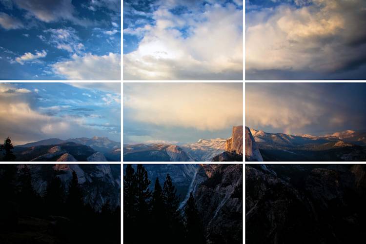
Move your camera around or adjust your zoom length until you have interesting parts of the scene where the lines intersect.
Depending on your camera’s settings, you may be able to turn on a 3 x 3 grid graphic on the camera’s LCD or in the viewfinder.

Note the craggy peak lines up where the right vertical line meets the lower horizontal line.
Leading lines

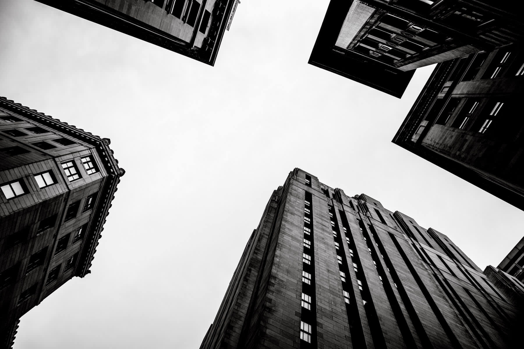
Leading lines draw the eye into the photo.
The leading lines technique can be used when photographing buildings or other subjects that have strong linear elements.
The lines can be the main subject of the photo, or they can be used to guide the viewer’s eye to a specific area within the photo.
Filling the frame

This photo is compositionally most interesting when the frame is completely filled by the boy’s face.
They say that if you want to improve your photography, do one of two things. Stand in front of more interesting subjects or move closer with your camera.
Moving closer to your subject is a great way to ensure that people know exactly what your intended target is while providing a different perspective on an otherwise familiar subject.
Symmetry

Symmetry is your best friend.
Symmetry provides a sense of balance and proportion that we find pleasing. One of the most common ways to get symmetry in your photographs is by composing your photo so that it can be divided with each part being a mirror image of the other.
Eye position

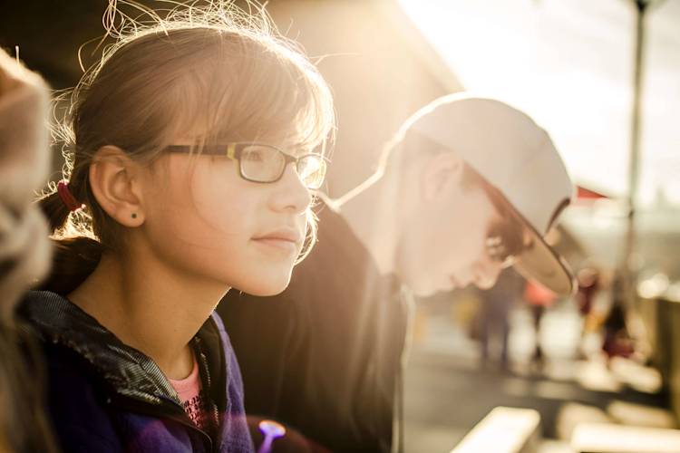
Showing some “look space” helps draw the viewer’s eye in the direction the subject is looking.
A great technique to lead the viewer’s eyes through your photo is to use your subject’s eyes. We are naturally drawn to another person’s eyes, so use that natural tendency to your advantage to lead your viewers through your photo so they see what you want them to see in your image.
Foreground interest

The stone in the foreground adds depth to the serenity in this photo.
When shooting landscapes, there are two things you can do to improve your composition. First, consider including one or more foreground objects in your photo. This will give your image more depth, leading the viewer’s eye from the front of the photo to the back.
Second, when you’re composing your shot, resist the temptation (and habit) of setting up your tripod at its highest setting. Get low to the ground to provide a different perspective.
Break the rules

Does this photo break the Rule of Thirds? Yup!
Practice and follow these composition guidelines and you’ll find that your photography will begin to improve no matter how long you’ve been shooting. Then, once you have a good feeling for each of these rules, don’t be afraid to break them! After all, rules were made to be broken and you never know what you’ll create when you step outside the lines.
