Here at PicMonkey we’ve been hard at work since well before Christmas consulting our crystal balls, shaking our Magic 8-Balls, and shuffling tarot cards (not to mention all the paper cuts we’ve gotten from folding cootie catchers) so that we can bring your the definitive list of design trends to watch for in 2017. This year is gonna be full of bold colors, patterns, and a generous helping of nostalgia. Let’s take a look forward into what this design year has in store.
Branding
1. Hand-drawn elements

This follows a general trend of brands wanting to look more authentic. Hand-drawn logos and graphics help make a design look personalized and crafted. PicMonkey has a wealth of scribbly-looking graphics including Doodly Hearts, Stars, and Arrows. Not to mention any of the fonts in our Handwriting group, but specifically Mossy and Sue Ellen Francisco.
2. Modernized retro

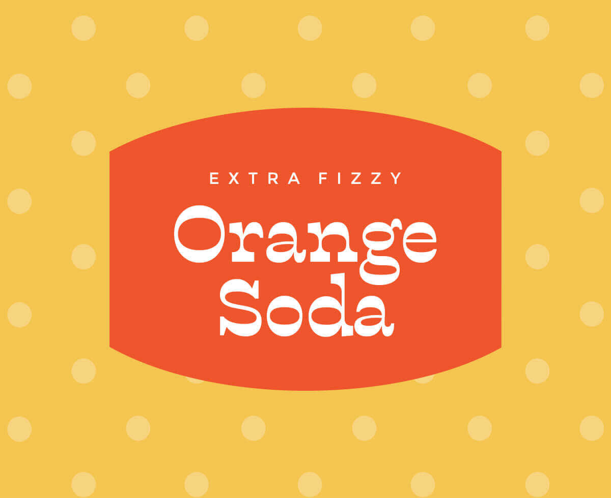
The font on this label, Buffon, came from a free font site. Easily access any font you download by clicking the “Yours” tab in our Text tool.
2017 is all about throwing it back to a simpler time, and what better way than with some retro-inspired logos? This trend spans the decades and is all about making the familiar look fresh again. Use bold, blocky fonts or some with a more vintage feel. Browse our PicMonkey fonts, or check out these free font resources and add your own. Apply some sleek shapes, like in our Labels group and bring the look into the now with some bold colors.
Color
3. Bright colors (and lots of ’em!)

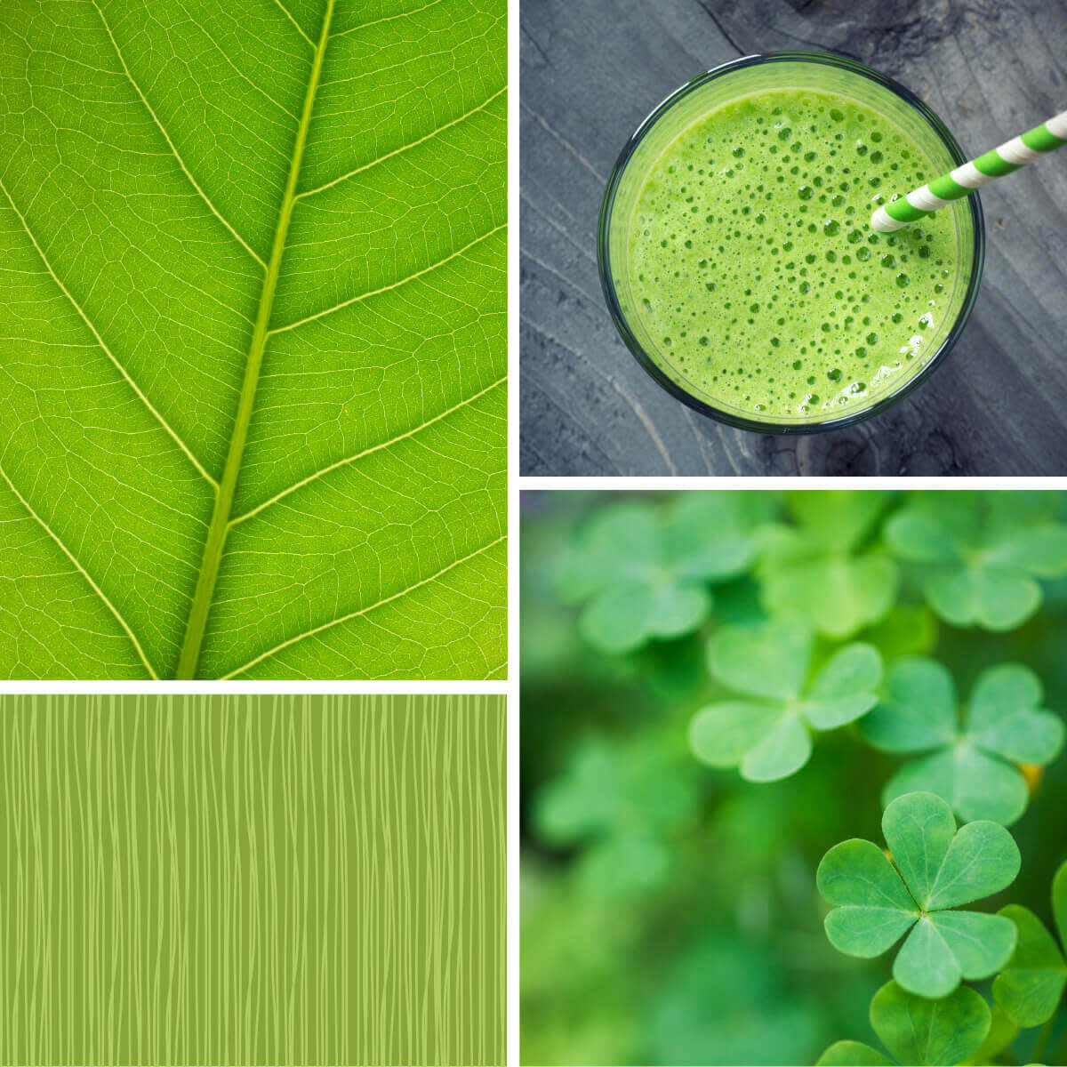
Get this Greenery inspired collage look with a little help from our Spring Bling swatches.
Speaking of colors, 2017 is going to be bright, loud, and warm. Think sherbets! Think sunsets!! Think ‘90s ski jackets!!! It’s all happening this year. Plus, if you want something bright, but still kind of earthy, Pantone named their 2017 color of the year Greenery.
Graphic design elements
4. Geometric shapes

Lines and shapes are happening faster than you can say, “sohcahtoa.” Whether you want to stick an image inside of them (like with our Shape Cutouts frames) or stick a bunch of them together in various colors to create an abstract Facebook cover thang, it’s hard to go wrong.
Photo editing
5. Gradient imagery

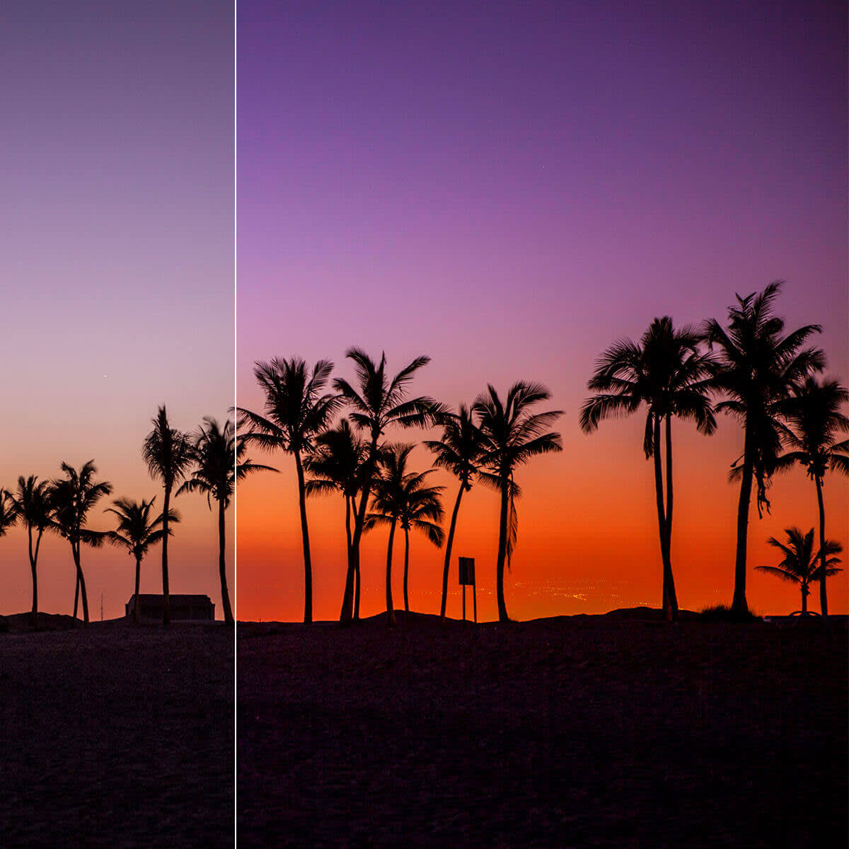
This one fits right in with the bold colors we mentioned above–take any photo and instantly up the style and production value with this look. Plus, it’s super easy to do in PicMonkey. Just open your image in the Editor and apply the Ombre effect. Pick any two colors, adjust their orientation by dragging the Direction slider and then adjust the Fade slider to make it look as daring or subtle as you like.
6. Saturated colors

Bump up the drama with ultra-saturated images. Take the colors that appear naturally in your photographs and give them the little boost they’ve been begging for. This will also increase the richness and dimension in your image. To increase saturation in PicMonkey, go to Colors under Basic Edits, and adjust the Saturation slider.
Photography
7. ‘90s style and candid shots

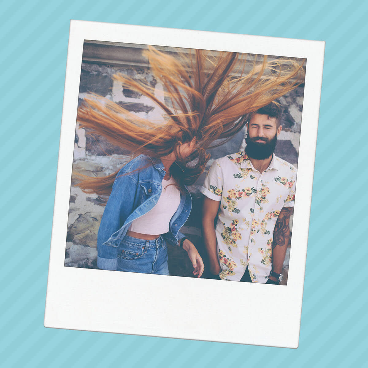
With arguably the most important year of the ‘90s turning 20, nostalgia is reaching a fever pitch and photography is not exempt. Expect to see more polaroids, colors (there’s our #2 again!), and greater use of flash photography. Plus, following the general theme of brands trying to appear less stuffy and more personable, you can expect to see shots that look more candid and less posed.
Layouts
8. Modular Layouts

Bring everything from flyers to blog banners into the modern era with modular layouts. In addition to looking sleek, this is a great way to highlight information as it gives the text and image their own spaces to shine. Get started on your own modular flyer with our tri-oomph template.
9. Layered photos and text

We are super excited about this look because it adds dimension to your designs in a new and visually engaging way. The text and photos interact by layering parts of the image over the text. To get this look in PicMonkey, start with a transparent canvas and create your text design. Flatten the text to the transparent canvas and save it before opening up your image. Open the text as a graphic and erase away. This is magic, people.
