A brand board (also called a brand mood board) can be a vital part of creating your brand’s visual identity. If you want to develop or refresh your brand so it reflects who you are as a company, this is the place to start.
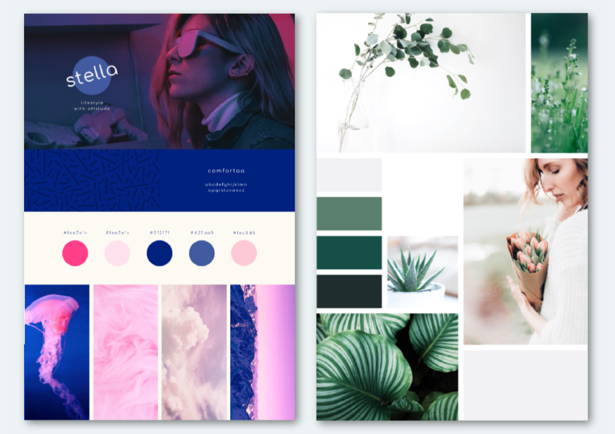
Think of a brand board as an outline or checklist for your brand. If a design asset isn’t clicking or if something looks out of place, you can check it against the board to find out why. Your brand board is the place to begin codifying what you want your brand to express — what does it stand for, how do you want people to think of it, and how will you visually represent all of that?
What do you put in a brand board?
You can put anything on your board. You’re not limited by any particular set of guidelines — if you have an idea for something that visually represents your brand, try it out.
The basics, of course, are images. These can include photos, drawings, sketches, etchings, whatever, but remember that design elements can come into play here, too. Colors, fonts, textures, even more esoteric things like lighting or photo effects can be part of your brand.
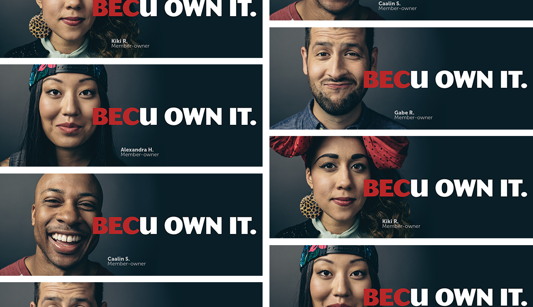
Boeing Employees Credit Union used this style of portrait and lighting for years, and it became as recognizable as their red logo. And by using members rather than models, It also reinforced the fact that they’re member-owned, which is an essential component of their brand.
If you find a photo with a style that feels right, grab it and put it on your board. The board isn’t for public viewing, and it comes before you create your assets to give direction and examples, so there will be a lot of borrowing.
Choose your colors
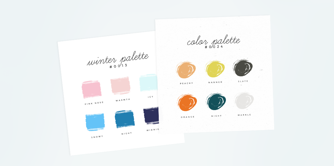
Color is a big deal. Peruse PicMonkey's guide to color to get your feet wet, and click through a kaleidoscope of possibilities.
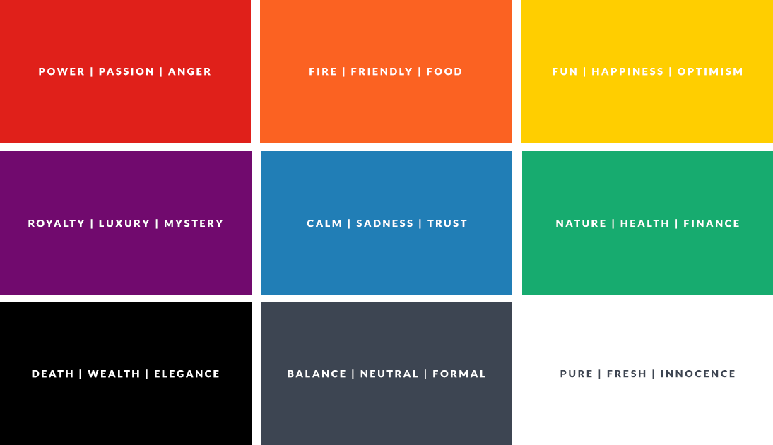
Colors have strong associations with mood, message, and meaning. They're culturally specific, so they'll vary from country to country, but you want to pay attention to those associations so you don't unknowingly choose a color that radiates a vibe that's not in line with your brand values.
Stumped as to how to pick a color scheme? Ground your explorations with a quick dive into color theory and see how easy it is to choose color schemes, once you know the basics of analogous and complementary colors and the difference between tints, shades, and tones.
Find the right font
There’s a reason Aston Martin and AOL use different fonts in their logos. If you don’t buy that and think that designers just choose whatever font they’re fancying that day, take a few minutes to swap the fonts and recreate those logos. It doesn’t work.
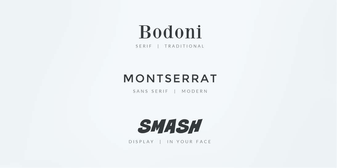
Want a traditional, reliable feel? Use a serif font. Want to look nimble and modern? Ditch those serifs and use a sans serif font. Need to be IN EVERYONE’S FACE ALL THE TIME? Find a bold display font like Smash.
What are you writing with your fonts? Words, most likely. In terms of a brand board, you’re gonna see rather than hear words, so think about fonts, placement, and effects. If there are words that describe your brand, find a way to make them stand out. And focus on single words rather than sentences — think “compassionate” rather than “concerned for others.”
Can a single word really be that essential to a brand? You bet. Type “relentless.com” into a browser to get an idea of how important a word can be to someone.
Get inspired by templates
And brand boards can be physical or digital. The cool thing about physical boards is that they can engage all of the senses — they can be picked up and looked at in various lighting and situations. The downside is that they can’t be readily shared, especially if you have a distributed team. Digital vision boards and brand boards, on the other hand, are easy to share, easy to tweak. Of course, that’s where we shine.
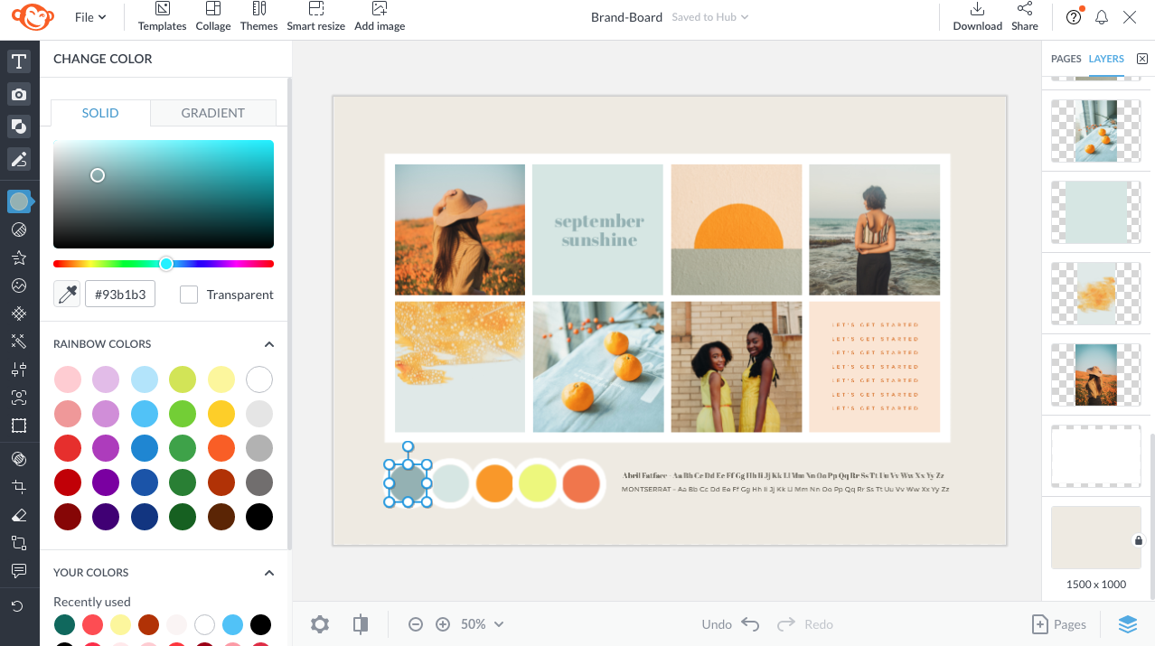
PicMonkey has board templates all ready to go for you. While it’s possible that one of them is filled with all the inspiration you need, you'll most likely be replacing all the images, colors, and fonts with your own. Here's how:
Background color — use the color picker to match your brand colors.
Text — click template text and replace it with your own.
Graphics — use one of ours, or replace a template graphic with one of your own.
Position — move elements exactly where you’d like them to be.
Our Help articles like this one have all the info you could want about messing around with templates. Take a look if you need a little of the how-to.
Use whatever you want

One cool thing about a brand board is that it isn’t limited to things like fonts and colors. Is there a painting that shows the exact look of determination you want to portray? How about the napkin doodle that started your company? Or is there a feather or a leaf you picked up on a hike that inspired your logo? Anything like that can be part of your board. If you’re going digital, take a pic of it.
Explore what else you can do in PicMonkey: use our reshape photo tools, make a color splash image, or get fresh ideas for your Instagram backgrounds!
