Guidelines for creating propaganda posters:
Use bold, simple colors
Add frames and labels
Be geometric
Go big with text and messaging
Now onward, to inevitable poster design victory!
Using bold, simple colors
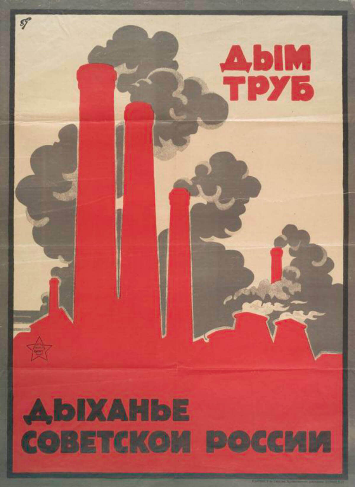
New York Public Library. USSR. (1917-1921.) Dym trub. Dykhan’e Sovetskoi Rossii. (Additional title: The Smoke of Chimneys is the Breath of Soviet Russia.)
Just Say No to Propaganda Posters!
… Hang on, that sounded a little propaganda-y. We’re a freethinking bunch here on Team PicMonkey, so we don’t advocate manipulating the minds of the masses with the power of your design. However, we do appreciate design in general, and propaganda posters are undeniably iconic examples. So what can we learn from them?
As it turns out, propaganda posters of the twentieth century can teach us a lot. Many were created by artists as part of government-run contests, and exemplify techniques and themes from art movements such as Modernism, Art Deco, and Constructivism. However, propaganda is unique in that it’s high on emotional appeal and intended to influence attitudes towards specific policies: the quintuple-shot espresso of government outreach, if you will.
Propaganda posters are famously direct, and their color palette is no exception. Many iconic propaganda posters were designed using as few as three colors, often black, white, and a warm shade like red.
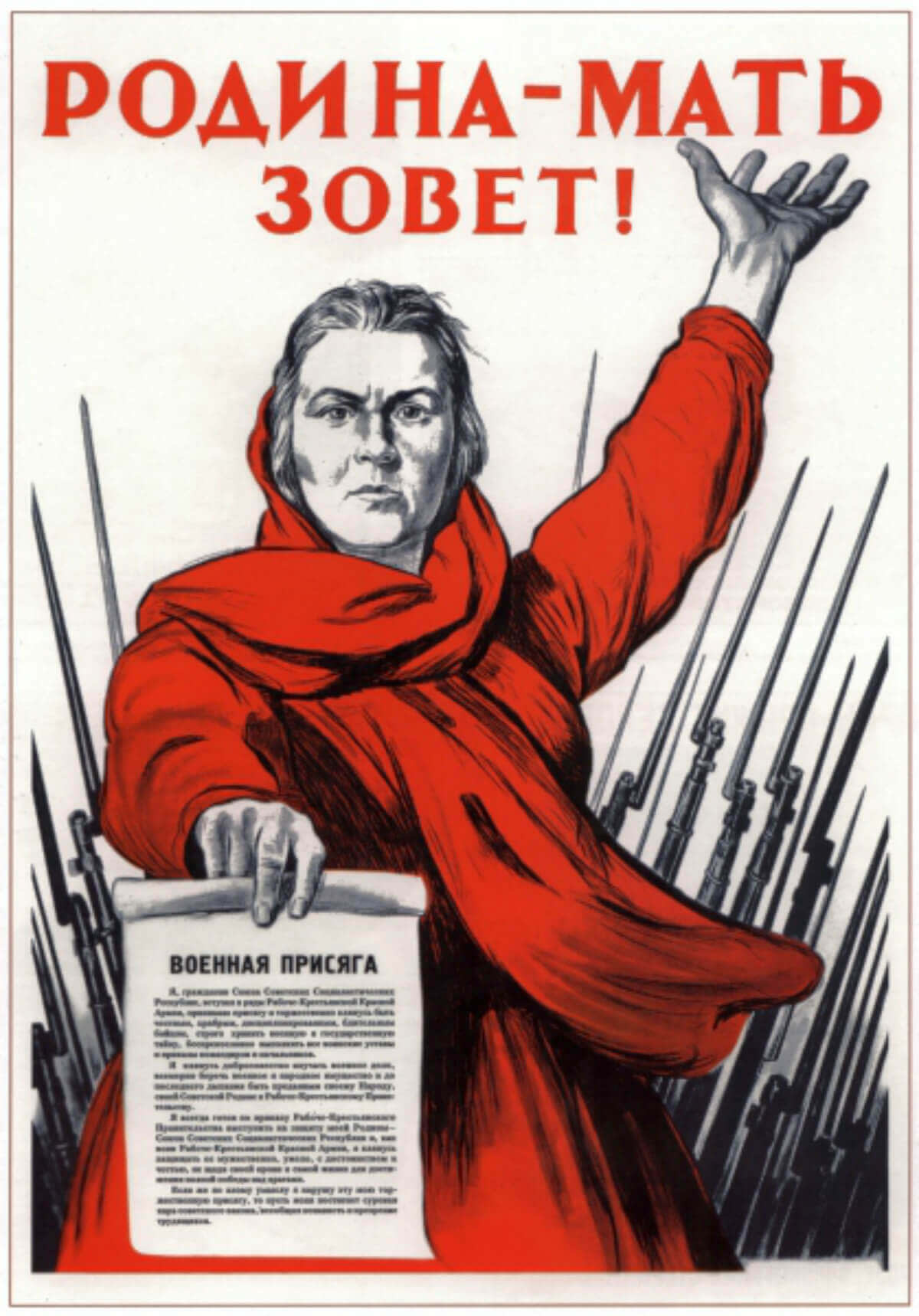
I.M. Toidze. 1941. “The Motherland Calls.”
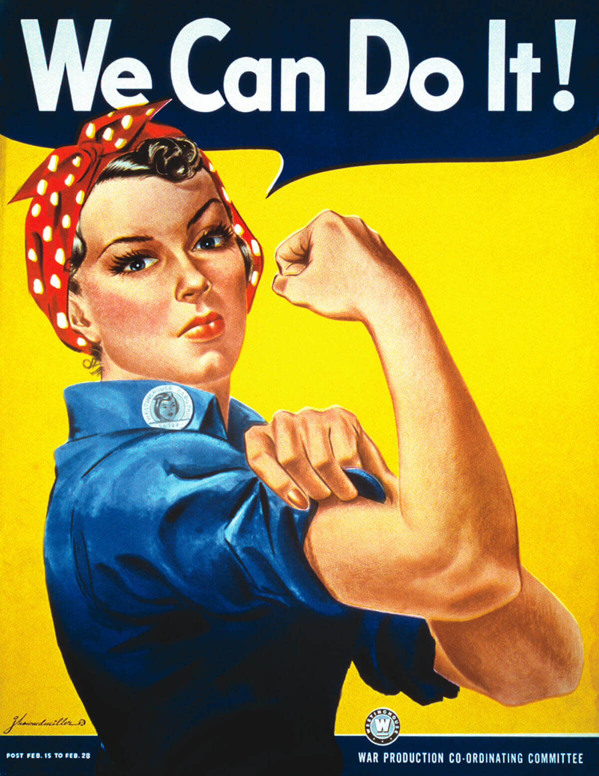
J. Howard Miller. 1942. “We Can Do It!”
Even posters that feature more colors, like Rosie the Riveter’s realistically shaded skin and hair, tend to focus on a few bold shades that grab the eye. In Rosie’s case, they’re the three primary colors, with a peppy si-se-puede yellow lighting the background.
Pro tip: Generate your own custom color palette based on propaganda posters and use it for any project you like. Simply choose a poster with colors that strike you, then follow our tutorial to create your palette.
Adding frames and labels
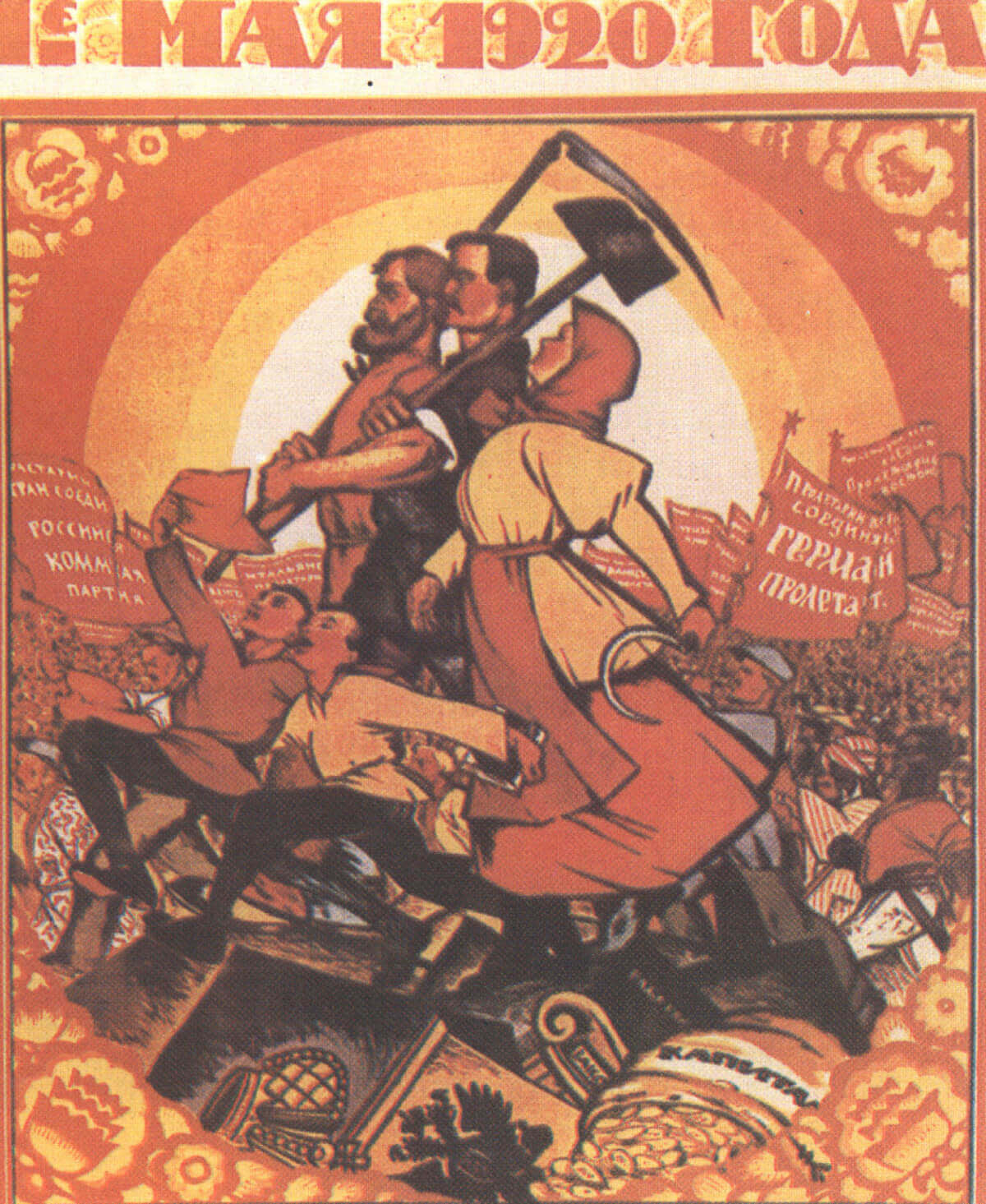
Wikimedia Commons. 1920. Russian First of May poster.
Elaborately framed pieces are a hallmark of Art Nouveau, an art style popular from 1890 to 1920, which is why you’ll see intricate frames and graphics pop up in the propaganda from the WWI and Bolshevik eras.
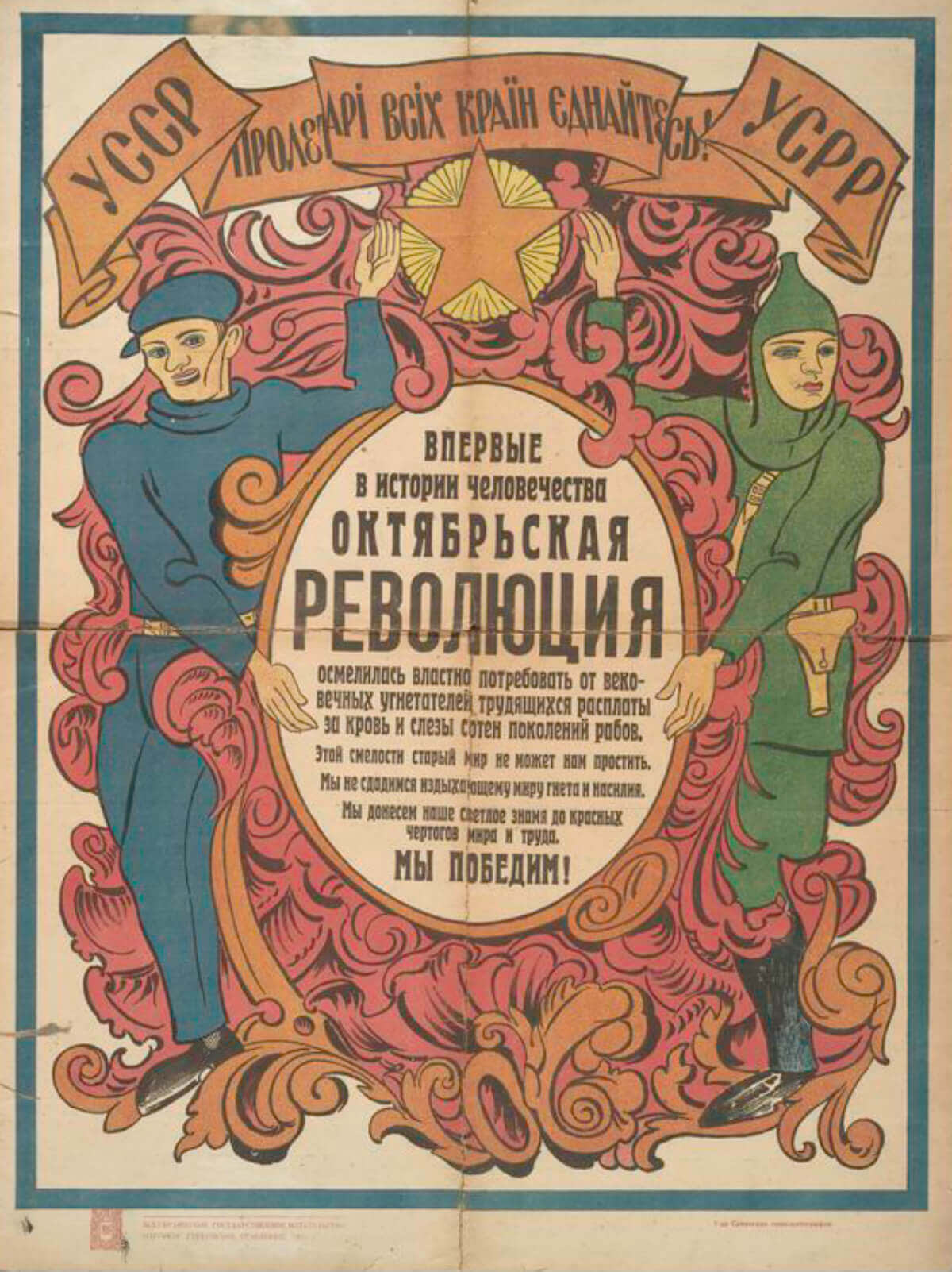
New York Public Library. USSR. (1917-1921.) Vpervye v istorii chelovechestva Oktiabr’skaia revoliutsiia osmelilas’ vlastno potrebovat’ ot vekovechnykh ugnetatelei trudiashchikhsia rasplaty za krov’ i slezy soten pokolenii rabov. […] My pobedim! (Additional title: For the first time in the history of mankind October Revolution took the liberty to demand from the ages long opressors of working people the payment for blood and tears of hundreds generations of the slaves. […] We will gain!)
We love these garnishes: not only are they beautifying, but they can be a great way to organize information. Spotlight your revolutionary tagline by putting it on a pedestal (or over a semi-transparent box). Fancy up your pastoral proletariat scene with decorative corners. Put a frame on it!
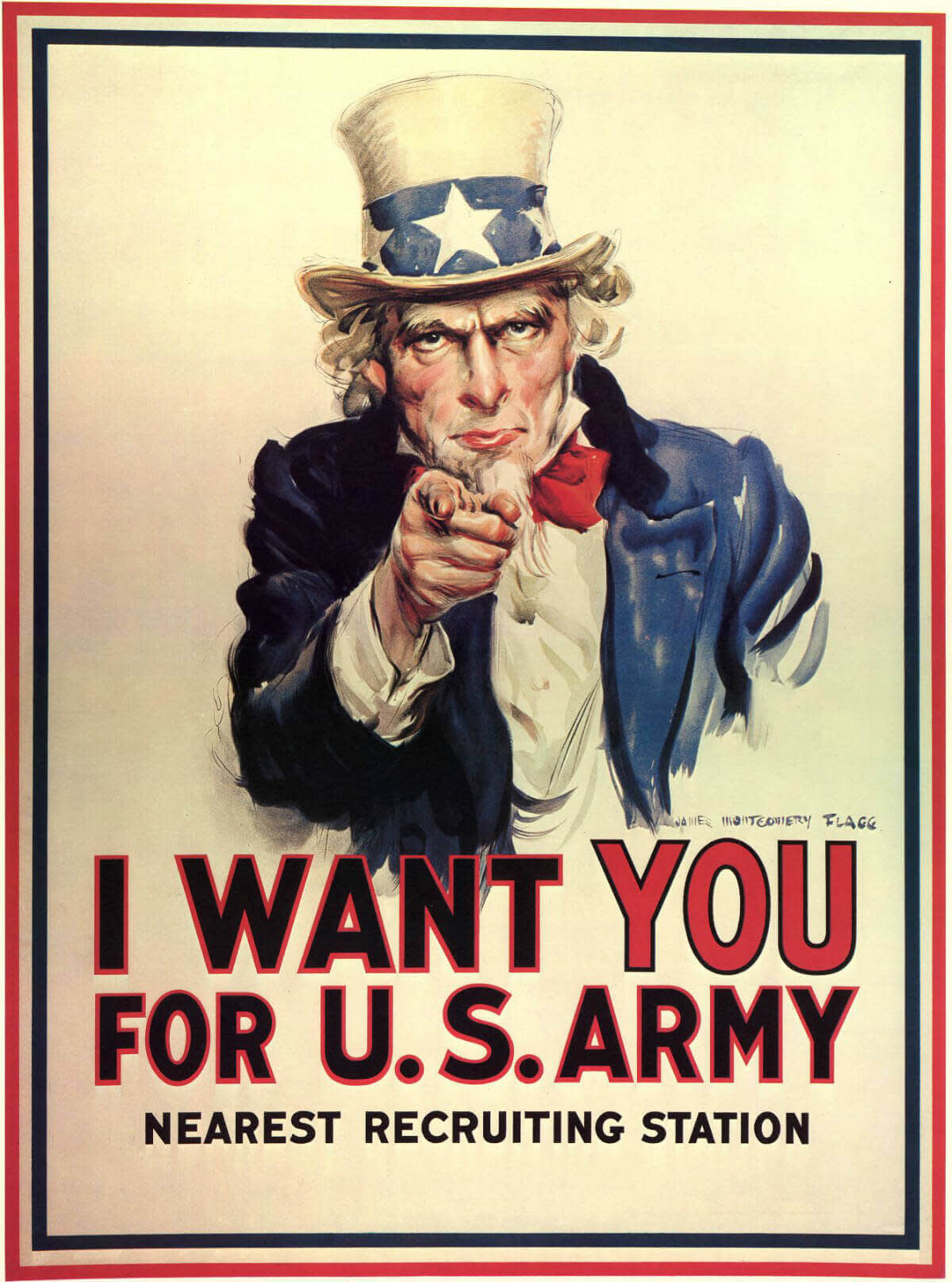
James Montgomery Flagg. (c. 1917.) “Uncle Sam Wants You.”
If it’s good enough for Uncle Sam, it’s good enough for you. Check out how the flag-colored frame supports the patriotic message of the poster.
P.S., you know who has some sweeeeet corners, frames, and other decorative flourishes? Uh, yeah, that’s little old PicMonkey. Find them in the Frames tab, as well as in the Corners, Garnishes, and Labels graphic groups.
Being geometric
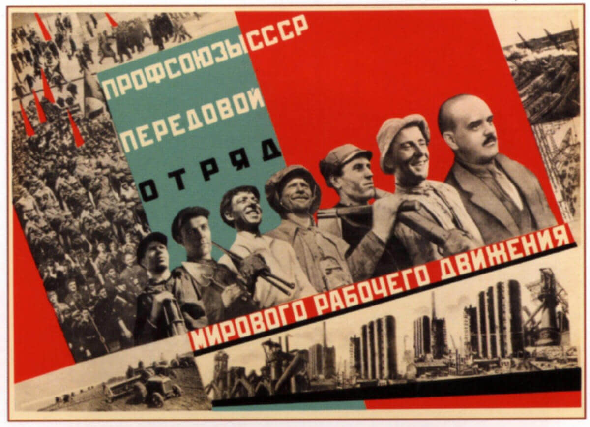
Koretskiy V. B., Gitsevich V. A. (1932.) “The Soviet trade unions-the vanguard of the world-wide workers’ movement.”
Let’s say you’re less about curlicues, and more about those straight-shooting geometric shapes. In that case, you’ll wanna skip on ahead in the history of art from nouveau to deco—and the famous Russian art form, Constructivism.
Just as Russian Communists envisioned a totally new way of ordering society, Russian Constructivist art envisioned new ways of creating shapes, inspired by emerging technology. What this meant for propaganda posters in the 1910s and ’20s was a focus on geometry and abstract shapes.
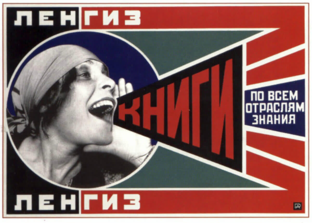
Aleksandr Rodchenko. (1925.) “Lengiz, Books in all Branches of Knowledge.”
Shapes, man!
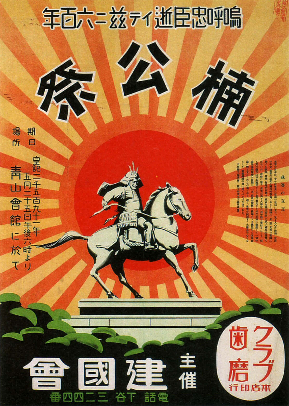
Japan. 1931. “Kusunoki Masashige Festival.”
Meanwhile, if you’ve ever admired the radiating grandeur of a rising-sun-style graphic flourish, Art Deco says you’re welcome. Chevrons, sunbursts, and zig-zags are hallmarks of the Art Deco style, and can be seen in a number of twentieth-century propaganda posters—including this Japanese number portraying modern-day samurai.
If you like an artistic element on a specific poster, whether it’s a graphic or a style of portraying people, hit the search engines to figure out what artistic school it comes from. Chances are, other work in that style will have more inspiration for you.
Going big with your text
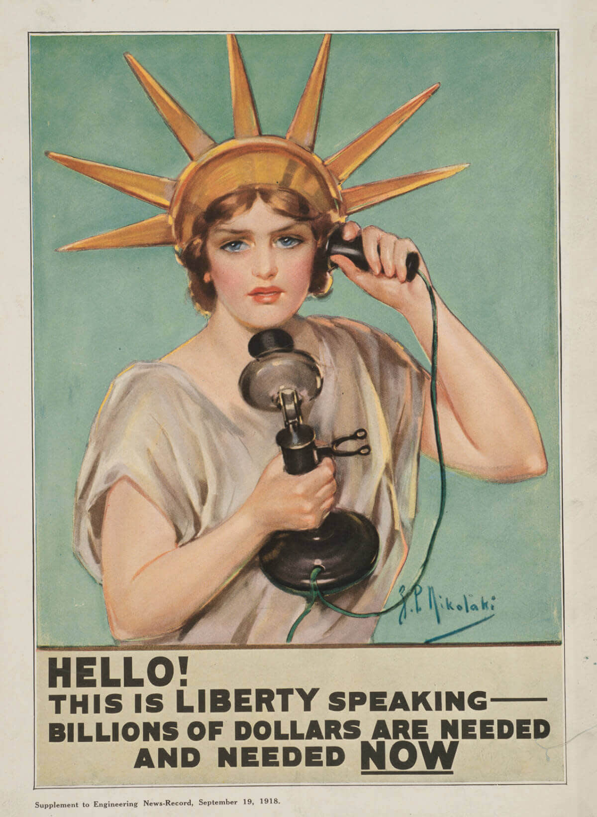
Z.P. Nikolaki. (1918.) “Hello! This is liberty speaking—billions of dollars are needed and needed now.”
Many propaganda posters of the twentieth century were used in the context of war: to build morale and coordinate action at home, or to persuade and undermine abroad. So they don’t pussyfoot around when it comes to message, there’s no time! Our people are out there!!! LOOSE LIPS SINK SHIPS, ARTHUR.
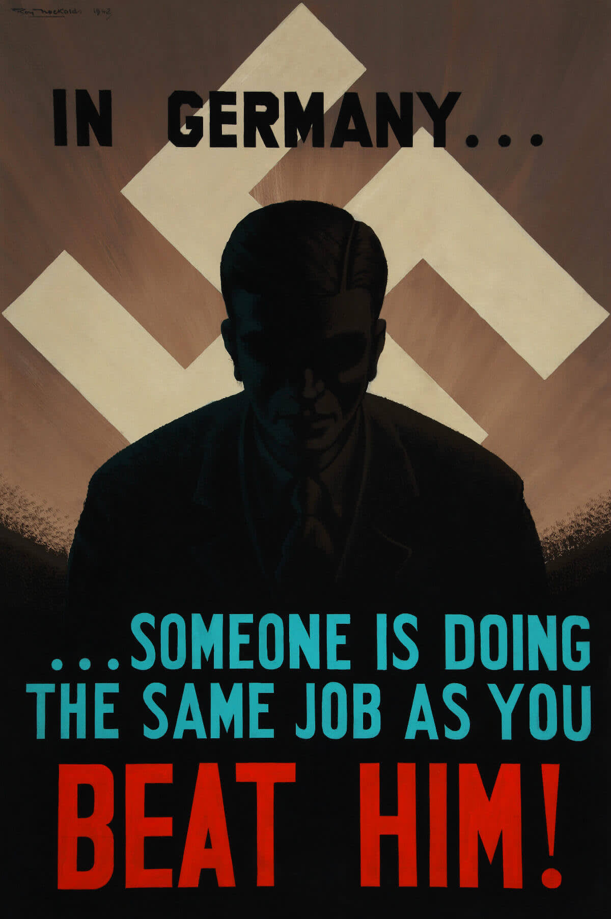
Roy Nockolds, The National Archives (UK). (1942.) “In Germany…someone is doing the same job as you. Beat him!”
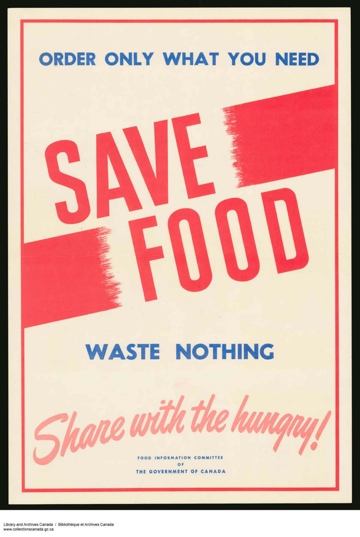
Food Information Committee of the Government of Canada. “Save Food—Waste Nothing.”
What’s the lesson here for us? Experiment with big, bold text—in terms of both typography and message.
Don’t get us wrong: we love a delicately crafted, multi-metaphored turn of phrase as much as the next word jockey. Sometimes, though, simpler is more effective. That’s how we get “When you ride alone, you ride with Hitler” and “This man is your friend, he fights for freedom.”
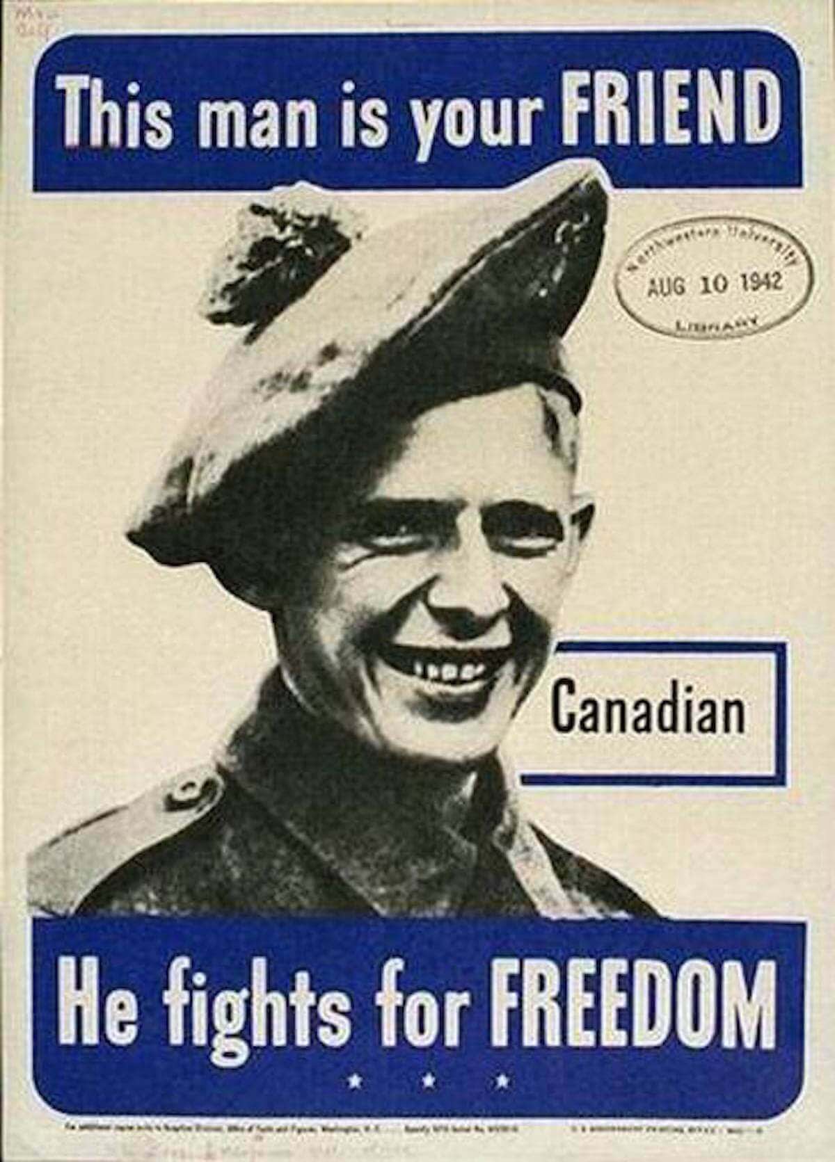
United States Office of Facts and Figures. (1942.) “This man is your friend.”
So don’t hold back! Get right to the point, capitalize with abandon, and tug at some heartstrings. (Or guilt-strings, as with the famous British poster that asks, “Daddy, what did you do in the Great War?”)
Of course, propaganda is all about knowing your audience. The over-the-top phrasing on many of these old posters makes us giggle today, so either adjust your message accordingly, or lean hard into the comedy.
So there you have it! A few of the styles and techniques common to propaganda posters that can influence your own designs. Now get out there and take over the world!
… But like, not literally.
