There’s no delight quite like the moment your meal comes together, on the plate. Whether it’s a pile of fries at a dive diner or a delicate stack of fanciful ingredients you’ve created in your home kitchen, food is beautiful, and it’s only natural to want a snap a picture to savor later once the meal is gone. At the same time, it can be a bore to scroll through Instagram every Sunday morning and see an onslaught of near-identical brunch food porn pics. What’s the best way to keep your eggs Benedict looking envy-worthy?
4 steps to drool-worthy food porn photos:
Find a good angle of your dish
Use natural light
Pay attention to color
Add finishing touches—presentation is everything!
Learn more below:

Hungry yet?
To get the scoop on how to make every meal look as mouthwatering as possible, we turned to Michael Biesemeyer, founder of Swerver, a social media services provider for the dining industry. Michael manages social media for five different Bay Area restaurants and he’s proud to say he’s taken over 40,000 pictures of food in the last five years.

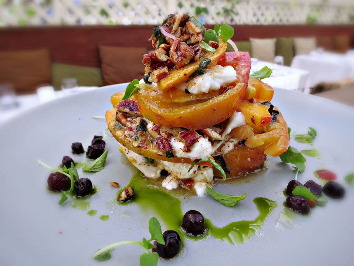
It doesn’t take hours in a studio to get a great shot –– try rotating your plate to get an angle that feels right, like Michael did with this heirloom tomato peach salad from Flea Street.
But unlike some professionals, Michael doesn’t rely on fancy equipment to get great results. “My camera is a point-and-shoot that sits in my back pocket,” he says. “Sometimes I’ll show up to a shoot and people say to me, ‘Where’s your camera?’ But you don’t need to spend thousands of dollars to take good shots. Even with your iPhone you can get great images.” And when it comes to post-processing, Michael says, “I’ve always used PicMonkey.”
Rather than using a studio setup, Michael shoots food as it comes out of the kitchen. “I only get about 30 seconds to shoot a dish coming off the line,” he says. So what’s the secret to getting a great shot without a fancy camera rig and set up time? “In order of importance: angle, lighting, and color,” says Michael.
1) Get a good angle of your food
To get the best angle on a dish, Michael offered up a few tips. First: make sure the protein is the focal point of your plate. “If you’re taking a picture of a steak,” he says, “you’ve got to make sure you’re not taking a picture of the onions or potatoes.” This should be no problem if you’re out at a restaurant –– most servers are trained to set down plates with the protein closest to the diner –– but in any case, just twist the plate around a little until everything lines up.

When photographing a main dish, keep the protein front and center.
Of course, not every plated meal has a basic meat and potatoes layout. “Treat a dish like a person,” Michael says. “Try to find their angle.” Be aware of capturing height and texture: “If a dish has layers, it’s important to make sure you can see that.” Last, Michael recommends keeping the camera at about a 25 degree angle from the plate. If you’re holding it too high or too low, you risk missing the best vantage point. “Top down shots can look cool, but they tend to flatten out the subject. And if you’re too head-on, you lose perspective.”
2) Go for natural light
Photography literally means drawing with light, so it stands to reason that lighting is key to composing an image well. Natural light is best, but often restaurants have less than ideal conditions. “Try to get away as much as possible from lighting with artificial color, since that destroys the image,” says Michael. But If you can’t seem to catch the light right, don’t sweat it. PicMonkey has plenty of options to brighten and color-correct images. The simplest way to do this is using PicMonkey’s Exposure tool –– Michael says he uses it on nearly every photo.
And, as a final rule: “Never use flash.” Not only does it make for a terrible image (Martha Stewart’s food photo foibles, anyone?), it can disturb fellow diners and aggravate restaurant employees.
3) Pay attention to color
The last way to ensure your latest snack is looking great is to concentrate on color. Michael recommends aiming for clean, bright hues, rather than over-filtering. While dramatic effects can add interest and texture to portraits or landscapes, it’s best to stick to true-to-life hues when it comes to food. “I used to use a cross-process filter a lot,” says Michael, “but looking back now, it doesn’t look great. I have a client that’s mainly seafood –– and no one wants to see weirdly yellow fish!”

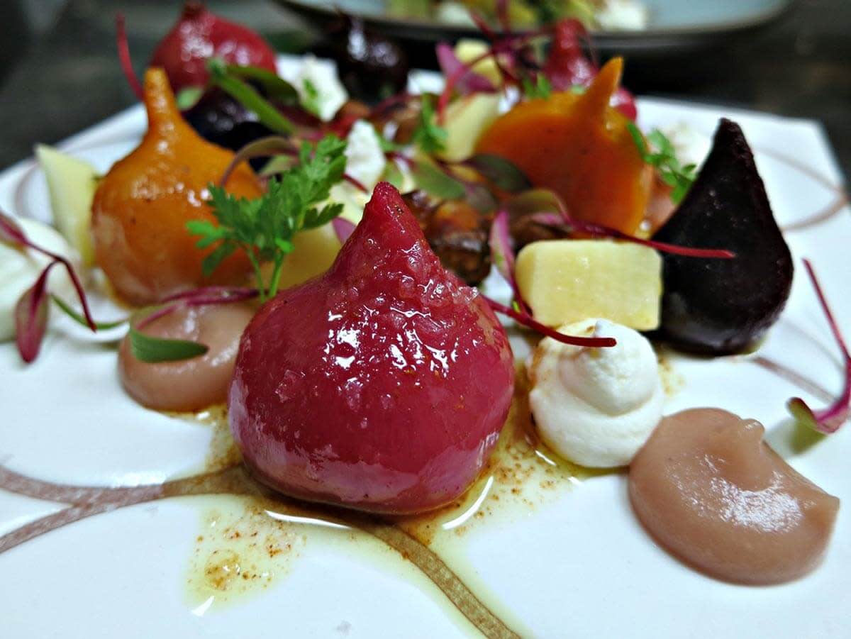
Keep colors looking crisp and vivid by correcting the white balance –– yes, these potatoes really are bright purple!
If your camera has a white balance feature, you can adjust color settings on the fly, but it’s easy to brighten and correct color once your meal is done. “I use the default settings on PicMonkey effects, and if I don’t get what I want right away, I toggle around looking for solutions,” says Michael. Use Colors (in Basic Edits) to make colors pop, or use Dodge to brighten and bring light to your shot’s focal point. And adjust those sliders to your heart’s content!
4) Add finishing touches
When you’ve got your image looking sharp, clean, and bright, it��’s time to fancy things up a bit –– but it doesn’t take much. When it comes to text and graphic details, Michael recommends keeping things simple. “Make sure any added elements harmonize well with the color and texture of the food,” he says. “For example, if I’ve got a really red marinara sauce, I’ll use a red font to match rather than overpower that.” A few simple lines, or a frame like Museum Matte, can also be a great way to add some order and balance to your composition.

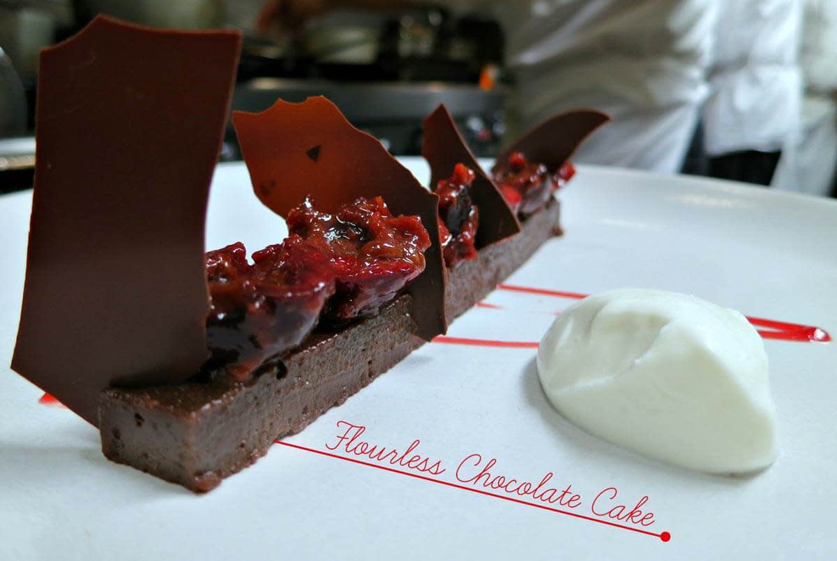
A delicate, understated script font and a simple red line are perfect complements for the elegance of this rich dessert. When adding graphic detail, try matching color and style to the ingredients on the plate.
If you’re shooting in a messy kitchen or a crowded restaurant, and you’re worried about the background drawing too much attention away from whatever’s on your plate, blur it out gently using Focal Zoom. This shallow-depth-of-field look is a great way to get your finished product to mimic the kind of shots you’d get with a higher-end DSLR camera.
Last, PicMonkey Collage is a great way to integrate images of several dishes into a picture of your whole meal. If you’ve whipped up several impressive new recipes for a family dinner, or dined out at a swanky place serving four courses, you can display everything side by side. “I try to treat Facebook like an extension of the dining experience,” says Michael. Making and eating food has always been a communal act—it only follows that sharing pictures of food must be the next step in human evolution.
