Karen and Emily from The Graphics Fairy have bestowed upon us this incomparable guide to vintage graphics for your pictures and digital scrapbooking projects.� Create your canvas to play along at home, PicMonkeyers!
Note: We’ll be opening images in the Graphics tab, then making adjustments to the color, fade, and blend modes in the Graphics palette. The adjustments are optional, but they really tie the scrapbook together.
1. Open a blank, square canvas in Design.
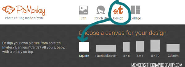
2. Add background paper.
Select the Textures tab (mesh square) and pick from PicMonkey’s array of Paper and Papyrus textures. Or, if you have your own paper in mind, you can open it in the Graphics tab (the pretty butterfly icon). We used this one. Don’t forget to set the Fade slider to around 25%!

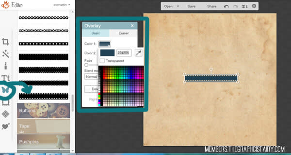
3. Add ribbons.
Select a ribbon from the Graphics tab. Resize the ribbon by adjusting the corner handles (protip: hold Shift when dragging to stretch or skew the ribbon to your liking). You can either choose a color from the palette, enter your HEX value (the blue here is 224255), or use the dropper tool to match another color in your image. Don’t forget that you can recreate graphics by right-clicking them and selecting Duplicate graphic.
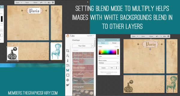
4. Add flourishes and label layers.
Flourishes and Labels are also in the Graphics tab. Place, resize, and rotate the graphics as desired. Make adjustments to your heart’s content. For the corner flourish, we set the fade to 60% and selected the Multiply blend mode.

5. Add graphics.
Add images by opening them as Your Own images in the Graphics tab. For the perfume bottle, we selected the Multiply blend mode. Setting the blend mode to Multiply helps images with white backgrounds blend in to other layers, as you can see with the chair and the Paris image.
6. Add photos and papers.
Again, make sure you’re doing all this by opening your images as Your Own graphics. We set the blend mode to Darken for the store photo, the Parisian ad, and the blue medal, whereas the Eiffel Tower photo is set to Multiply. That dashing Sigaut label is rocking Multiply with a fade level of 20%.
Tip: If you have a photo over several different backgrounds (like the dancer in this case) that still doesn’t look right with any blend mode, try putting your photo over a box (Graphics > Geometric) and set the photo’s blend mode to Multiply.
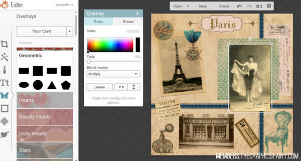
Add final graphics, banners, and text. Following the same process, add a corner, a postal graphic, and a banner. Or several! It’s all up to you. Put text on your banners via the Text tab. Pick your favorite PicMonkey font or open any of your own. We used a winner called Black Jack.
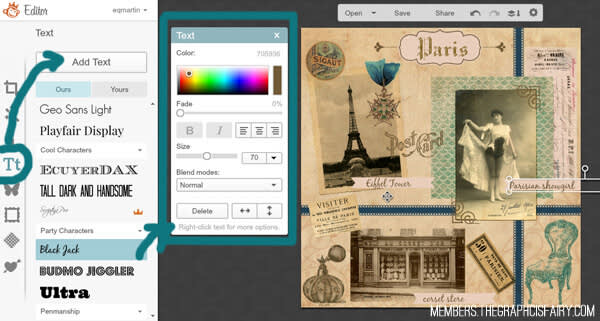
7. Combine and save.
When you’re good and satisfied with your masterpiece, combine all the elements and save.
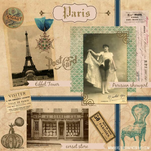
The images used for this collage are:stained paper, Eiffel Tower photo, showgirl, Visiter ad, Paris text, Sigaut label, store photo, Frenchy chair, Parisien 50 label, perfume bottle, French medal, French receipt, wall paper clipping.
We hope this inspires you to create your own scrapbook pages and collages. Using the Graphics tool—whether you’re using your own photos and images or PicMonkey’s numerous decorative embellishments—you’re sure to make a gorgeous project!
The Graphics Fairy is a blog that gives away free vintage graphics daily. They have a brand new premium site with additional graphics, file formats and premium printables delivered in weekly bundles. We’re good friends; check ’em out.
