
The mantra we all know too well, “don’t judge a book by its cover,” is easier said than done, especially when referring to book covers.
It’s natural to make assumptions about the book cover design based on its color choice, layout, illustrations, photography, and font choices. All of these elements work in harmony to convey what the book is about; a successful book cover design will elicit emotions and pique your curiosity, urging you to dive into the book.
Let’s dive into standard book cover sizes and eight book cover ideas and design tips to make a stunning cover that sells.
Book cover sizes
Book covers sizes come in various dimensions, depending on the genre and book material. These dimensions can affect the overall layout of your book cover, from the font used along the book’s spine to the artwork design on the front cover.
Below is a list of common book cover sizes (in inches and pixels) listed by book genre:
Paperback
4.25 x 6.87 inches (408 x 659 pixels)
Hardcover books
6 x 9 inches (576 x 864 pixels)
8.5 x 11 inches (816 x 1056 pixels)
Fiction books
4.25 x 6.87 inches (408 x 659 pixels)
5.25 x 8 inches (504 x 768 pixels)
5.5 x 8.5 inches (528 x 816 pixels)
6 x 9 inches (576 x 864 pixels)
Nonfiction books
5.5 x 8.5 inches (528 x 816 pixels)
6 x 9 inches (576 x 864 pixels)
7 x 10 inches (672 x 960 pixels)
Novellas
5 x 8 inches (480 x 768 pixels)
Children’s books
7.5 x 7.5 inches (720 x 720 pixels)
7 x 10 inches (672 x 960 pixels)
10 x 8 inches (960 x 768 pixels)
Textbooks
6 x 9 inches (576 x 864 pixels)
7 x 10 inches (672 x 960 pixels)
8.5 x 11 inches (816 x 1056 pixels)
Book cover ideas and design tips
Before diving into creating your book cover design from scratch, take the time to get inspired by other book covers and see how you can utilize their design styles. Here are eight different book cover designs to use for inspiration and best practices on how to mimic it in PicMonkey.
1. Utilize color contrast to its full potential
The first thing that catches a person’s attention when browsing the library or bookstore is the book’s color, right?! Color psychology plays a huge role in book cover designs and also communicates the book’s meaning through color choice.

Use complementary colors in your book cover design, such as orange and blue, yellow and purple, or green and red. Image via Goodreads.
When deciding on a color palette to use for your book cover design, aim for impactful and even complementary colors, such as orange and blue. You’ve got an ultra warm color that meets a cool-toned color, making the contrast between the two even more powerful.
Create color complements in PicMonkey
Experimenting with contrasting color choices such as purple and yellow, may be daunting (and let’s admit it, a little uncomfortable) at first, but PicMonkey makes it simple to quickly change colors within your book cover design.

Experiment with solid or gradient color sliders to make a wow-worthy impact.
Simply select the layer you’re editing and click Change colors on the left tools menu. Choose from pre-set color swatches, or enter in a specific six-digit hex code. Don’t worry if it’s not perfect right away—you can always tweak the overall color later on if needed.
2. Make an impact with minimal design
Minimal doesn’t mean boring. The truth is, you can make a huge impact on your book cover design with intentionally designed yet minimal elements. Every element, from the font to the colors and illustrations, plays an integral role in the overall design. You’re eliminating all of the fluff and keeping what truly sings.

Image via Amazon.
This book cover design achieves that and more by drawing melancholy tones from the deep blue that makes up the majority of the design. With a minimal silhouette and circle, you can feel the sad emotions coming off of the book cover.
Make it minimal in PicMonkey
The best way to achieve minimal design is to find recognizable graphics and icons with powerful color psychology. Take it back to the basics here—jot down things that you think of when you read a book’s title.
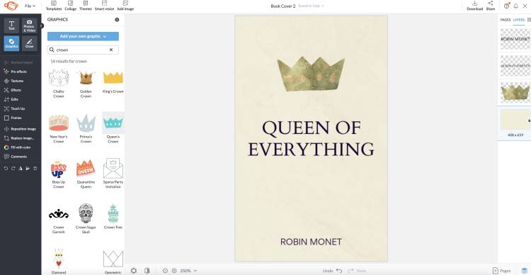
Amp up simple icons with PicMonkey’s textures and source complimenting fonts for your minimal book cover design.
For example, this Queen of Everything book cover relies on the strong connection with the crown and the gold accents, making it a successful minimal design choice. Then, find a font that ties it all together. This serif font, Cardo, has all of the professional and angled features that feels like royalty.
3. Overlay textures and photography
Mixed media, the combination of different forms of art mediums, is a popular art style that makes for a compelling book cover idea. Mixing photography with a brushstroke is one way to achieve that. Source contrasting textures and compositions to really make these overlays in different graphics work in harmony.

Image via Book Cover Archive.
Combine textures in PicMonkey
Layering textures and graphics over one another is a powerful way to communicate a specific message or emotion in your book cover design. In PicMonkey, you can easily manipulate each layer and incorporate different art styles with images and graphics.
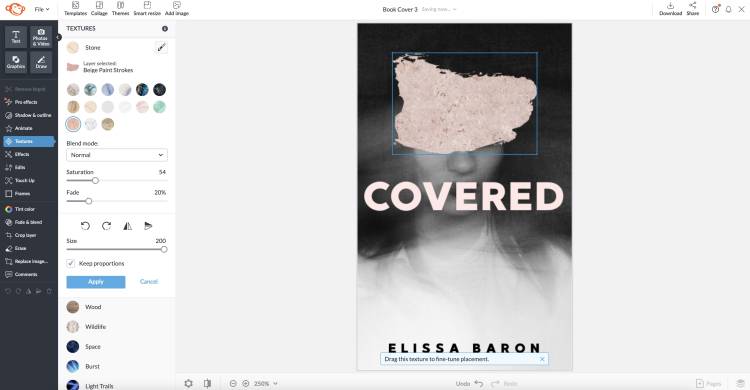
Utilize both images and graphics to create a stunning composition.
Search for specific or vague search terms in either library to find a vast selection of book cover elements.
4. Use typography as a focal point
In addition to using illustrations and photography, you can use fonts in a visually compelling way for your book cover design. Duplicating type or manipulating each letter can lend powerful results.

Image via GoodReads.
Tap into type with PicMonkey
Font choice can easily make or break the book cover’s design. Find a font style that works in harmony with the book and let’s get to typing! Experiment with duplicating font layers with Command + D (Mac) and adjust each layer to appear behind the previous one. Duplicating fonts is a great way to emphasize the book’s title and lure the viewer into the entire book cover.
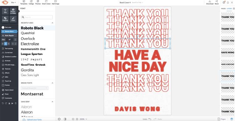
Experiment with using only typography in your next book cover design.
You can also add in outlines, drop shadows, or inner shadows to add even more emphasis to a word or phrase on your book cover with the Shadow & outline tool. There’s no need to go overboard on these text edits—reign it in and let the text speak for itself, no WordArt necessary.
5. Allow graphics and text to interact
Sometimes all we want to do after finding the perfect font style for a design is to add a solid color and call it done. But, if you take it one step further, you might just arrive at the perfect book cover idea.

Image via Book Cover Archive.
Rather than stopping at the aligning and color selection process, try experimenting with layering graphics over text in specific areas or applying a transparent gradient to let your text fade into the distance. This extra step makes your book cover design feel even more purposeful and intentional.
Use text effects in PicMonkey
When adding text to your design in PicMonkey, try separating each letter (if you have a single word title) or by breaking up your title into different lines, like above. From there, you can overlap the graphic over the individual letter, apply a transparent gradient, or experiment with various font sizes for a collaged-style book cover.
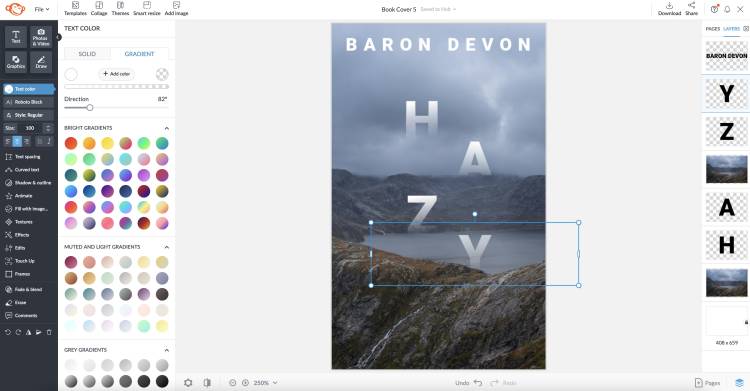
Experiment with separating each letter or word out into its own line or space, then applying effects, gradients, and more for that extra wow!
6. Showcase handwritten or textured type
Some of the most famous book covers feature custom-made text just for that design. While everyone may not have the time and creative abilities to draw text and bring it to life, you can achieve similar results with handwritten fonts.

Image via Book Cover Archive.
This book cover design relies on a textured, brush strokes style type with irregular letters to fit within the island shape. In the background, additional text is drawn out to fill the entire background. While there is a lot going on in terms of text, the book cover design is successful because it separates the primary text from the secondary, or background text with color and size.
Access handwritten fonts in PicMonkey
Handwritten and textured fonts over serif or sans serif fonts can make a huge difference in the overall tone and message derived from the front cover. After all, you have one chance to make an impact on the viewer.

PicMonkey’s text library comes chock full with various font styles. Categories such as Display and Handwriting house unique fonts that are perfect to use for book titles and author names.
7. Play around with circular text
Another way to add unexpected visual interest to your book cover ideas is to incorporate circular text into the title. Orienting text in a circular manner can give your book title that extra pop it needs.

Image via Book Cover Archive.
Get circular in PicMonkey
Creating circular text is as easy as a few clicks in PicMonkey. Simply type out the title text, head to Curved text in the left toolbar and choose from Circle or Arc and adjust the appearance on a slider.
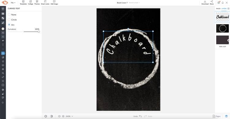
If you need to edit your title after you’ve made it circular, you can easily head back to the text panels and change out the font, edit the title, or change its size. Easy peasy!
8. Utilize compelling photography
Using thought-provoking photography in your book cover design can draw viewers in and make them think about the front cover. If you have a book topic that is difficult to convey with color and text, try incorporating imagery that tells a story.

Image via Book Cover Archive.
In this book over climate change, the book cover conveys a wooden sled going down a grassy hill, automatically making you think, “where’s the snow and ice?!” Something as simple as using a scene with thought-provoking changes can lure more viewers into the book.
To top it off, opt for simple text to let the compelling imagery really speak for themselves.
Incorporate photography in PicMonkey
Photography is an essential element to many book cover designs. If you’re stuck on where to source photography for your cover design, PicMonkey has you covered! You can search for professional stock photography and videos right within the program.
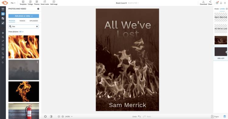
The difference between a compelling book cover and one that just doesn’t get you excited to read the book is all in the psychology behind the imagery, color, and text. When thinking of your next book cover idea, jot down words that describe the book and search for inspiration in similar genres.
Now that we’ve armed you with essential design tips and book cover inspiration, it’s now time to release your wings and make us proud. Go get ‘em, tiger!
