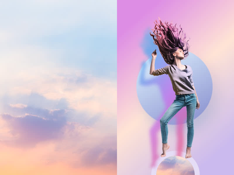
That natural gradient in the sky vs. gradients in backgrounds, drop shadows, and color fills in designs.
If you want to know the OG of gradients, step outside. Sunset and its nerdy, early-rising sister, sunrise, are a universal reference when it comes to gorgeous color transitions that create depth and interest. To gaze open-mouthed at them is to be human. It's one of the reasons why gradients have had such staying power in graphic design — they're listed in most top trend articles for the past five years and show no signs of stopping.
A gradient is the gradual blending of colors—typically two or more. We're gonna take a creative romp through some inspirational gradient designs and give tips for making them yourself. Cuz DIY is fly: Why download that gradient everyone's seen everywhere when you can create your own special sauce?
Using PicMonkey's gradient maker
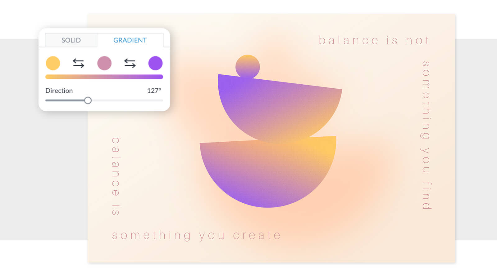
Using a gradient tool gives you a high degree of control to make something totally unique, and you can change it up anytime you like. And when you build your own gradient, you can replicate it across a group of different pieces to unify a particular campaign or brand look. In PicMonkey, you can store your gradient images in a brand kit so they're right there in the editor the next time you're creating a design. Even cooler? You've got like seven different ways to add a gradient—including gradient drop shadow. You won't find that anywhere else!
Color gradients used in logos

Long seen as the scions of simplicity, logos are current proof that flat isn't (always) where it's at. Technology brands, food brands, even stodgy banking brands have moved over to the gradient way of thinking. In a world where so much brand play happens online, gradients solve for the unique communication problems in 2D interactive space: along with shadows, they add dimension, which invites interaction, especially for clickable content and buttons. Tip: If your brand is often represented in print, you may want to use gradients more sparingly, because they don't always print well.
How to add gradient to your logo design in PicMonkey:
Start with a blank canvas and add a graphic or shape to it
Select the graphic and click Change colors in the left panel.
Click "Gradient'' atop the color picker, and choose your colors. Boom! Done.
Tip: Be sure to download your logo as a PNG to preserve transparency.
Gradient backgrounds for designs
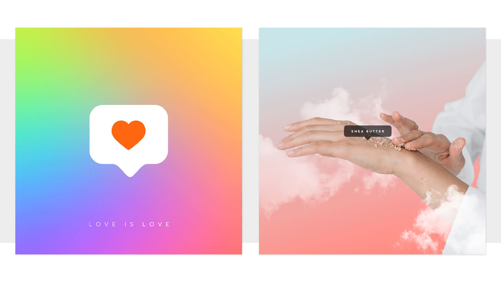
Gradient backgrounds are used heavily by tech companies like Apple and Instagram, but also hospitality brands, beauty brands and just about anyone with a quote post in social media. They can be used to create movement, drawing the eye from light to dark or from muted to vibrant color, and in the case of monotone gradients, can help draw focus to text in a design.
How to create a gradient background in PicMonkey:
Start with a blank canvas and click Background color, in the left panel.
Click "Gradient" atop the color picker, and choose your colors. Boom! Done.
Gradient effects on photos
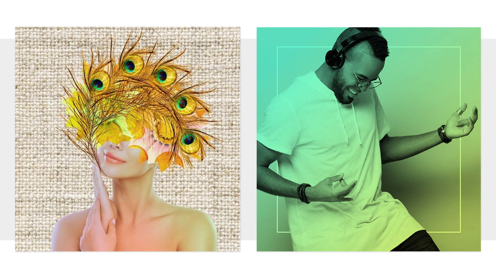
Design by digital artist Wendy Power on the left.
Color gradients bring photo tinting into the 21st century with some subtly luxurious lewks. They can also be used to pump up the visual interest in a photo that's not inherently dynamic. You can use our miracle-working background remover tool to isolate your photo subject and add the gradient to just that part of your design (like Wendy Power's design on the left, above) or add a gradient effect to the entire photo (like our PicMonkey design on the right).
How to add the gradient effect across an entire photo
Open your photo in PicMonkey, and click Effects > Gradient.
Choose your colors.
Click through the blend modes to find the best one. Boom! Done.
Inspirational color gradients for your designs
Before you choose colors for your gradients, you may want to get some color inspiration from a photo-based color palette generator so you can see how the colors of your gradient would work together in photos and designs. Get the hex codes of the colors you like, and then drop them into the color picker when you're creating your gradient. Here are a few we're liking...

Vibe in style. Gradients with super saturated colors are definitely eyeball grabbers. But they can be eyeball searers, if you pair them with equally electric graphics and text — designer, beware! Use these colors to communicate excitement, imagination, and innovation. Tip: If your design is tipping toward too many colors but you still feel the need for variation, add one that's a slightly lighter or darker version of an existing color.
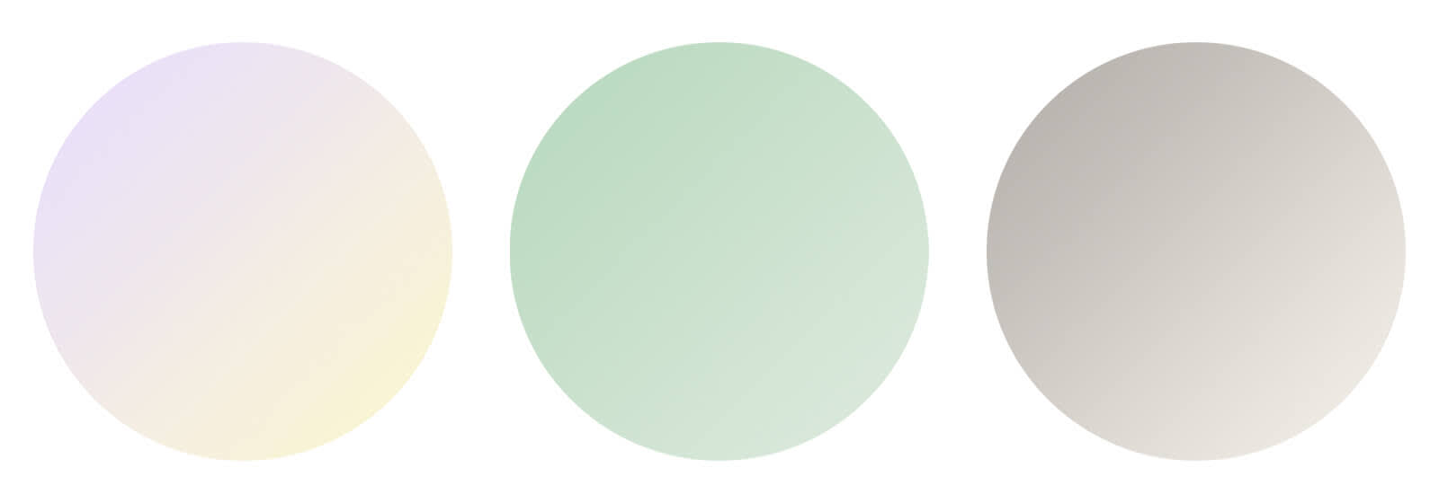
Calm thy senses. Pastel gradients like these are good for wellness brands, lifestyle brands, and messaging that conveys empathy, sincerity, and friendliness. Tip: Choose any pastel color in the PicMonkey gradient color picker, and the tool will offer you a second gradient color that is the same saturation level but a different hue, keeping it in the pastel family.

Mono is bueno. Monotone gradients, sometimes called "ombre," are when a color is gradually blended with transparency, white, or black instead of a second color (let's leave the question of whether black and white are colors for another day). These subtle gradients are the queens of cool because the average viewer may not even notice them. Use them to convey luxury, strength, and quietude with darker colors; and vitality, playfulness, and happiness with lighter colors. Tip: Rotate a monotone gradient to one side of your photo (using the Direction slider) to create an area where text will stand out gorgeously.
So go forth in gradience, ye designers, social media makers, and brand bakers. We're pumped to see what you make.
