The Color Picker is divided into two tabs — Solid and Gradient. When you select a design element (background, image, graphic, text), that element's tools menu will open on the left panel. Click Change color (or Tint color for image layers) to open the color picker. Read on to learn how to use it once opened.
Solid tab

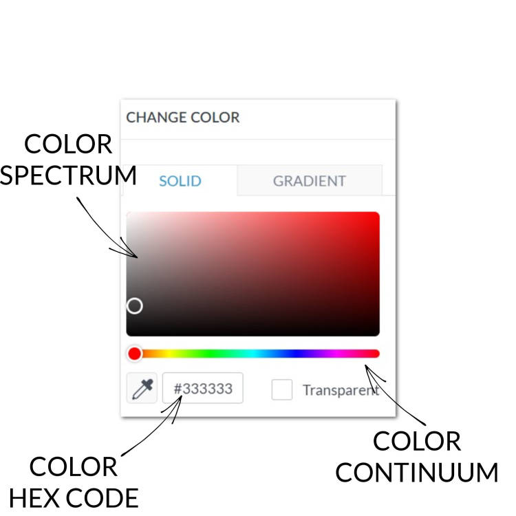
The Solid tab (for selecting solid colors) offers a high degree of control over color selection:
Color continuum
If you want to choose a color manually, drag the circle on the rainbow bar (color continuum) to pull up different color ranges in the color spectrum. Then use the spectrum's circle to select your specific color.
Hex code
If you know the hex code of the color you want, type it into the box next to the color dot (It looks something like this: #123456.)
Eyedropper
The Eyedropper helps you choose exactly what color you want from another part of your image. Click the Eyedropper and hover over the desired color. Click on the color to apply it to the selected layer.
Rainbow color swatches

Scroll down and you'll see the Rainbow Colors section which contains a slew of pre-designated colors you can just click to choose. Colors from a traditional color wheel show up top; colors you've recently used are below that; all the colors you've designated in your brand kit are at the bottom.
Gradient tab

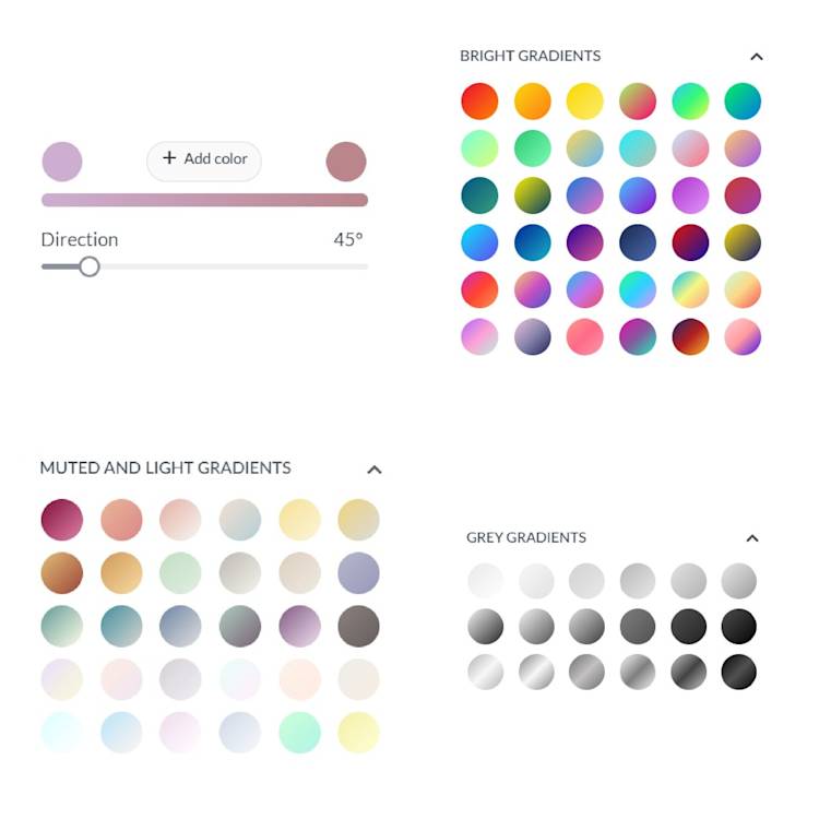
The Gradient tab offers a massive collection of pre-designated color gradient swatches, as well as the ability to create your own. Choose two colors, the direction, and add a third color if desired. To learn more about gradients, see: All About Using Color Gradients