When thinking about what graphic design trends will emerge as tops in 2021, we chose seven themes that both reflect the last year we've been through while also encompassing the hope we have for a new one. A few of these trends are in direct relation to the emotions felt by many these past few months: chaos and uncertainty for sure, but also a longing for the familiar and the authentic. Plus, we identify two 2020 trends that just won't quit: Gradients and Bold Typography are sticking around for 2021.
Below, we've chose seven examples of from the real world and created seven of our own versions with tips for how to get the look (or the template) in PicMonkey. Let's take a look at what we can expect to see in 2021.
1. Motion
image credit: East Olivia
2020 was all about movements, and we're not just talking about politics. An enormous surge in video capabilities across platforms like TikTok, the addition of Reels to Instagram, and video for Pinterest and Etsy have put motion in the limelight. It's no wonder that video/gif/animation is growing in popularity (especially among marketers) when ads or posts with video receive twice the clicks as those without.
Because it’s moving, video naturally catches the eye, and the format is ideal for showing how things work in that crucial 3-5 second time frame of capturing someone’s attention as they scroll through their feeds.
Browse more of PicMonkey's video templates to customize
Designing with motion in PicMonkey is easy to do when you start with a video template. Or, browse our Stock Video Library and add a clip to your design. Did you know you can also upload and export GIFs in PicMonkey? You surely can!
Get inspired by these video & GIF articles:
Bring Your Designs with Video - tutorial on designing with video in PicMonkey
How to Add a GIF to Almost Everything - tutorial on using GIFs in PicMonkey
2. Real Humanity
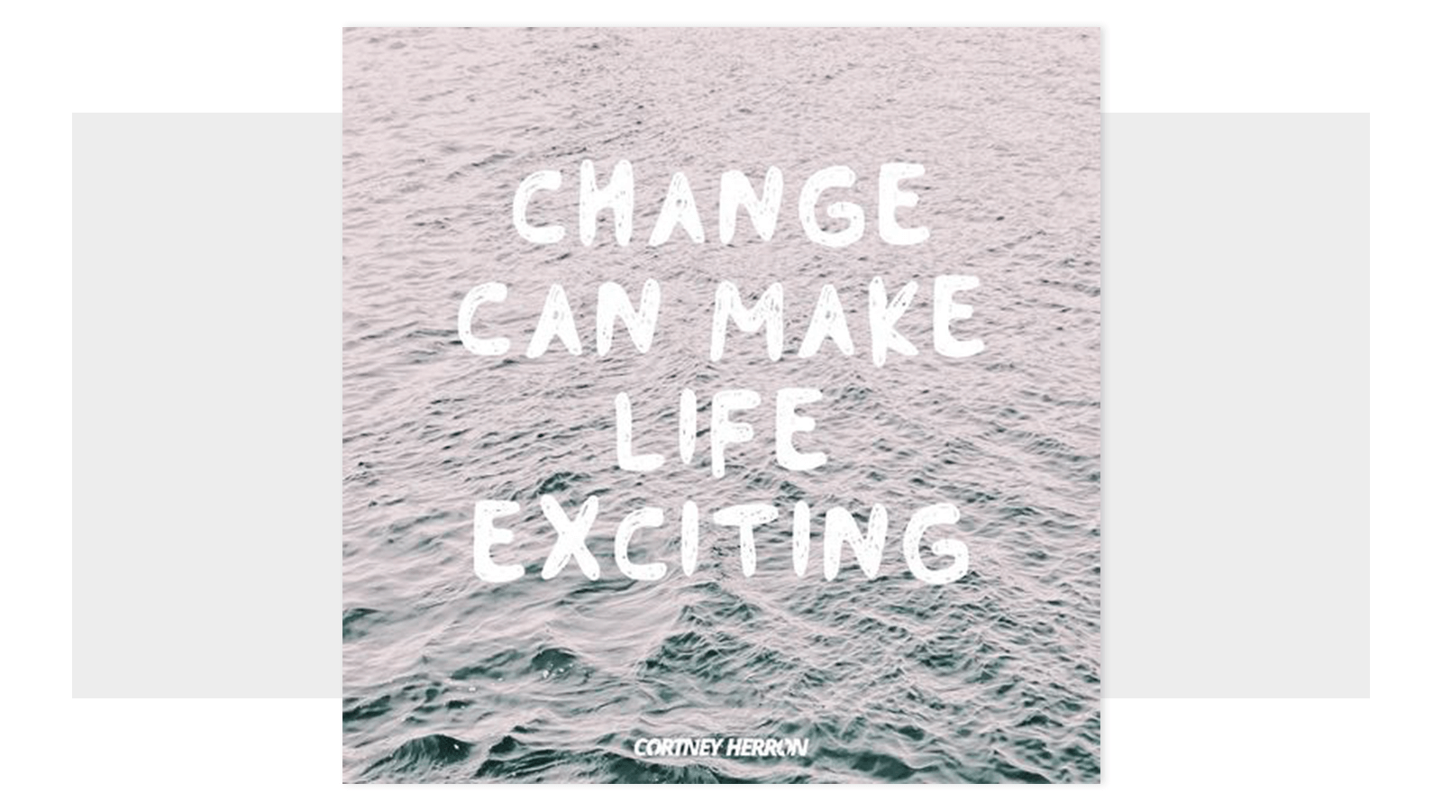
image credit: @cortneyherron
Humans are bundles of feelings and this past year has been an emotional one like no other in recent history. People are hurting, dying, longing for normalcy, longing for change, isolated from loved ones, cooped up with loved ones...the list goes on.
A sharper and more public focus on mental health issues has brought the once-fringe ideas of wellness and mindfulness to the forefront in social media where many people openly discuss their troubles. Instagram and TikTok have seen a swell in these types of accounts where folks comment and discuss more serious topics than OOTDs; topics like depression and how to be kind to oneself, for instance.
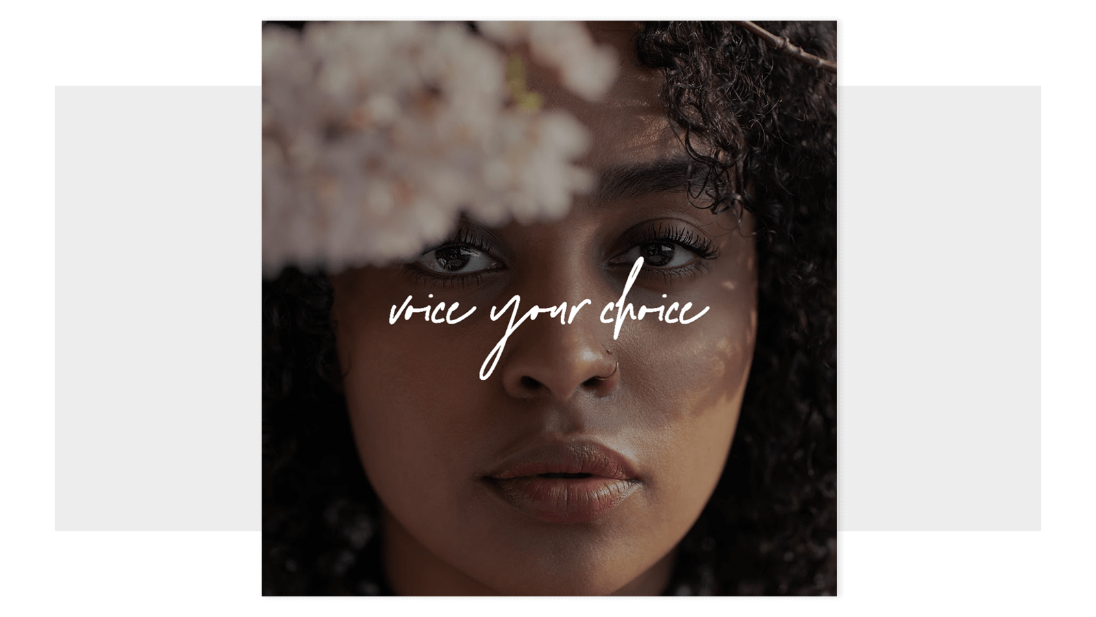
Customize this Instagram post template
Sometimes knowing that others feel the same way you do can be a huge comfort, and that comfort can often be conveyed through a poignant image. Thank god for art.
3. Collage
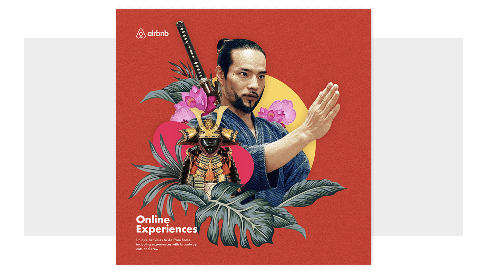
image credit: Airbnb Online Experience Campaign
Collage has always been popular in some form, but there is a burgeoning interest in the design world and in pop culture in new—freer—forms of collage. There are squared-off grid collages which are an excellent way to show off a bunch of related pics, and there's also this freeform, tactile, surreal style of collage we're seeing everywhere from Airbnb and Nike Women ad campaigns, to our very own in-house collage designs.
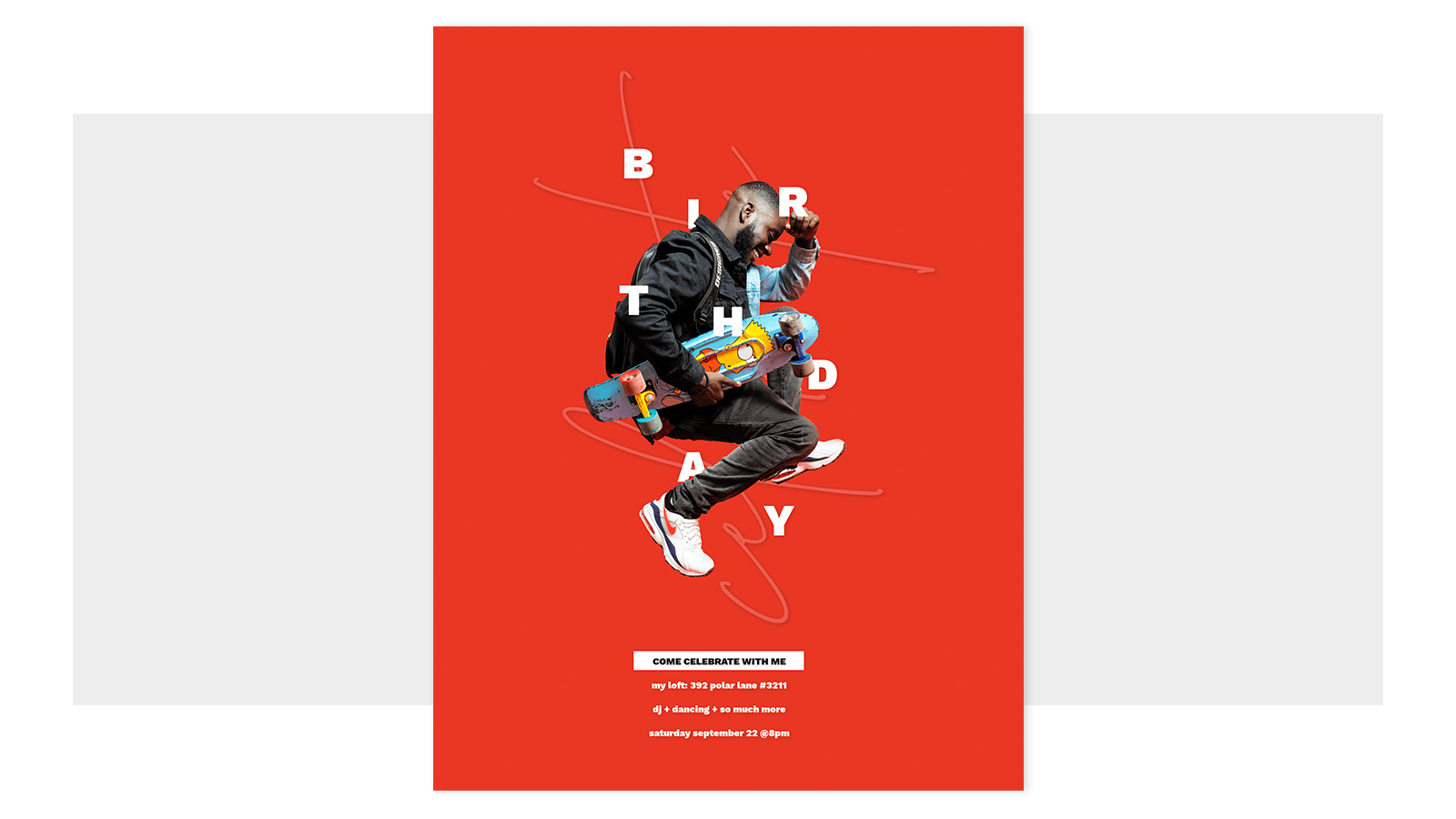
Browse more PicMonkey design templates like this or customize this one
Mixed media collages were pioneered by Georges Braque and Pablo Picasso in the early 1900's as a way to break the traditional boundaries of art by using everyday objects and materials in their works. In the digital realm today, mixed media collage employs graphics, photos, and videos to change up textural feels and get that sweet three-dimensional look.
Get inspired by these collage articles:
4. Gradients
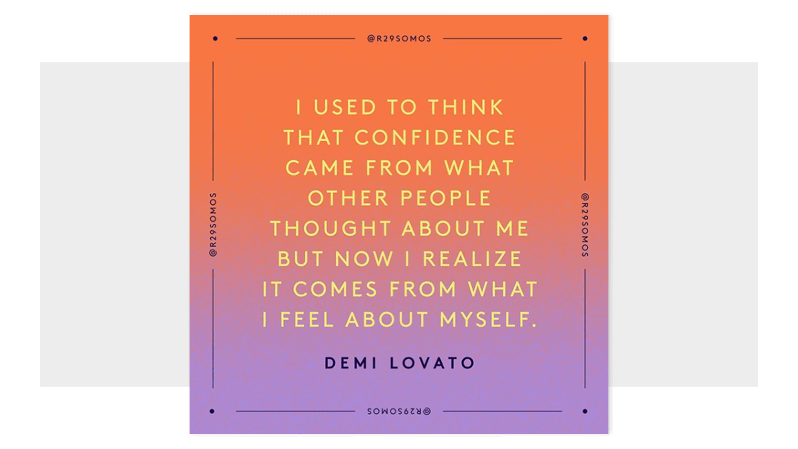
image credit: @r29somos
A trend that just won't quit, we're seeing color gradients everywhere—from print and online ads, to websites and TV, and even in fashion and home textiles. Why go with a solid-color background on a social post when you can gradiate a color or four instead? Part-rainbow, part-ombre, gradient gives off a dynamic feel with subtle-to-bold hues that move the eye around a design.
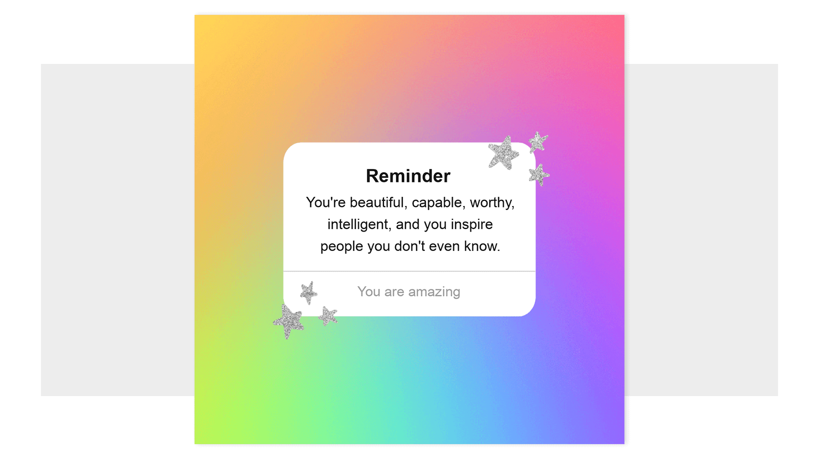
Customize an Instagram post template like this with one of our 30 color gradient textures
In PicMonkey you have a few choices for how to use the gradient trend in your designs.
Color gradient textures: Apply a gradient as a texture to images, graphics, or text.
Gradient effect: Choose the colors that make up this gradient filter and apply it to your design elements. (Or try the similar Ombre effect.)
Stock photos: Search "gradient" in the stock photo library to find hundreds of unique, multicolored images to use in your designs.
5. Organic Simplicity
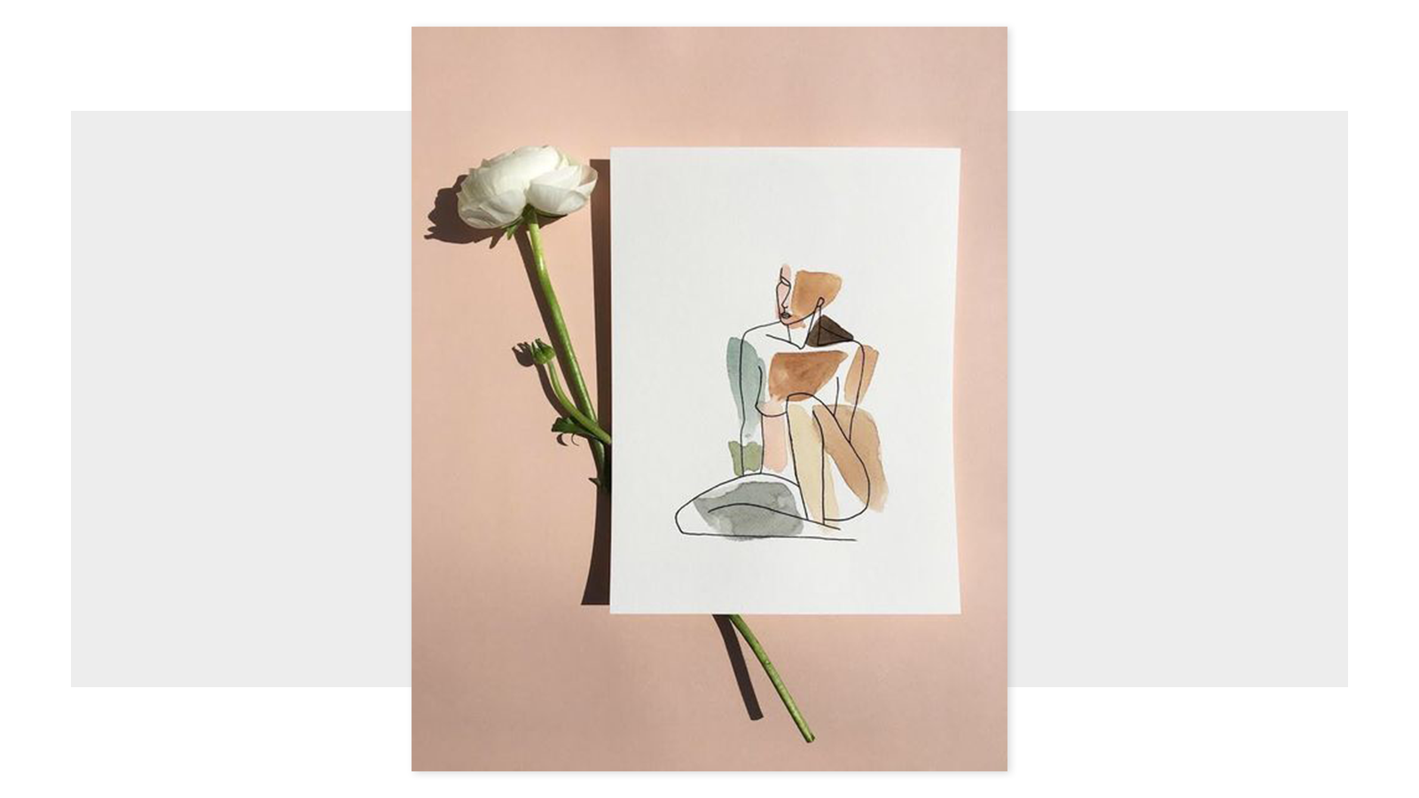
image credit: @anmistudio
This past year found many of us isolated in our homes, with socially-distanced nature walks or camping trips a main source of recreation. While various forms of nature raged and spread in the form of a virus, the scorch of a forest fire, or the destruction of a hurricane, other iterations of nature were gentler.
Either way, this year has brought us closer to nature in all its forms, reflected in art and design taking the elegant, simple, soft forms of monoline and organic shapes and colors that soothe and comfort.
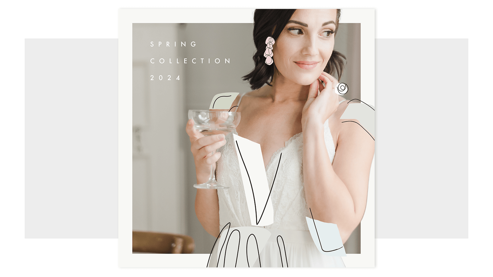
See more of our monoline graphics to use in your designs
The growing popularity of simple monoline drawing is perhaps in reaction to the overwhelm of news, constant digital messaging, unending bombardment of ads. The simplicity of it forces design ideas to reduce to their most basic lines—the bend of an elbow, the curve of a shoulder. The delicate lines of our Monoline People graphics applied to a photo elegantly accentuate the design above.
6. Bold Type
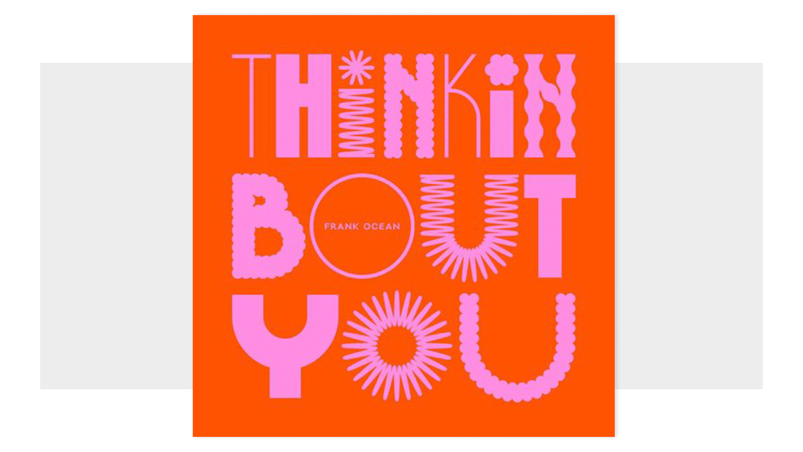
image credit: @jasminazornic_design
Another popular trend that isn't going anywhere any time soon is big, in-your-face letters. A fitting contemporary trend when thinking about all the handmade protest signs we saw in 2020—massive, chunky, blocky, and bulky, big fonts are an excellent way to grab people’s attention with a strong, bold look and message.
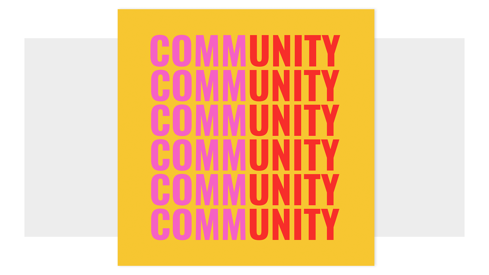
Customize this Instagram post template and make it your own
With typography this big, the letters are the design. Try combining fonts, masking, or keep it simple by matching bold bright colors with bold big letters. We have thousands of fonts that you can browse and learn more about here: Top Fonts.
7. Back to Basics
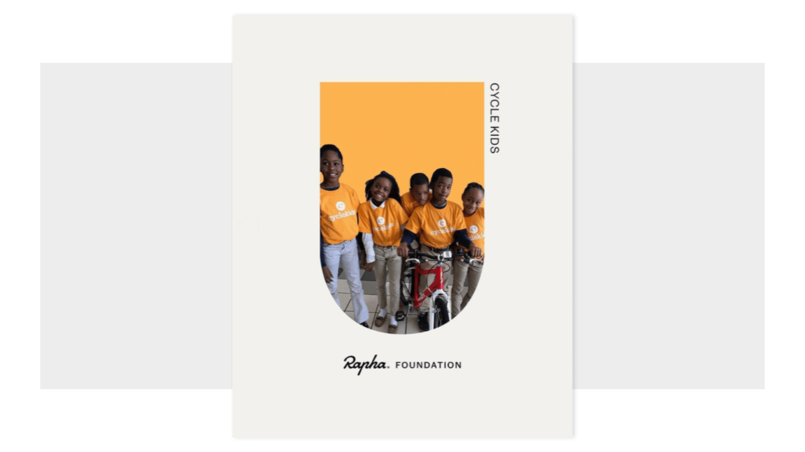
image credit: @rapha
With so much unexpected in 2020 and the ever-present inability to plan ahead with any certainty, many of us found big comfort in returning to the familiar during a year that saw too much of the word "unprecedented." Besides the familiarity of basic shape and color, they are simple and uncomplicated and they make sense—that's why we're picking this trend as a winner for 2021.
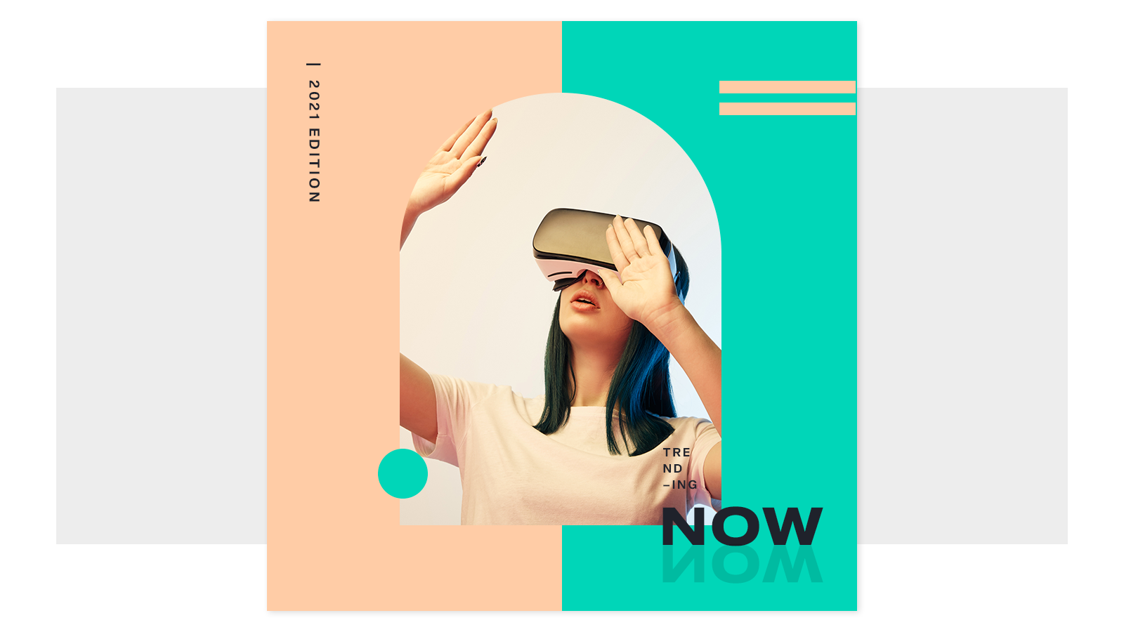
Explore shape graphics, geometric graphics, and colors
There's a reason that shapes and colors are some of the first things children learn, they are the fundamental building blocks of our world, and the cornerstone of design. With their infinite simplicity, shapes and colors can combine to bring anything you can imagine to visual life. Just like kids learn through playing with crayons and blocks, creating a design with shape graphics and color palettes can help your imagination get to where it wants to go—while enjoying the creative journey along the way, into the new year and beyond.
Everything you need for epic designs:
