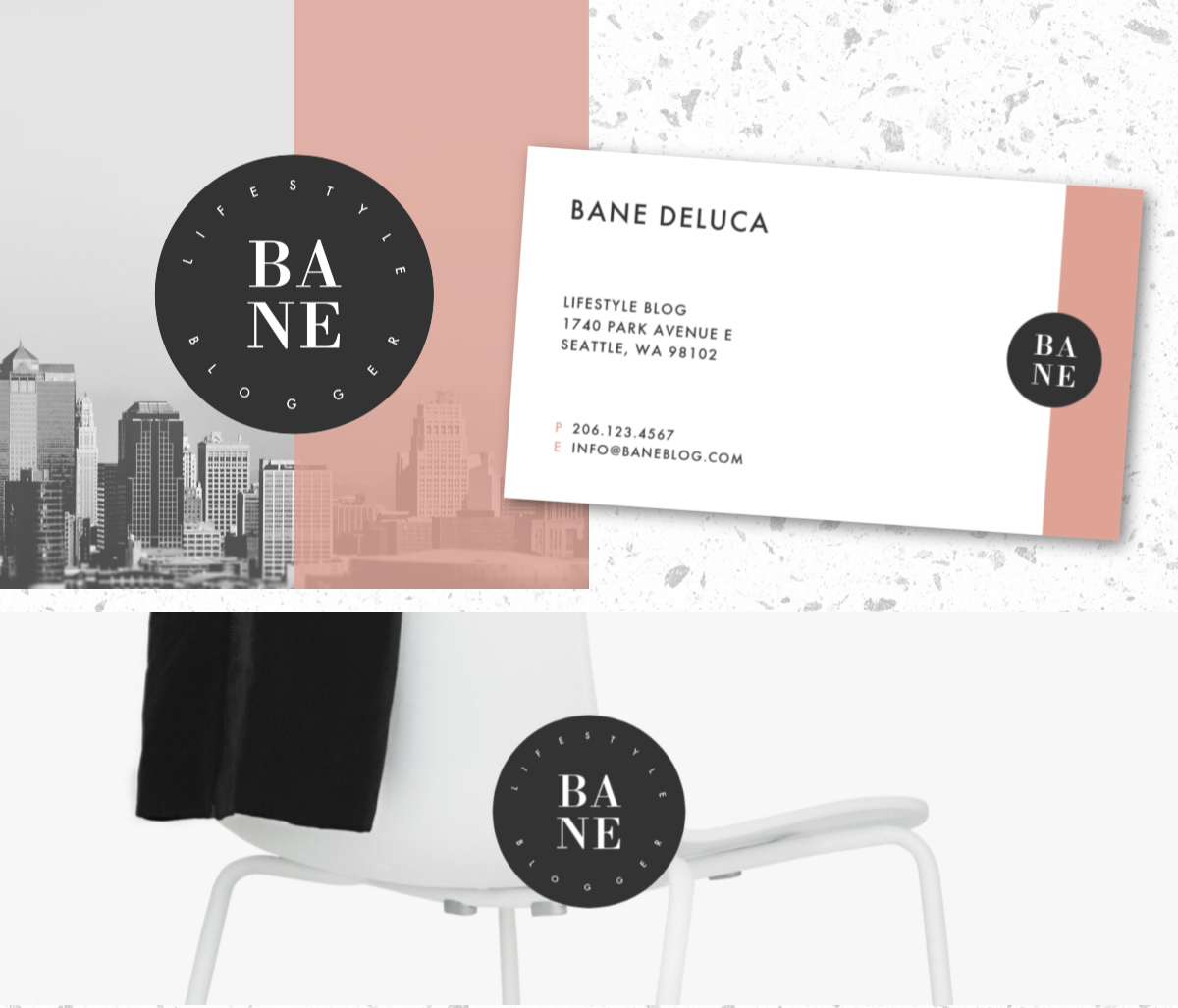
Browse our logo templates to get started.
One of the most common shapes in the natural world is the circle: the rings around Saturn, the yellow center of a daisy, the ripples that are formed from a pebble tossed in water. There’s something soothing and comforting about the beautiful symmetry of the circle. Void of any harsh angles or rigid lines, it suggests simple, blissful perfection.
No wonder some of the most successful brands in the world have chosen to use the circle for their logos. Mercedes, Pepsi, Starbucks, AT&T, Pinterest, Burger King, GE — the list goes on and on. If you’re looking to create a trademark for your business or personal brand, check out these ideas for round logos that you can make with PicMonkey’s curved text tool.
Curved text was made for circle logos

Some businesses truly lend themselves to the circle logo. The round opening of a Starbucks cup, the spherical basketball of the Detroit Pistons, the circular bun of a Burger King hamburger all come to mind when looking at these organizations’ logos. And what could be more perfect for a circular logo than a watchmaker?
This logo is made with the face of a watch with the name of the company placed around it. The blockiness of the font contrasts with the circle in the center, and the white vertical lines in between the words echo the hands of the watch. If there’s something circular in your business, see if there’s a way to work it into your own logo design.
Bedazzle your circle logo with graphics

After reading the above, you might think, “Record store? Let’s put a record in the logo!” But sometimes the obvious choice can be a little too on the nose. This record shop steers away from including the obvious record album in its logo and instead opts for using graphics that reflect its name. Start with a circle shape among PicMonkey's circle graphics, choose a cool mask, and a star. For more options, browse through all our graphics.
To get this gray shadow effect with any graphic, just add two of the same graphic to your design, make one of them a lighter color, and position it underneath the first. The Layers palette will help you place the right one on top. Alternately, you can add a drop shadow to your graphic from the Graphic palette under Effects.
Need growth-inspired design tools for your business? Check out PicMonkey Business.
Curved text for your personal circle logo

If you want to really up your personal branding game, consider making your very own logo. This circular design calls to mind the wax stamps that people used to seal their letters back in the day, but the bold geometric shapes bring it into modern times. You can use this classic, simple logo on everything from your social media profiles to your email signature. Try using it to create a watermark as well. It’s a good idea to make several versions with complementary colors for different situations so you can mix things up a bit.
Want a head start? Find your circle logo template here.
A little curve goes a long way

Browse all the logo templates
You don’t have to go full circle to reap the benefits of rounded logos. Sometimes just a bit of an arc will give your logo the same feeling of softness and comfort. This logo for a wedding planner deftly uses floral graphics and a gentle curve to inspire trust and confidence in potential clients. This design does a great job pairing disparate fonts to create a complex, yet unified look.
