Find different styles of design bundles under the Themes tab in the editor.
In need of a remarkable brand look, cohesive event theme, or an eye-catching marketing campaign? Don’t start from scratch, instead check out these seven new bundled design themes — they’re stylish, pre-packaged content like graphics, textures, effects, colors, fonts, and templates that all go together beautifully. It’s kinda like having a brand kit, but we’ve already put it together for you!
You’ll find all of our bundles under the Themes tab in PicMonkey where we’ve been adding new design-forward themes to kickstart your creations. All the existing classic holiday-themed packs are still there, too.
Browse the seven new design themes in PicMonkey, and use these ideas to get inspired!
1. Brush & Burnish: An upscale, high-desert dream

Combine shadow graphics with copper metallic textures, add a warm terracotta palette and get an earthy, sophisticated look perfect for branding an ecommerce shop selling jewelry, cosmetics, or ceramics.

Customize this Facebook personal cover template. Find it in the Brush & Burnish theme.
Design hint: apply a texture to a graphic like so: select a graphic on the canvas, go to the Textures tab on the left, choose a texture to apply, tweak size, opacity, or adjust blend mode and then click Apply.
2. Rustic Gold: Delicate, metallic florals perfect for a wedding
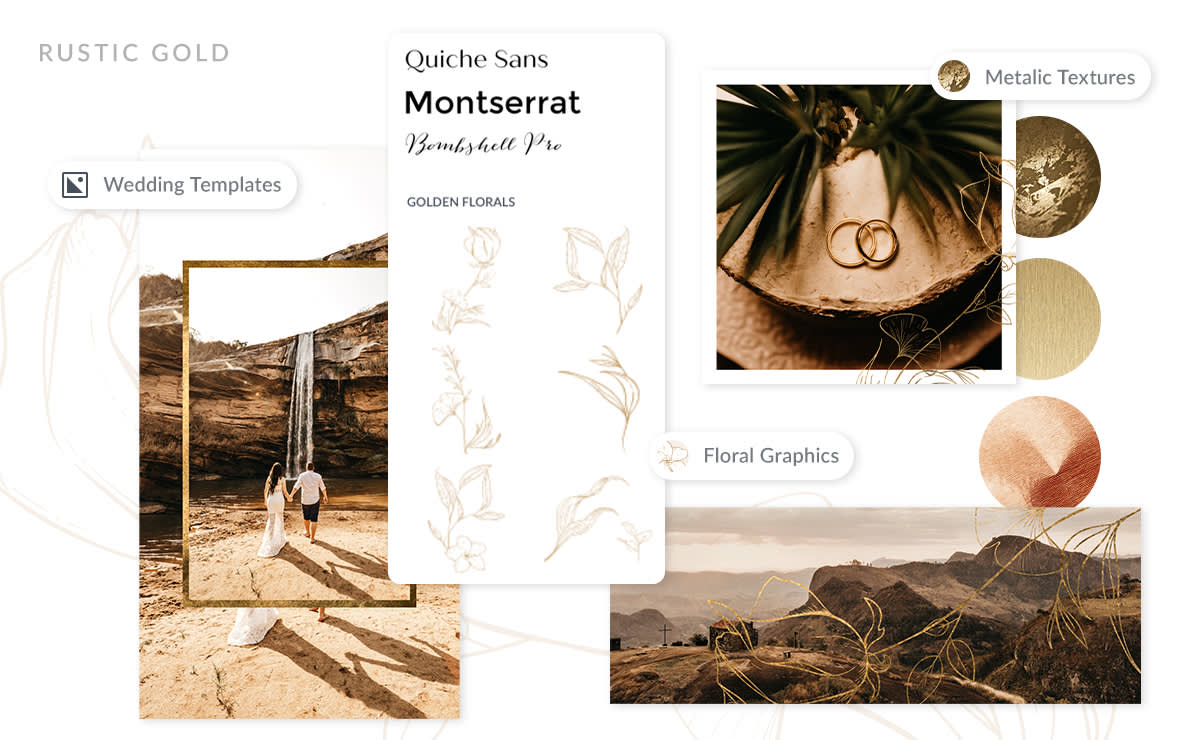
This black, white, and gold design bundle is all about timeless, chic romance which makes the Rustic Gold theme ideal for a wedding. Use the design elements to create invitations, place cards, and thank you notes. Wedding planners or vendors use this theme for advertising your business on social media or on your website.

To customize this Instagram post template, visit the Rustic Gold theme.
Design hint: for a delicate lacy floral look, make the inside of the flower graphic transparent. Do this from the color picker on the Graphic palette.
Read more: Wedding Congratulations Messages and Templates
3. Paperie: For a handcrafted, organic vibe
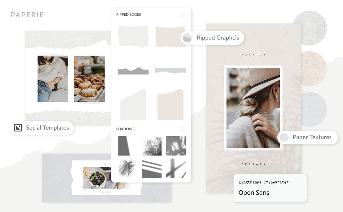
We love this theme for its handmade paper look, and the tranquility of neutral, calming colors like gray and taupe. Use the torn edge graphics to add an arty scrapbook-feel to your designs. Those selling organic products, spa services, or art classes could make this theme work very well for their branding.

Customize this template from the Paperie theme.
Design hint: Apply a paper texture to a ripped edge graphic to add an extra tactile appearance to your design.
4. Retro-static: A hot, neon bold look for youthful lifestyle brands

There is no scrolling by the bold, in-your-face design aesthetic of the Retro-static theme. Rich blues and hot pinks contrast nicely with black and white retro pattern textures. This theme would be ideal for youthful music or clothing brands, or for vibrant travel or shopping blogs, or for a YouTube channel.

Create a mood board to help visualize your brand look and feel. Customize this template from the Retro-static theme.
Design hint: open your color palette on your canvas while you work so you can "grab" the colors with the eyedropper tool in the color picker.
5. Frame Job: Celluloid nostalgia meets mod fashion
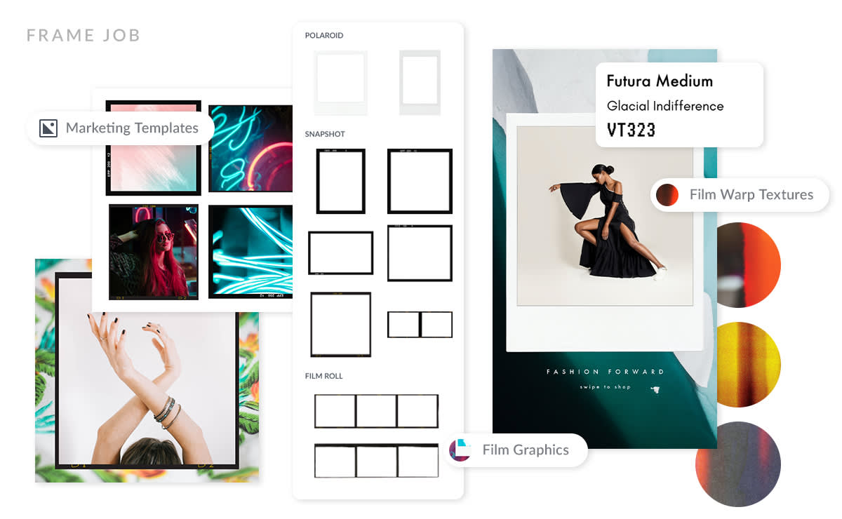
We're especially fond of the Polaroid frame graphics, and the film strip graphics around here because they make whatever's inside them look so darn cool. This theme is ideal for city life bloggers or fashion designers to show off their brand style with flair.

Use the film strip graphics with an Etsy shop big banner template to get this look.
Design hint: You can apply more than one texture to a photo. Just apply the first one (like Dust Scratches), and then apply the second (such as Light Leaks) on top. Play with the blend modes to achieve an unique look.
6. Wanderlust: Take your content on a beach vacation
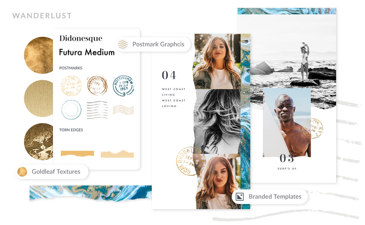
The Wanderlust theme evokes a sense of writing letters at a rich, old-fashioned stationery desk with real ink pens and marble desk accessories. The sense of nostalgia, though, is anything but old and tired when paired with deep peacock blues and the bright Santorini effect that gives all photos a beachy vibe — definitely something to write home about.

Customize this Instagram Story template found in the Wanderlust theme.
Design hint: To get this ripped edge look on your photos first open a ripped edges graphic on your canvas and select it. Go to Textures and choose "Add your own texture" to select the photo you want to apply to the graphic. Congrats! You just did a photo mask.
7. Wrapped Up: Freeform, soft neutrals for un-boring backgrounds
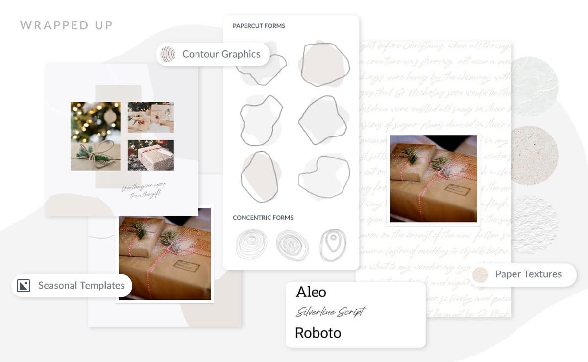
When you want to make a distinct impression with your branding design, but don't want to overwhelm your message then check out the Wrapped Up theme. Interesting, abstract shape graphics and a variety of paper textures in soft hues combine to tell a subtly significant story.

Make a subtle splash with this customizable Facebook Page Cover template from the Wrapped Up theme.
Design hint: Get this look by enlarging graphics by pulling the corner handle on the bounding box, then positioning them partly off your canvas.
