Email is a direct communication line to your audience, which means it’s ridiculously important that every email looks (and sounds) professional and on-brand.
Whether you’ve already gone the email service provider route and are itching to send out newsletters and promotional emails, or you just want a professional-looking signature block with all of your contact info, we’ve gotchu. We’ll walk you through how to make a custom email signature graphic and give some tips on how to make all of your emails reflect your brand.
Design your email signature
Creating a signature graphic with your name, title, and contact information lends a sense of legitimacy to emails associated with your brand. This graphic appears at the bottom of your emails (except those that you send through an email service provider, like Constant Contact or MailChimp).
Here’s a look at how we created a custom email signature graphic for our imaginary brand, Prickles & Pots. Head to Picmonkey.com to play along and make your own design.
1. Start with a blank canvas
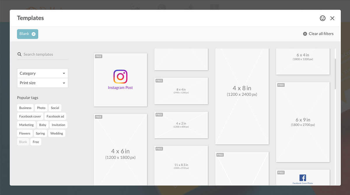
Hover over Design on the PicMonkey homepage. Click Blank canvas and select a canvas size. There isn’t any hard-and-fast rule when it comes to dimensions for your email signature graphic, just try to pick something on the smaller side (like 4 x 2) so that you don’t end up with a large, slow-to-load file.
2. Add an image
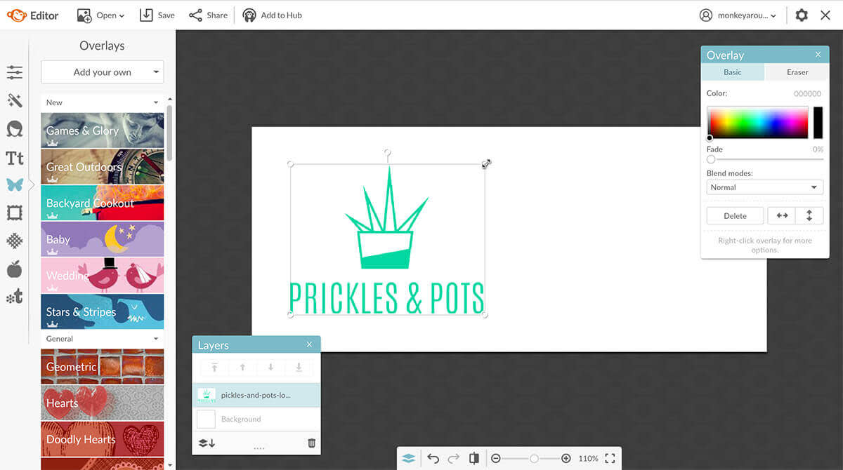
Your logo is a great option here. If you’d rather not use it, add a photo of one of your products or a headshot. Head to the Graphics tab, click Add your own, then select your image. When it opens, use the corner handles to make it a nice size on your canvas.
3. Add text
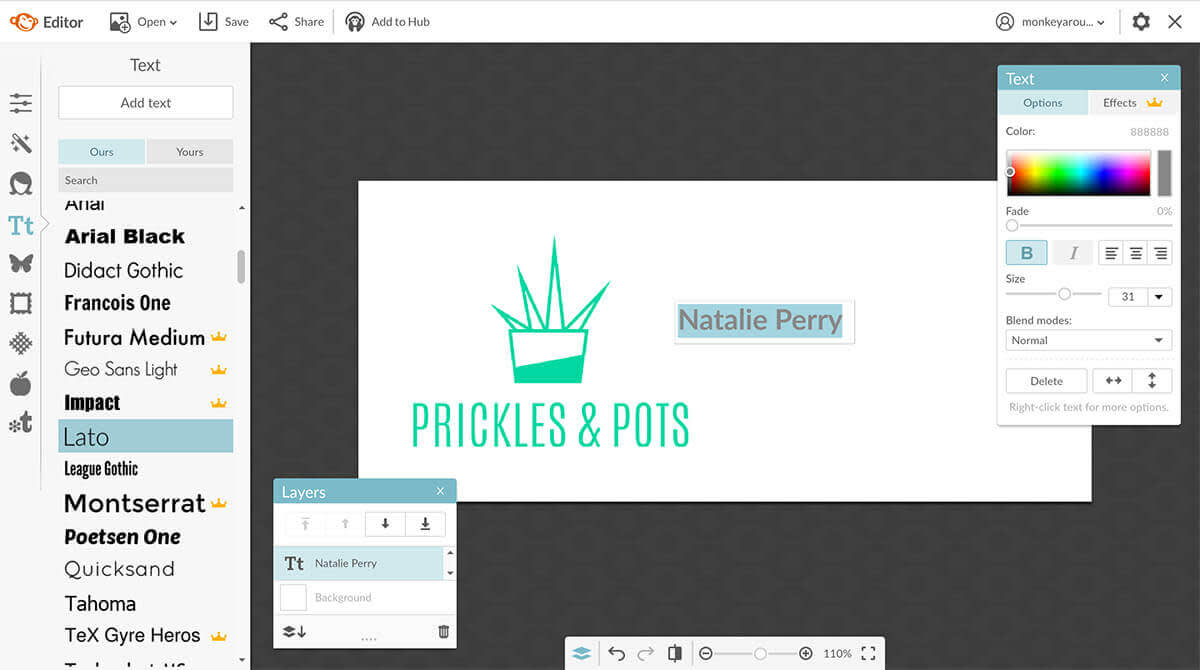
Click the Text tab, find your brand fonts (in either the Ours or Yours tab) and use them to add important information like your name, title, phone number, business address, etc.
To center your text, expand the text box horizontally so that it stretches across the entire canvas, or part of the canvas where you want your words to appear. Now click the Align center button on the Text palette.
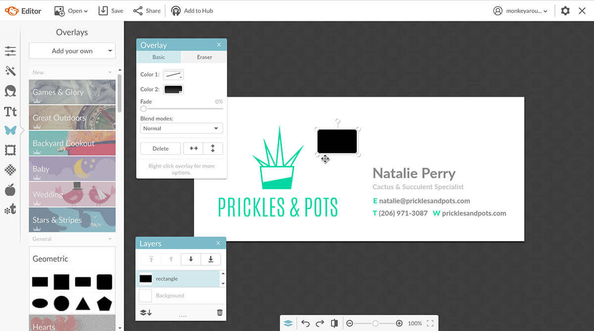
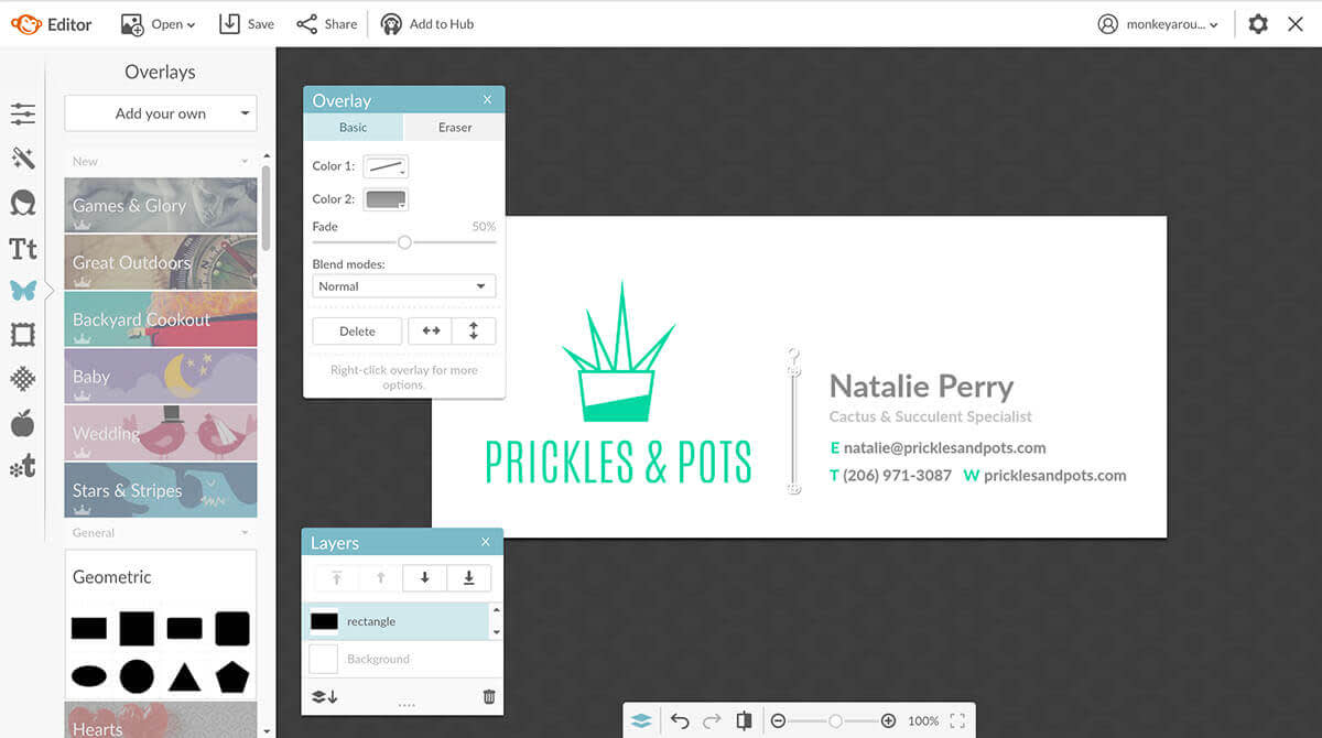
If you’d like to include other graphics, like a line to separate your words from your logo, go back to the Graphics tab and add them. We used a rectangle from Geometric, and skinnied it up into a vertical line.
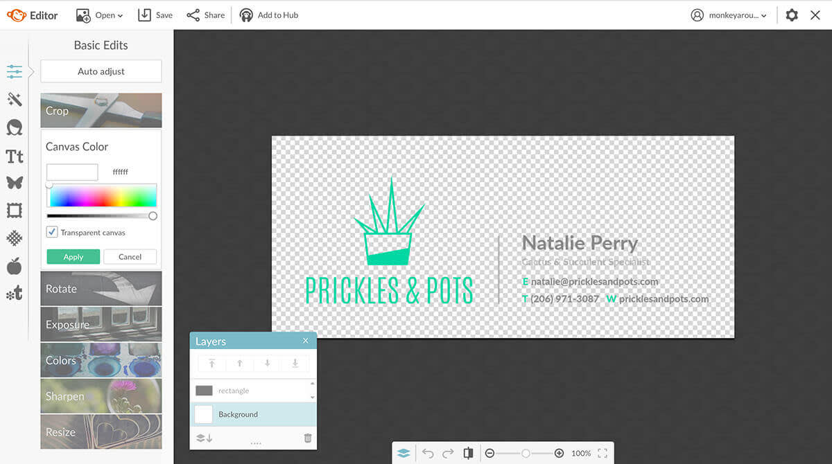
Unless you want your signature to appear with a filled background behind it, you should make the background transparent, so your design appears to float over the body of your email. Click Transparent canvas under Canvas Color in Basic Edits.
4. Save and add to your email settings
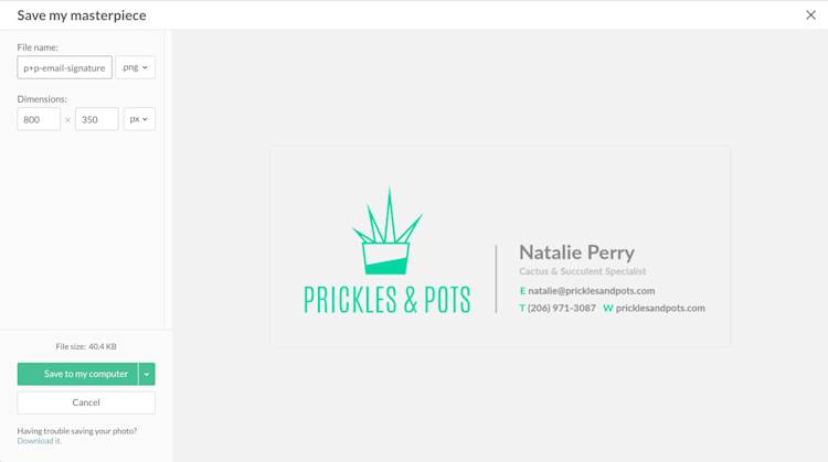
Click Save in the top toolbar, give your signature graphic a name, and save it to your computer. You may also want to add it to Hub in case you want to make changes later without starting over.
Adding your signature graphic to your email will be a bit different depending on which email program (like Gmail, Outlook, etc.) you use. Generally speaking, you’ll want to log into your email account and find Settings. From there, you can add the graphic and link it to your website. There are some great YouTube tutorials on how to add a signature graphic for each type of email account.
When you’re finished, compose a new email draft and evaluate how your signature graphic looks. Hello, professional!
Design the body of your email
If you’re using an email service provider (MailChimp, Constant Contact, etc.) to send your newsletters, promotion info, and other emails, they’ll likely have templates for groovying up the body of your email with graphics and photos. We’ve got some tips for ensuring that what you design reflects your brand.
Note that creating luxe designs without an ESP, however, isn’t advisable. If you’re sending an email with a background and images in the body from a Gmail account, for example, those design elements may look totally different once they get to an AOL inbox. If you want to send something like a receipt to your customers, put these design tips to work on a blank canvas and send it as an attachment.
1. Put your logo at the top

Email is one of the bazillion places where you should put your logo to use. Having your logo either right on top of the email background or in your hero image design (like this one) puts your brand front and center from the start.
2. Choose on-brand images
Nobody’s saying you have to have pictures in your emails, but if you’re going to use them, make sure to keep your imagery consistent with your brand. Before you start hunting for something new, take a look at the fabulous website and social media assets you’ve created. Also, if you have a blog, you may find the perfect image for your email in one of your posts.
Many ESPs have built-in tools that make it easy to get the right image size, but you can also open you images in PicMonkey and use our Crop and Resize tools to get the right pixel dimensions.
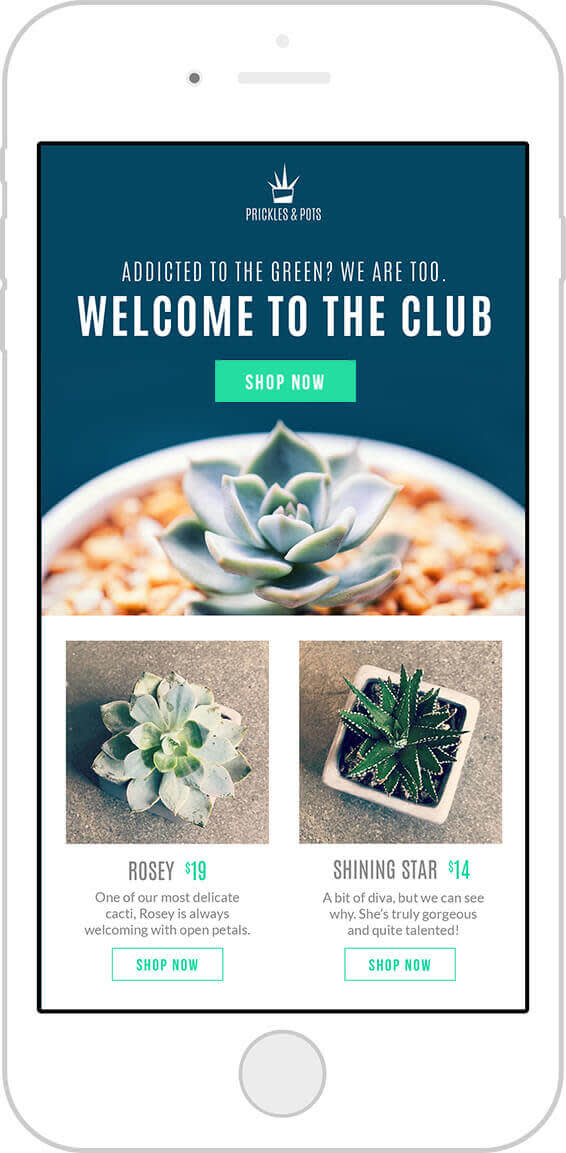
For this email, we reused some of our website assets (recognize these product shots?).
Tip: If you wanna give already-used images a mini makeover before their email debut, try adding text to them.
3. Use your brand fonts and colors
Remember that moodboard you made at the beginning of this branding adventure? Put those clearly defined brand assets to use and your emails are pretty much guaranteed to look like your brand.
Your brand fonts come into play in email copy, any text you’re adding to images, and button text. As for your brand colors, put those hex values to work in your page background, buttons, headlines and subheadlines, and the social media icons in your footer.
While you should feel free to change the page part of your email, the part behind it should stay a light, distraction-free neutral color like white or grey.
Tips for your words
When it comes to copy for your emails, there are a few things you should keep in mind:
Keep it short. Nobody wants to read a novel in an email, especially since more than half of all emails are now read on mobile devices. If you’ve ever tried to read an ebook on your phone, you know why keeping emails short is the way to go.
Make it sound like your brand. You don’t need to be a professional wordsmith to know whether or not something sounds way off base. For example, since we defined Prickles & Pots as “fun” and “sassy,” we added the line: “Addicted to the green? We are too” to this example email.
Think about your subject lines and preheader text. Your subject lines and preheader text should get right to the point and convey what the email is about. Preheaders can be used as an extension of your subject line. For example, if your subject line is “Our biggest sale of the year just got bigger!” your preheader could be “Take an extra 20% off clearance items.” They should also be (surprise!) short. Try to keep preheader text to 40 or 50 characters, and subject lines between 40 and 70 characters.
Your sender name matters. Yup, even these words make a big difference. Your sender info displays before any other words in your email—even your subject line. If you’re using an ESP, make sure to set your company name as the sender name. For emails not sent through an ESP, set up an email address with your domain name. This adds legitimacy to your business. For example, seeing natalie@pricklesandpots.com as an email sender instills more confidence in a brand than natalie@gmail.com.
Now that you have a good-lookin’ and good-sounding email, send yourself a test version. Open it on your computer and on your mobile phone, and make sure that everything is easily readable and displays correctly. Once it’s ready to roll, send it off to delight inboxes everywhere.
Next up, your final brand-building exercise: making advertisements and promotional images.
