Kimberly Geswein is a superwoman hero-thang because, while raising her two daughters, she managed to find time to become a typographer. She began with her own handwriting when she was digital scrapbooking and it quickly took off into KG Fonts. For that, we celebrate because she gave us the fonts Sue Ellen Francisco, Shadows into Light Two, La Belle Aurore, and Janda Stylish Script. These are stand-out favorites of PicMonkeyers and for good reason: they’re full of energy and delight!

To learn more about what drives Kimberly and get her tips on designing with type, we asked her a few questions.
Q. What three adjectives would you use to describe your font style?
A. Quirky, Fun, Unique
Q. I noticed that a lot of your fonts have a handwriting or scripty style. Tell me about whose handwriting they are based on.
A. At least 50% of my fonts are based on my own lettering styles. The others are based on the handwriting of friends and family members and fans who have sent in their handwriting to be “fonted.” I used to do a lot more of other people’s handwriting, but most of my designs now are 100% my own lettering.
Q. What is your process from idea to creation?
A. I use a variety of methods, from ink on paper to Wacom tablet with Adobe Illustrator.
Q. Where do you look for inspiration? What inspires you?
A. I keep an Evernote file on my iPhone. It is basically a virtual journal where you can write ideas and link to webpages and add photos. I use Evernote for everything in life! When I see something interesting, I snap a photo to remind myself to look at it again later- anything from a piece of art to handwriting on an envelope.
Q. What are some of the biggest challenges you face in your work?
A. It is tough to maintain the discipline to keep working every day. I don’t always want to sit at the computer all day working! I think we can all relate to that feeling of being trapped at the computer/desk!
Q. What do you find most rewarding?
A. I love seeing my fonts out in the world. When I see my fonts on a product, it never fails to make me smile. My daughter says I am famous but no one knows who I am. I’d say this is the truth for every font designer!

Q. When you look at your extensive folder of fonts, which are your favorites? And tell us a little about why those speak to you.
A. I like anything playful and fun. My favorites are usually the most recent ones I’ve made, because it means the hard work I’ve put into them is finished. I use my 5 sets of Flavor and Frames the most.
Q. Tell us about a couple surprising places that you’ve seen your fonts.
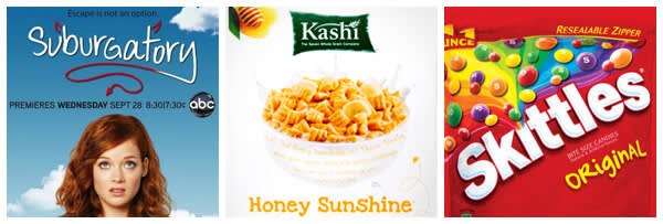
A. As a mom, I’m always at the grocery store. I see fonts pop up on products there and it’s a nice surprise during an otherwise mundane task. Kashi cereals, OrganicGirl vegetables, and Skittles are easy ones to spot. Two of my fonts are used by the ABC shows Suburgatory and How to Live With Your Parents for the Rest of Your Life

Q. Please give us a few tips or tricks for using fonts on photos or graphic designs?
A. Think about your audience and make sure the fonts are legible for what you are doing. Don’t use a playful font for a funeral or a serious font for a birthday! 🙂
Q. If you had to talk to someone who doesn’t know how to use fonts effectively how would you describe the best way to use them?
A. There is no right or wrong in design; just play and have fun. Don’t take things too seriously.
Q. What trends do you see happening in the world of type?
A. There are stackable 3D fonts and new colored fonts (that only work in certain programs) but I haven’t played with them yet.
Q. Tell us about a finished work or a communications piece in which type choice was particularly effective and well done.
A. Flipping through magazines is a great way to see ads well done. If they catch your eye and are legible, they are doing it right!
Q. Would you talk about a situation where you’ve noticed someone use the *wrong* font, and how it affected the piece.
A. It’s easier to see the wrong font in situations. My friend is a pharmacist and her name badge has Comic Sans on it. Comic Sans is a comic font meant for use on comics. It isn’t appropriate for a pharmacy, as pharmacies are neither comics nor funny. Also, I have high school students email me all the time saying they type their term papers in my fonts. Display (decorative, fun) fonts should be used in small doses only! Don’t torture your teachers with five pages of quirky letters!
Hear, hear, Kimberly. Thanks for taking the time to chat with us.
