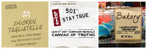
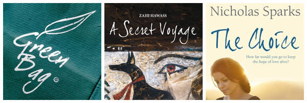
Have you heard this one? PencilPete, One Trick Tony and Brushtip Travis walked into a bar. Full stop. Isn’t that a hoot? Fonts can’t walk! If they could saddle up to the bar, though, Jeroen van der Ham’s fonts would surely pick up the tab; they’re that good. We are fortunate to have six of Jeroen’s fonts gracing PicMonkey. In addition to PencilPete, One Trick Tony and Brushtip Travis, we’ve got Stampete, Bruno Book, and Brush-tip Texe. Here’s our interview with the master typographer himself.

Q. Where and when did you get your start designing fonts and what led you there?
A. From early on I enjoyed writing, and turning my own handwriting into a font that could be used on a computer had always been a dream of mine. As soon as I got my hands on a font creation program (Macromedia’s Fontographer as it was called then), I created my first font: dearJoe 1. That was probably around the year 2000. I put it on a free font website called 1001fonts.com for people to download, and soon after I started seeing the font displayed in commercials and on T-shirts and such. This encouraged me to create more fonts, and in 2005 I found myself a studio in a former gunpowder factory in the city of ’s-Hertogenbosch, Netherlands. I’ve been working for myself (JOEBOB graphics) since then.
Q. What did you do before designing fonts?
A. After finishing my education in graphic design, I’ve had a couple of jobs as a designer and illustrator. At the time I started making my first fonts, I was working in the design department of a creative agency that specialized in multimedia productions. My main occupation there was graphic design and creating user interfaces.
Q. What three adjectives would you use to describe your font style?
A. Genuine, characteristic, unruly.
Q. Where do you look for inspiration?
A. I have a special interest for handwritten signs that are made by non-typographers. For instance, the ones you can see in a street market that say: “3 apples for a dollar” or “Our fish is the best there is.” The high brow term for this kind of amateur lettering is vernacular type. Sometimes I get inspired by the way characters are used in these signs, especially when they’re flouting the rules of typography.
Q. What is your process from idea to creation?
A. Usually it starts with a new pen or brush I find. When I try it out, writing in different ways and sizes, it is not uncommon for a new script to announce itself. After that I try to create a whole alphabet, written in that specific way. When I think I have a basic set that could work, I scan all characters, optimize them in Photoshop, and then implement them into Fontlab. Next I create all other characters, special signs, and accents and before you know a new font has manifested.
Q. What are some of the biggest challenges you face in your work?
A. There’s always the fear of repeating oneself, especially in my case, where I try to specialize in handwritten script fonts: how many ways can I write? So I force myself to try and write in odd ways and with new materials, steering myself into uncharted territory.
And then there’s discipline, or lack thereof, because in my kind of work I get to decide when I work and create a new font myself.
Q. What do you find most rewarding?
A. It is always great to see one of my fonts being used in public in a way that suits it and sometimes I feel flattered when major companies choose to use one of my fonts for a campaign, since there are so many great fonts to out there.

Q. When you look at your extensive folder of fonts, which are your favorites? And tell us a little about why those speak to you.
A. I like dearJoe 4, which looks rather debonair and his mad little brother dearJoeHannes, which was written kinda sloppy but works quite well. PencilPete is one of my favorites because of its graphite look-and-feel.
Q. Tell us about a couple surprising places where you’ve seen your fonts.
A. What comes to mind is a computer game called Grand Theft Auto IV (in which the moanLisa font was used for a brand of candy) and Tiësto’s music video for his “Just Be” single (in which the dearJoe 1 font was used). It’s also fun when people send me pictures of their latest tattoo for which they used one of my fonts.
There’s a section on my website that’s called ‘lost & font’ where a lot of these surprising places are displayed:

Q. Please give us a few tips or tricks for using fonts on photos or graphic designs?
A. Tip 1: Don’t use two fonts that are similar to each other in the same image.
Tip 2: Try finding some kind of balance between the image and the script you’re using in it.
Tip 3: Start out with your font set in a small size and then emphasize some of the words by making them slightly (or a lot) bigger than the rest.
Tip 4: Less is more
Tip 5: Avoid using comic sans
Q. What trends do you see happening in the world of type?
A. Handwritten fonts are making a come-back. Maybe that’s because now that everybody types on a keyboard, fewer and fewer people use their handwriting, which makes it a skill from the old way of doing things. This “old way” is getting associated with how good things were before all global industries and multinationals took over.
Q. Tell us about a finished work or a communications piece in which type choice was particularly effective and well done.
A. A couple of years ago I was asked by Apple to create smallface and plaincaps additions to my dearJoe 4 and dearJoe 5 Casual fonts. They were used in their “Cards” App for the iPhone, in such a way that they were mimicking handwriting on a real postcard. This made me laugh because one of the most digital companies in the world is now making it possible to send something as old-fashioned as an actual (analogue) postcard directly from one’s highly sophisticated handheld mini-computer.
