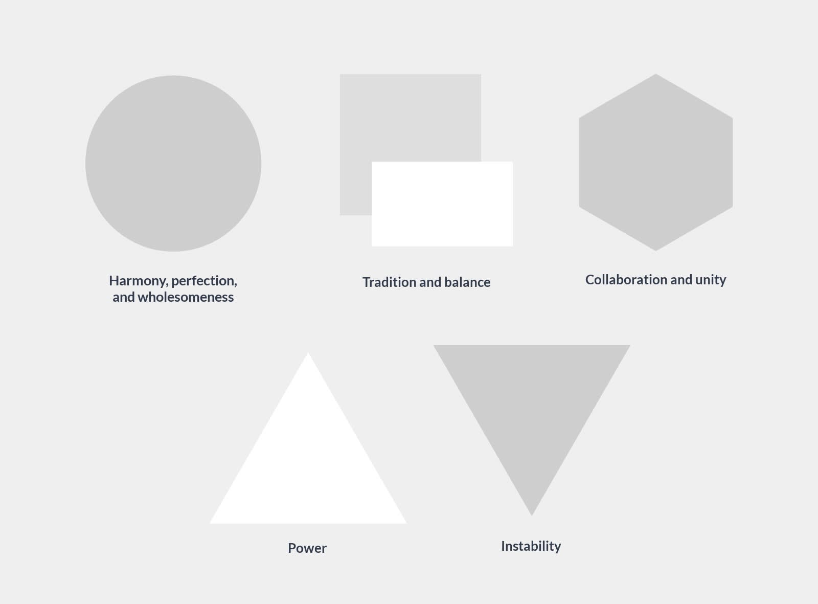
Geometric patterns have influenced artistic expression for thousands of years. There isn’t a singular answer to why they’ve stood the test of time, but we have a few guesses. For one, they’re extremely versatile (as we’ll show you), capable of complementing almost any existing design or forming something new.
No matter the shape, no matter the combination, geometric patterns have achieved what yearly trends wish upon stars for: immortality. The best part — you can introduce them into your own designs! Whether you’re new to patterns or just looking for some inspiration to get ya started, check out our diverse list of things you can do with all sorts of geometric designs.
Combine shapes to create new imagery
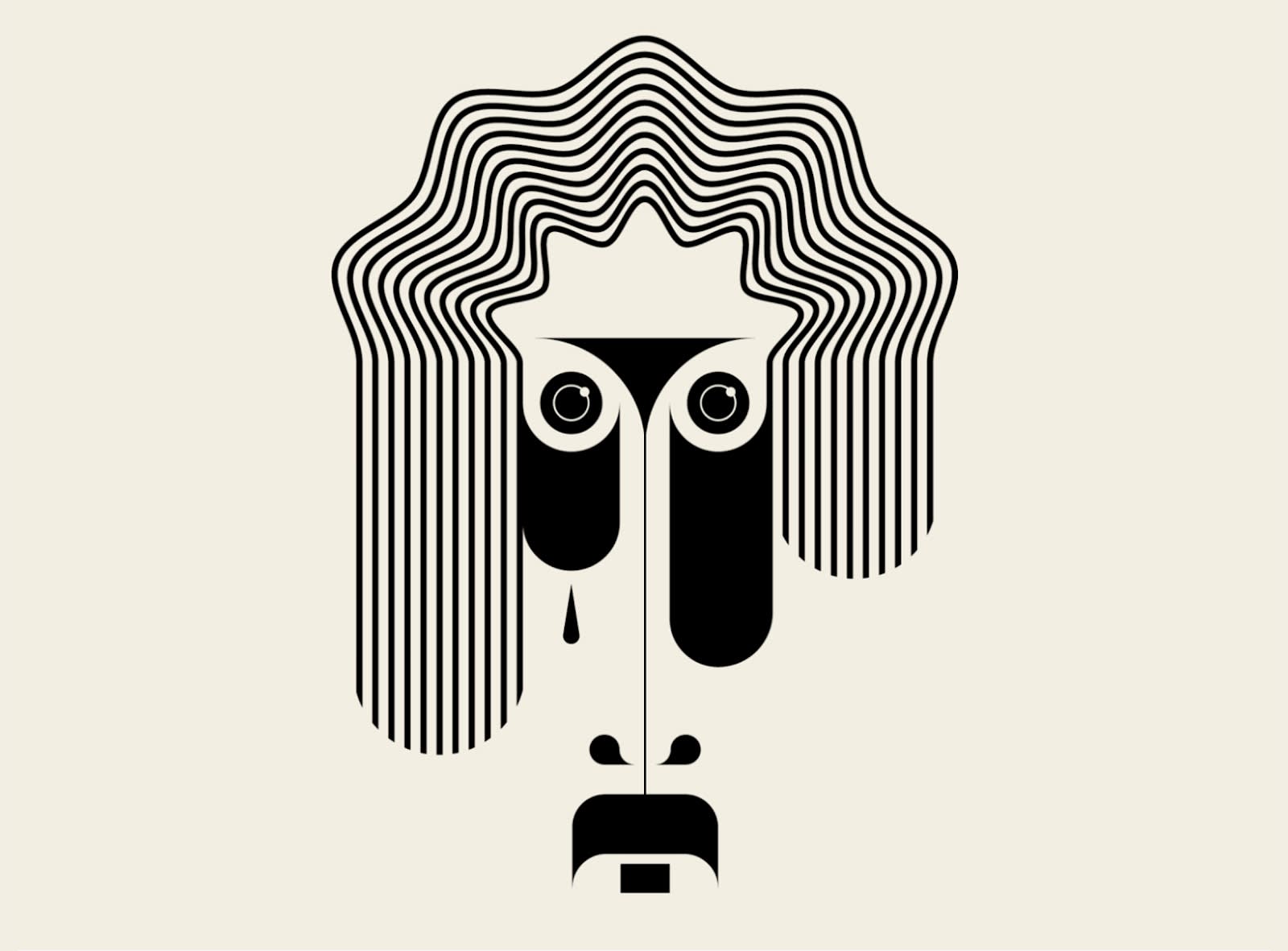
Image credit: TRÜF
It’s incredible how geometric shapes can be used to create recognizable images, like this face. Notice, too, how the designer forms emotion via an elongated design and geometric teardrop.
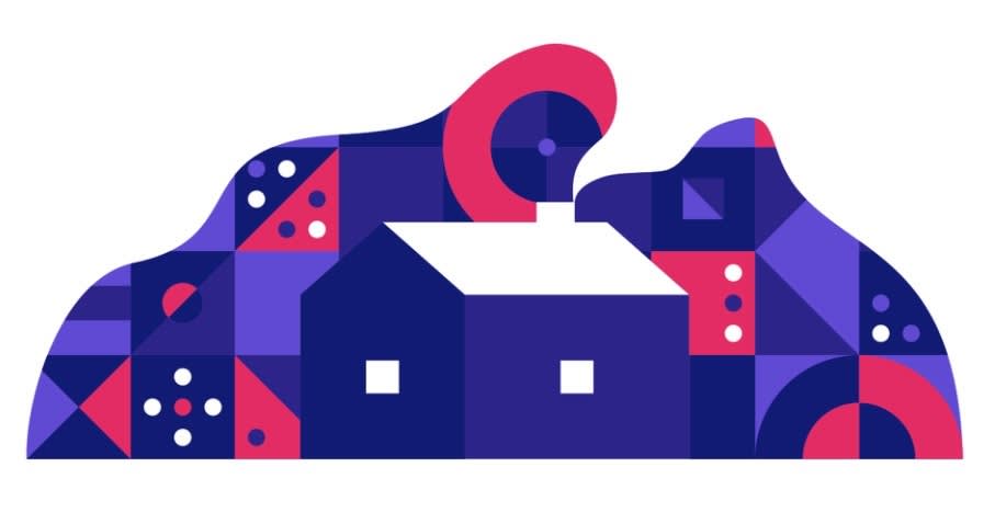
Image credit: Anthony Gribben
An array of geometric patterns have been used to produce this cottage scene. Circles, squares, and triangles form an abstract mountainscape. If it weren’t for the contrasting white, these patterns might blend together so well that we’d be left with an optical illusion. Is there a cottage?
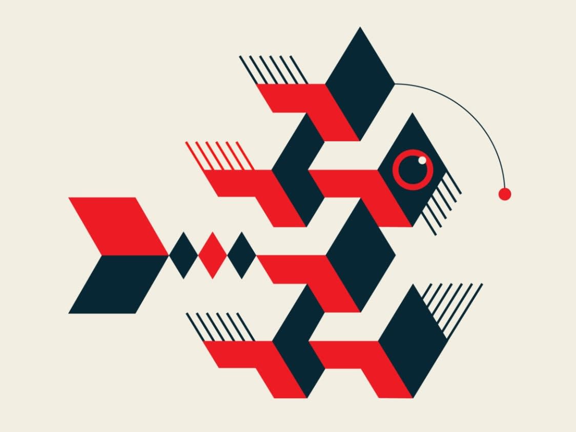
Image credit: TRÜF
This abstract anglerfish is a product of conjoining rectangles, squares, diamonds, straight lines (mostly), and a few select circles. You can create unique images like this using only shapes and intentional color choices. Take a look at how red and black contrast incredibly well with the cream-colored background, offering depth and clarity to the design’s geometric patterns.
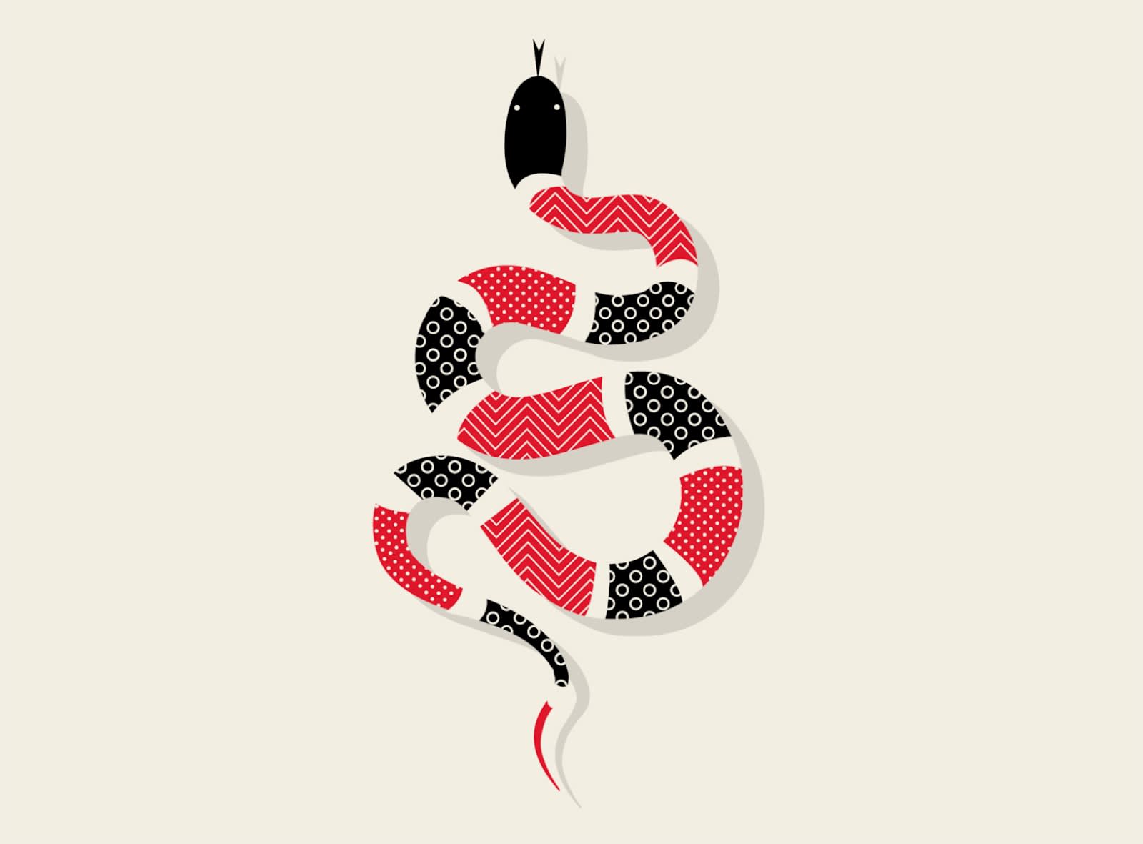
Image credit: TRÜF
This slithering serpent is imbued with simple geometric patterns that flow in a pattern of their own. The snake itself is a play on a traditional line. While the patterns are different, they play well together thanks to intentional color choices and the separation between each along the snake’s body.
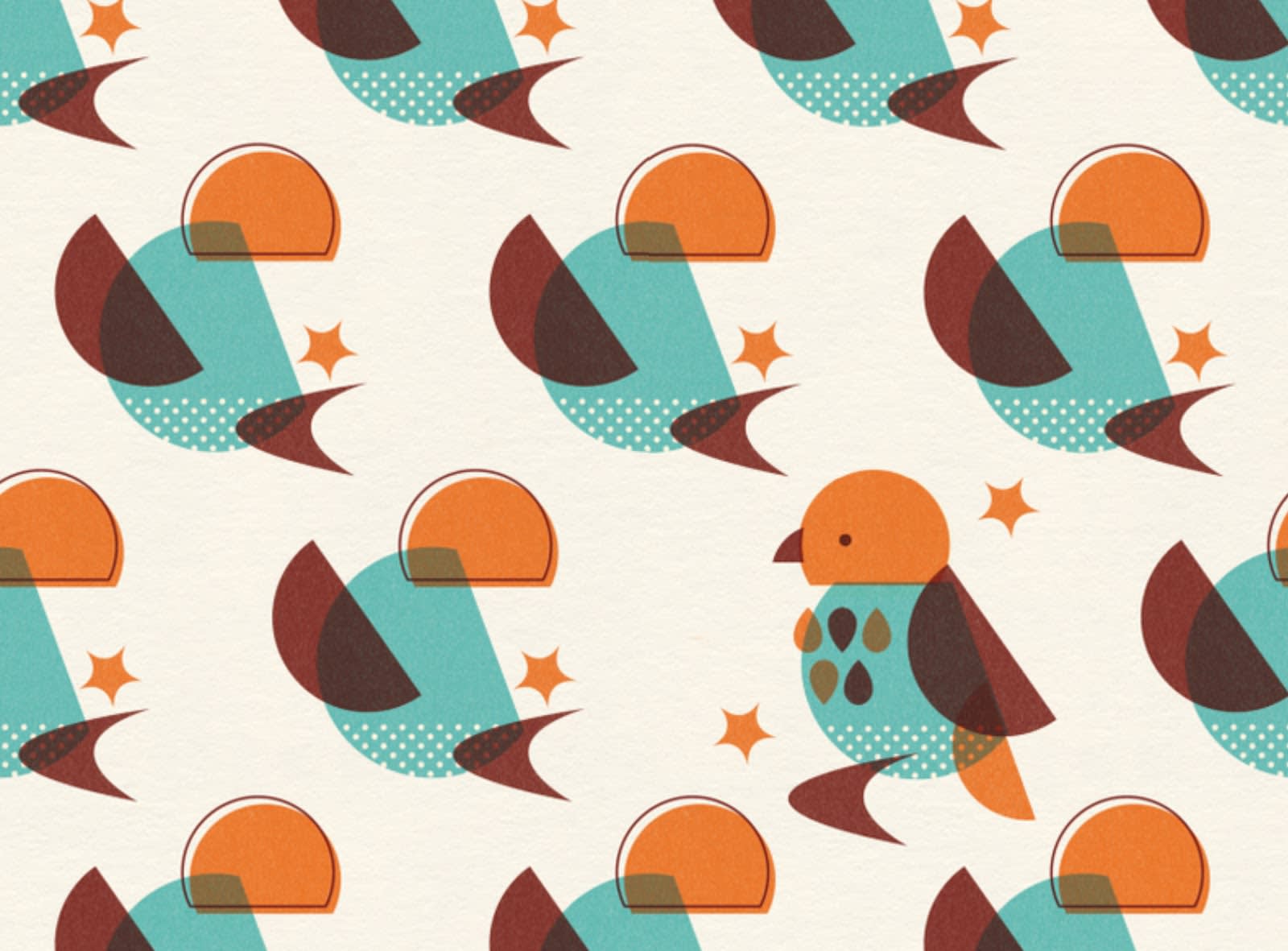
Image credit: Zara Picken
Bird Century Modern perfectly showcases how two shapes can be molded into different forms to create something wholly unique. Check out the bird’s body. Every single element is a variation of either a circle or oval.
Make a geometric collage
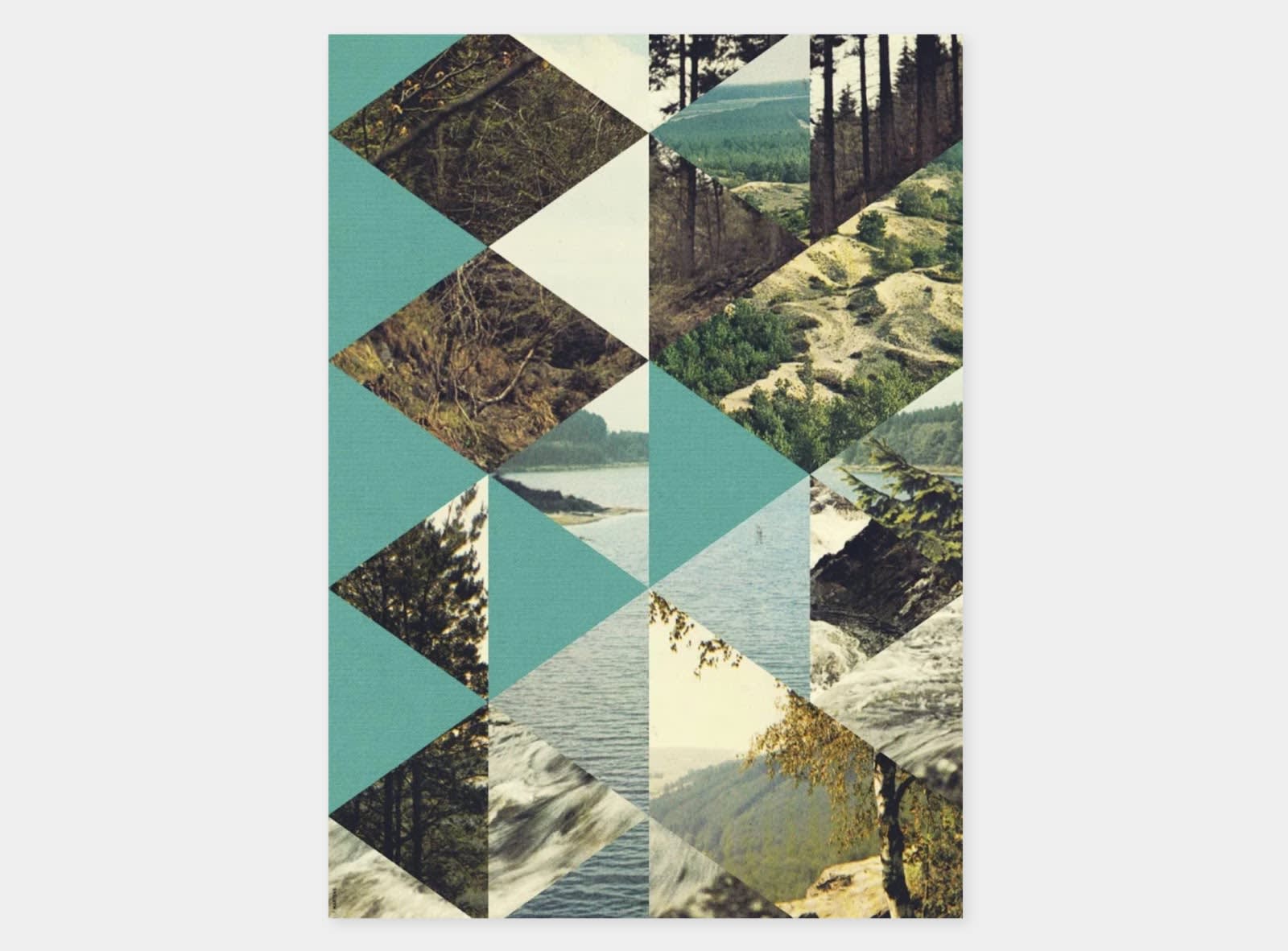
Image credit: Causal Optimist
The creative organizational nature of collages makes them jump off the page. In this example, real images of nature have been presented in a series of criss-crossing triangles.
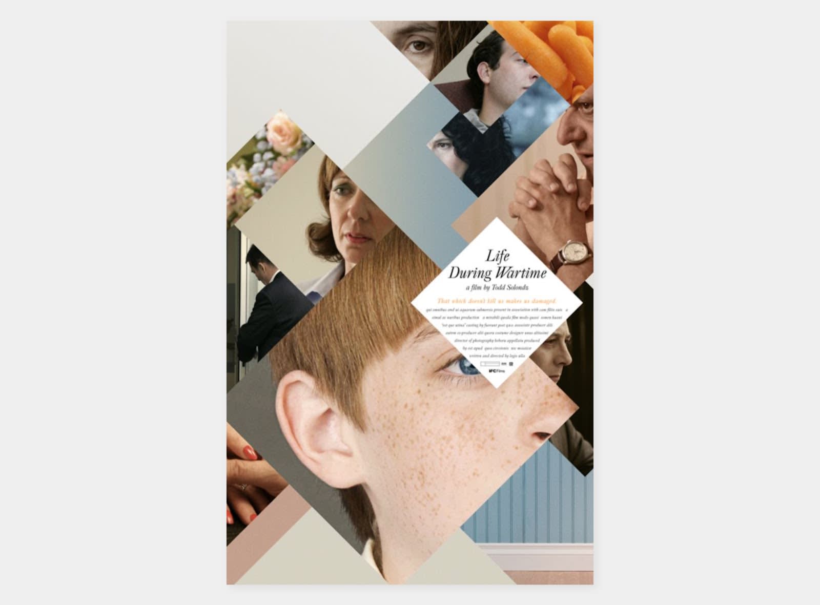
Image credit: Alan Acevedo
In this poster for the film Life During Wartime, square and rectangle variants combine a range of people and their emotions into a singular image.
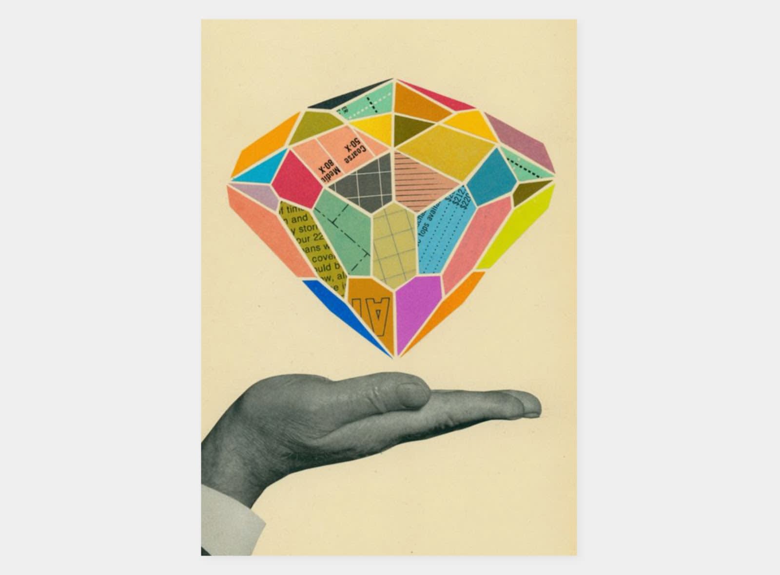
Image credit: Zindlr
Similarly, a vast array of geometric shapes combine with colors and text to create a grandiose diamond in this example. Notice how distinctive colors help to illuminate equally distinctive shapes.
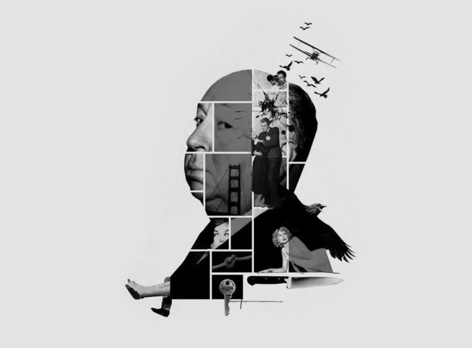
Image credit: aandhmag
This awesome tribute to the great film director Alfred Hitchcock makes use of thick white lines and rectangles. The collage reads like a spread from a comic book or graphic novel. Beyond images of the man himself, we see stills from some of his most memorable films.
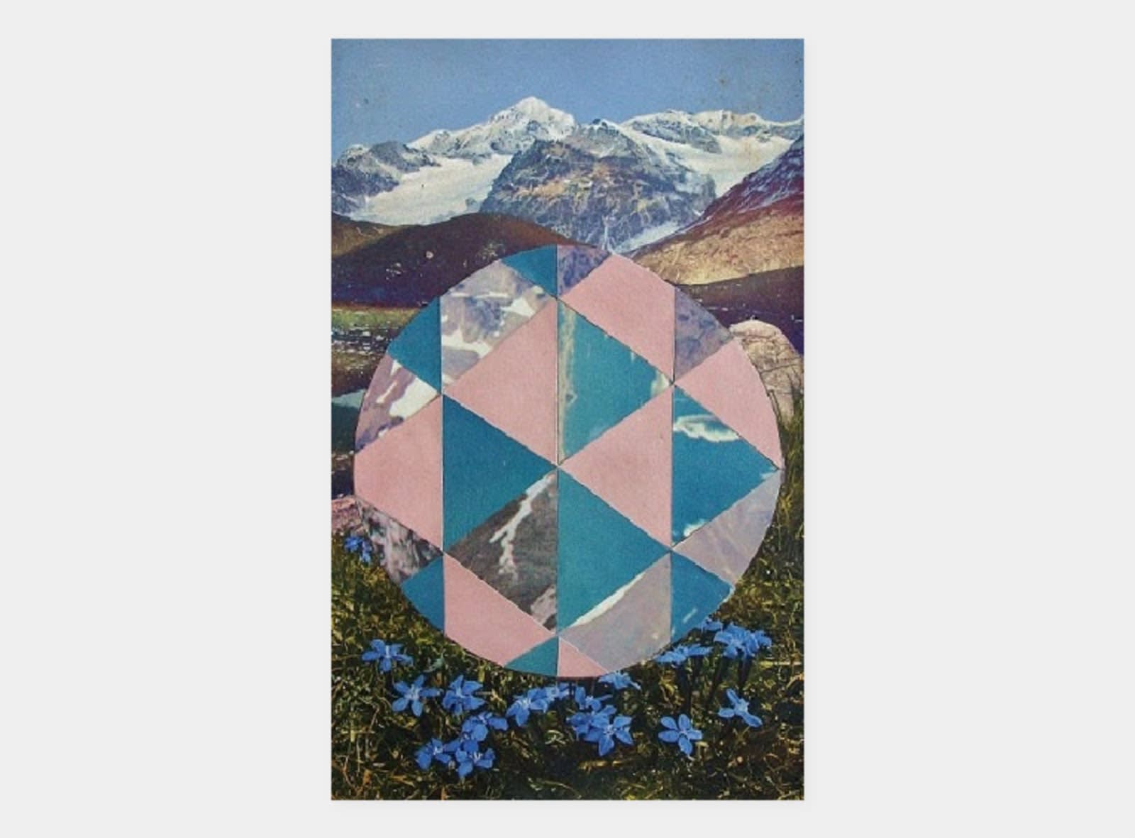
Image credit: WeHeartIt
With an expansive mountain range in the background, this collage comes in the form of a triangle-filled sphere, its patterns seeming to reflect the scenery.
Merge existing photos with geometric patterns

Image credit: RunPlus
Run+ incorporates lines and curvature into its branding. The brand also uses animated diagonal lines to transition between product offerings.
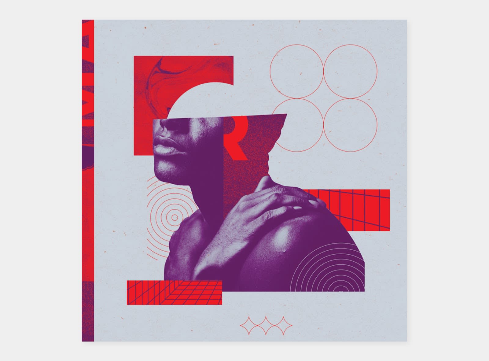
Image credit: Matt Pamer
While we didn’t include this design in our abstract section, it definitely channels its inner-abstractionist. Still, the recognizable image of a person (well...most of a person) has been incorporated into this medley of geometric patterns and colors.

Image credit: Matt Pamer
See the patterns? They’re slightly more subtle in this example, but you still have waving lines up top and a smattering of white circles below. Plus, there’s the shaded circle right in the middle of the image. The jagged outlines of both person and cliffs also create patterns of their own.

Image credit: Matt Pamer
Build geometric patterns around a central image to make it stand out even more, like in this example where a grid of shapes has been constructed around the photo of a woman.
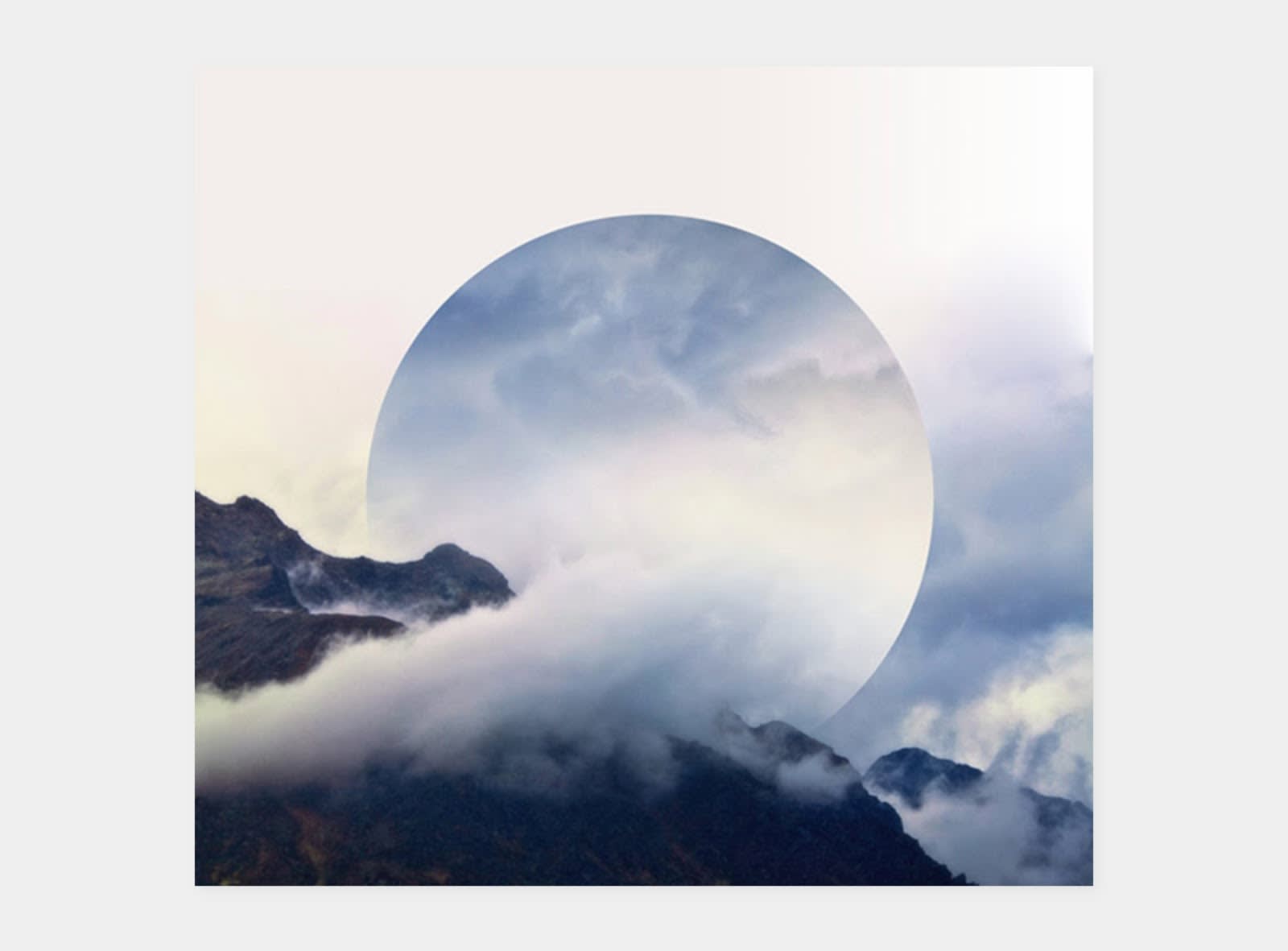
Image credit: Victoria Siemer
Sometimes “back to the basics” can create powerful imagery. In the case of Geometric Reflections, a circular reflection (reminiscent of sun and/or moon) has been added to a mountainous landscape.
Futuristic geometric design ideas
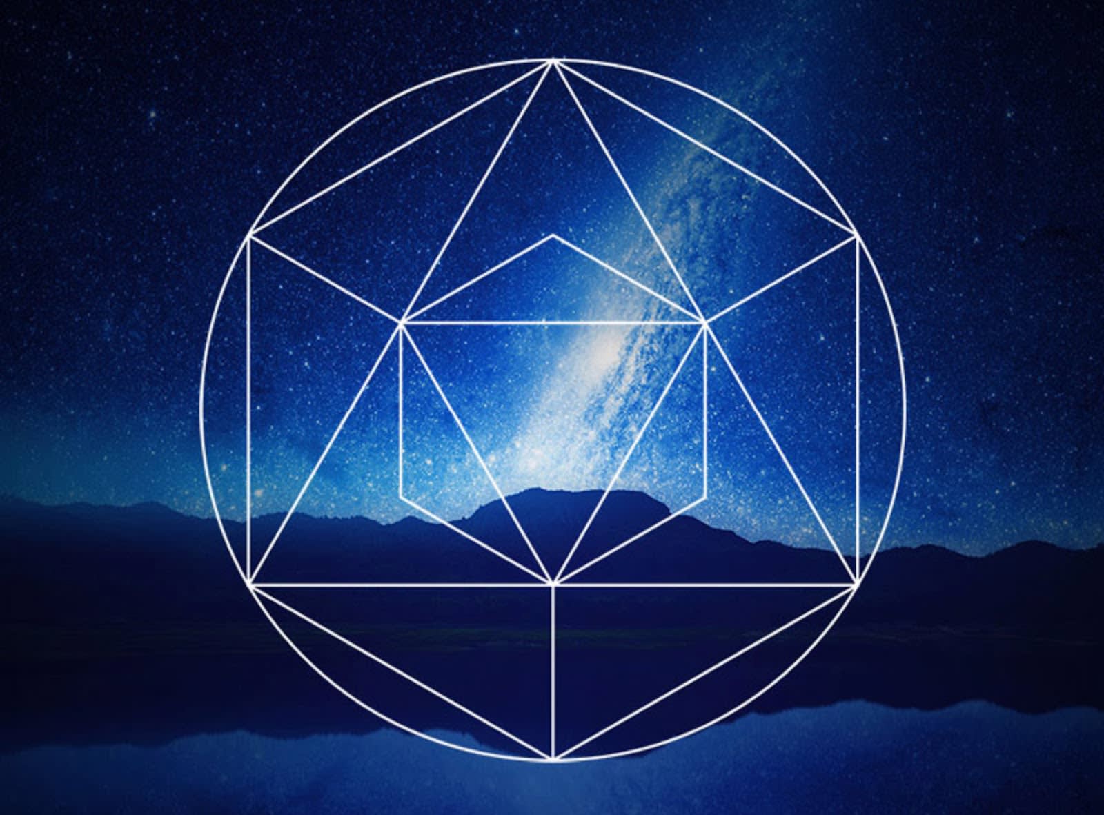
Image credit: Chris Spooner
The future remains unknown, which is why geometric patterns lend themselves so well to futuristic designs. Together, shapes meld and create something never before imagined. Like in this example. Simple white lines form shapes of all kinds. Nighttime colors in the background make this design dreamy and mysterious.
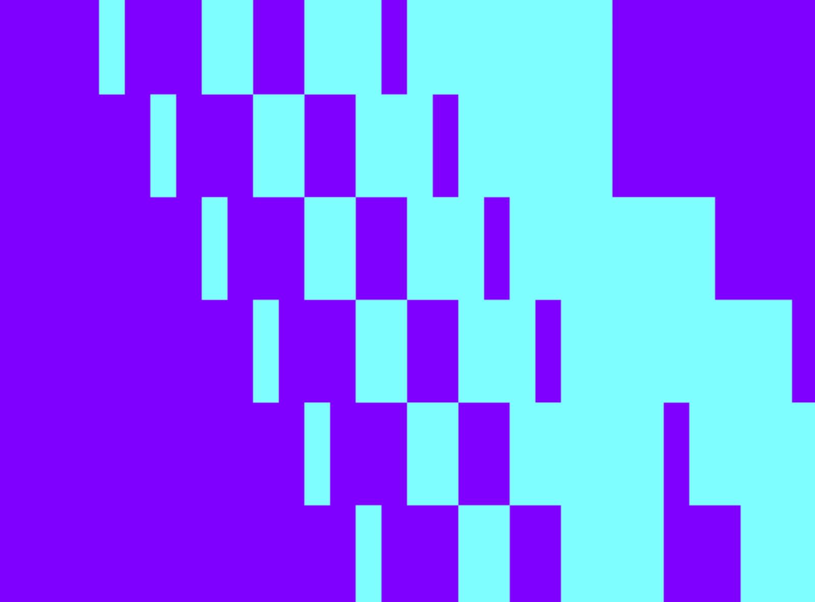
Image credit: Dan Kletter
When we think future, we also think digitization. You can create a pixelated feel with squares and rectangles. Bright, contrasting colors finalize the look.
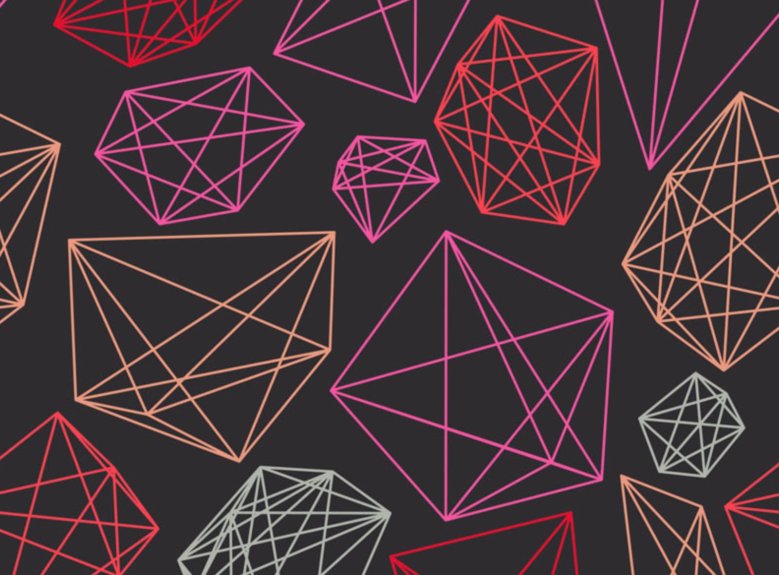
Image credit: Ess Kay
Anyone who’s played the Tron arcade game or seen one of the films is familiar with vector patterns and their role in the digisphere. Match geometric vector patterns with bold colors and you’ll have something futuristic.
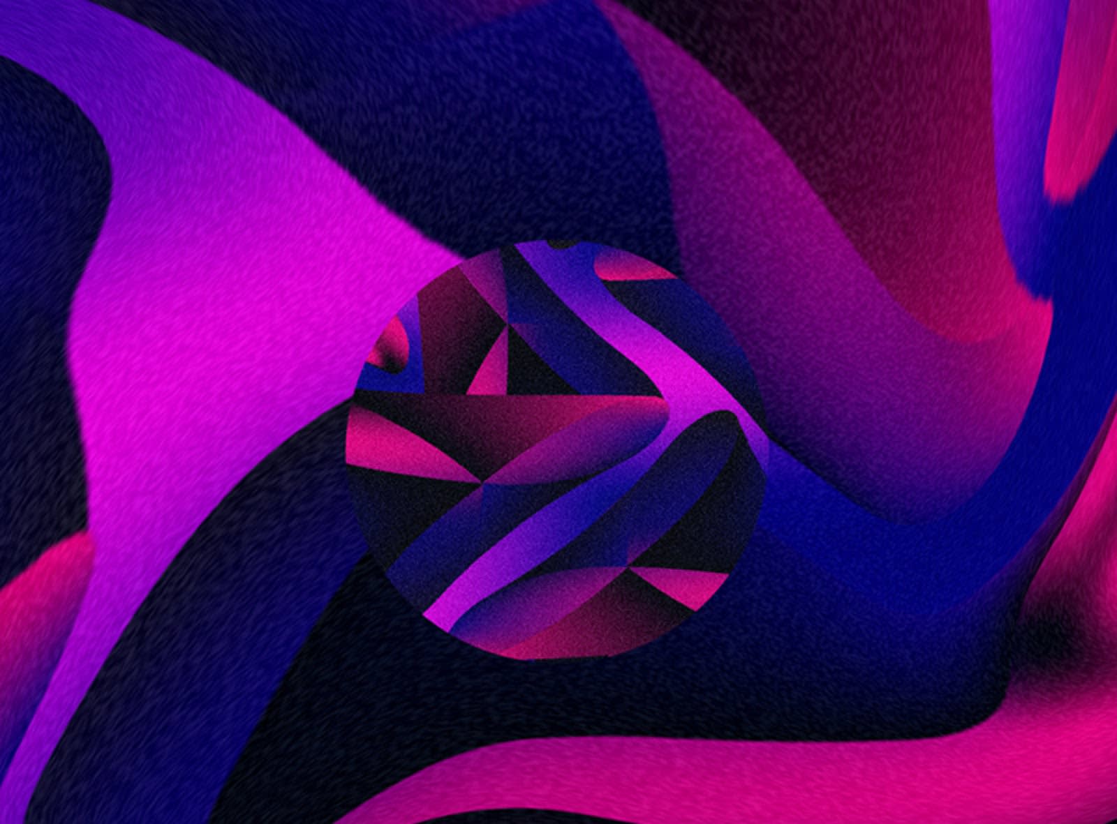
Image credit: Mackenzie Wyatt
These geometric waves look like they’ve been ripped from a future time. The colors help too. Rich shades of blue, purple, and magenta create a sleek and mesmerizing design.

Image credit: Giphy
Speaking of Tron...
Minimalism and geometry in design
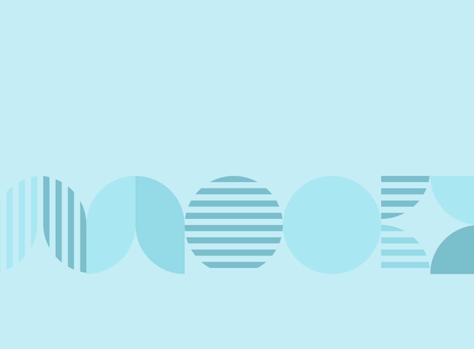
Image credit: Zlatko Najdenovski
Sometimes simple is better, yeah? A light color scheme and quiet uses of circles and thick lines inform this design.
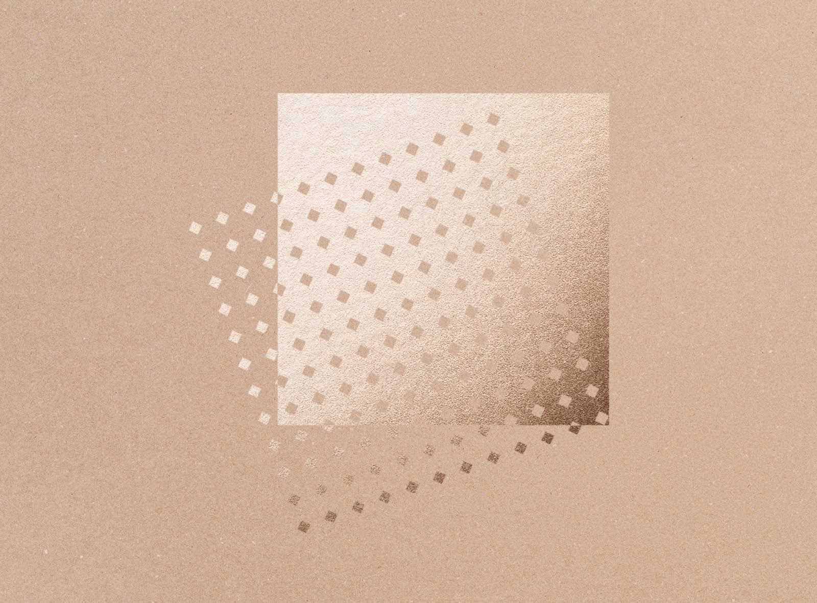
Image credit: Sean Ford
Foils and texture are used here in great minimalistic fashion. Two squares, one solid and one composed of miniature diamonds, along with a partial overlay.
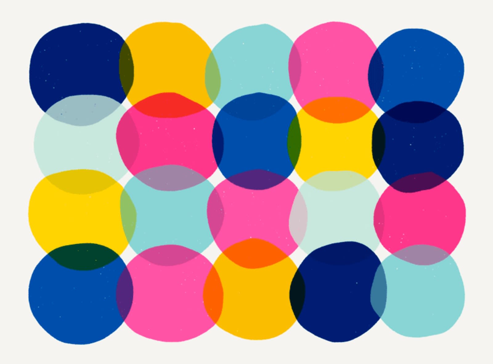
Image credit: Veronica Galbrait
Simple circles come together to form a rectangle. Is there a pattern to the bright colors? You tell us.
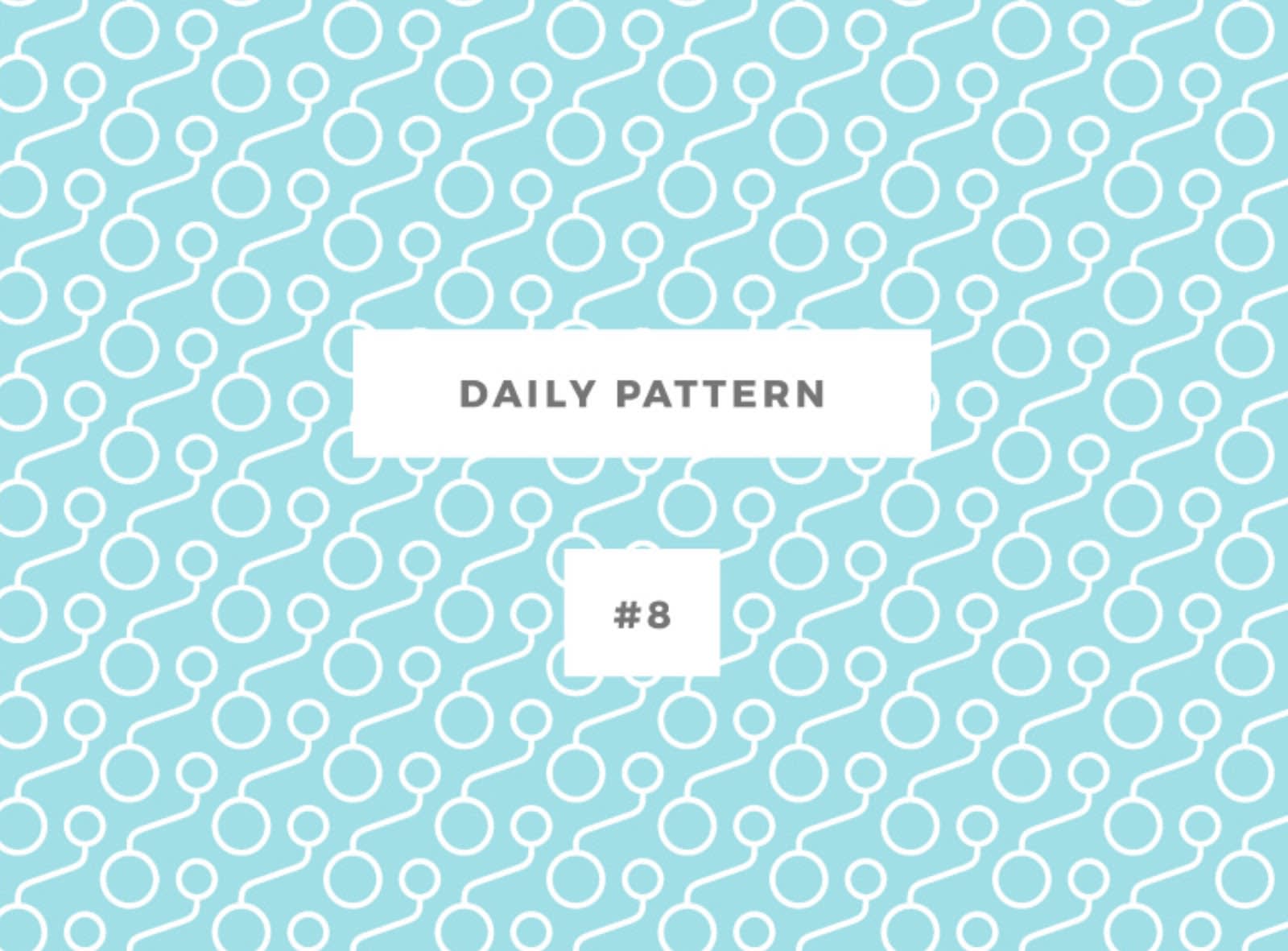
Image credit: Bulbfish
While it might seem like there is a lot going on here, when you look closely, the central pattern is two differently-sized circles conjoined by a distorted line. All designs don’t have to be complicated in order to look complex.
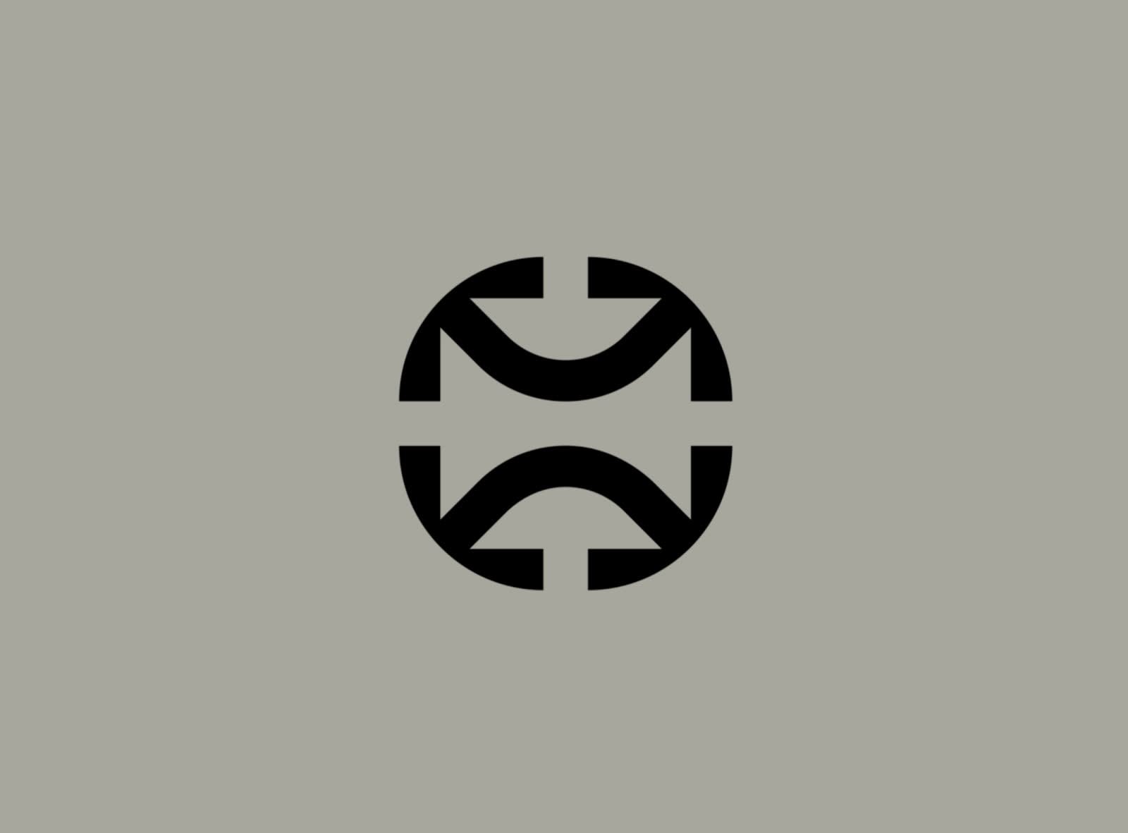
Image credit: Dylan Menke
Speaking of simple complexity. This is a fantastic example of using minimalism to create something with layers. The outer design is a circle, but can you discern the square that exists within the logo? And if you look even closer, you’ll see the use of arrows on each side.
Use patterns within patterns within patterns
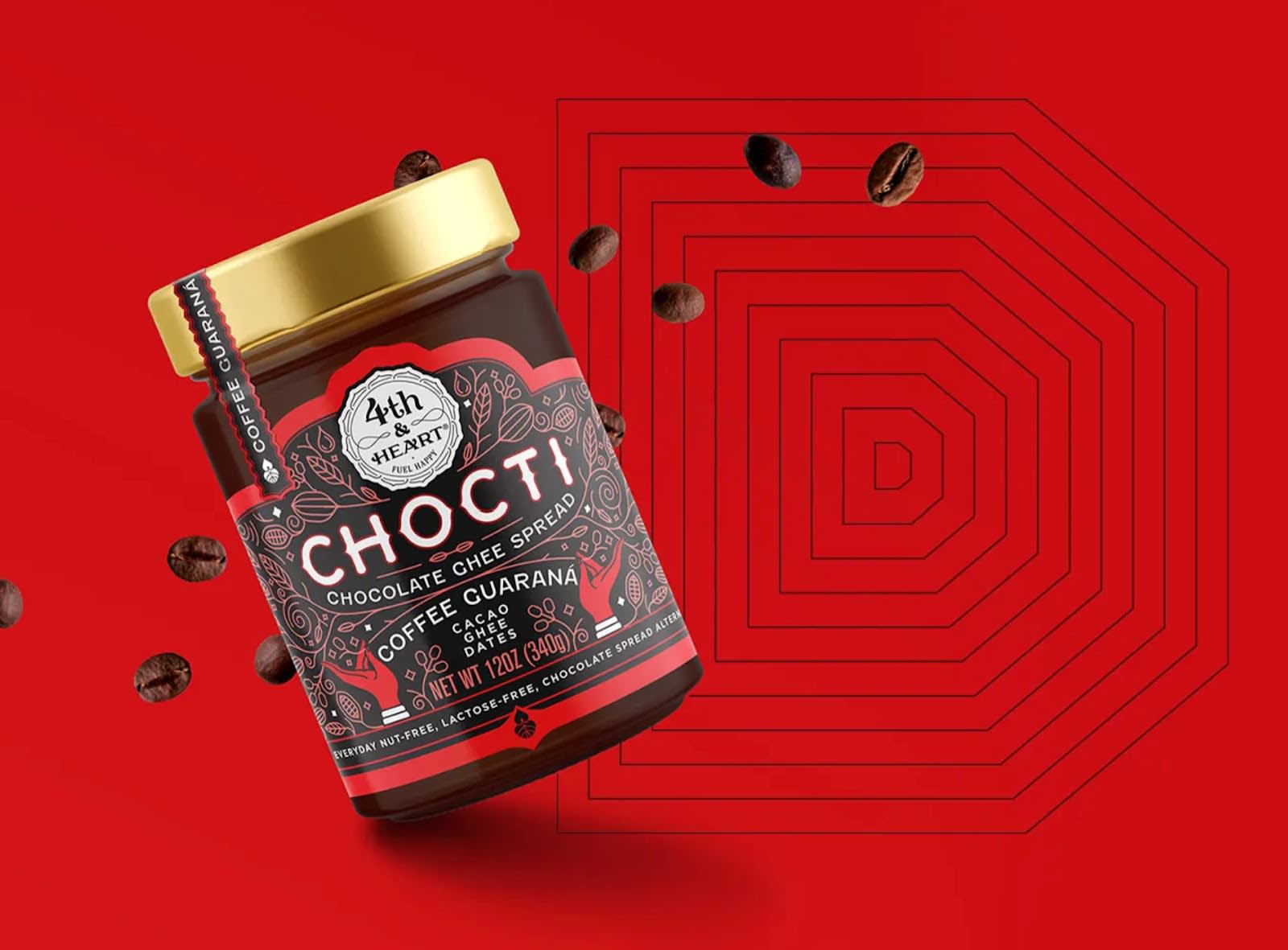
Image credit: DIELINE
Christopher Nolan might be the architect of dreams within dreams, but graphic design holds the heavyweight belt for patterns within patterns. Like with this image for Chocti. The hexagonal image in the background is a combination of 11 hexagons, making for something reminiscent of a maze.
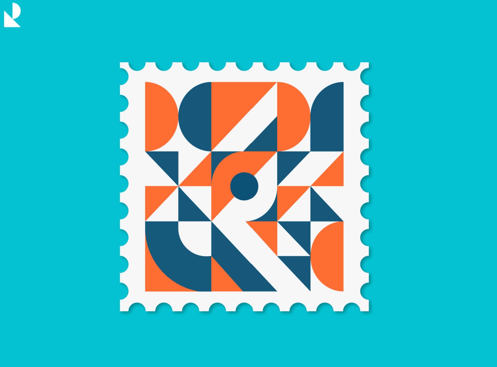
Image credit: Rachit
Sometimes patterns and shapes exist within each other and we don’t even realize it. Given that this design is a stamp, we start with the square outline. Then another. Then nine individual squares, each with their own colors and geometric patterns!
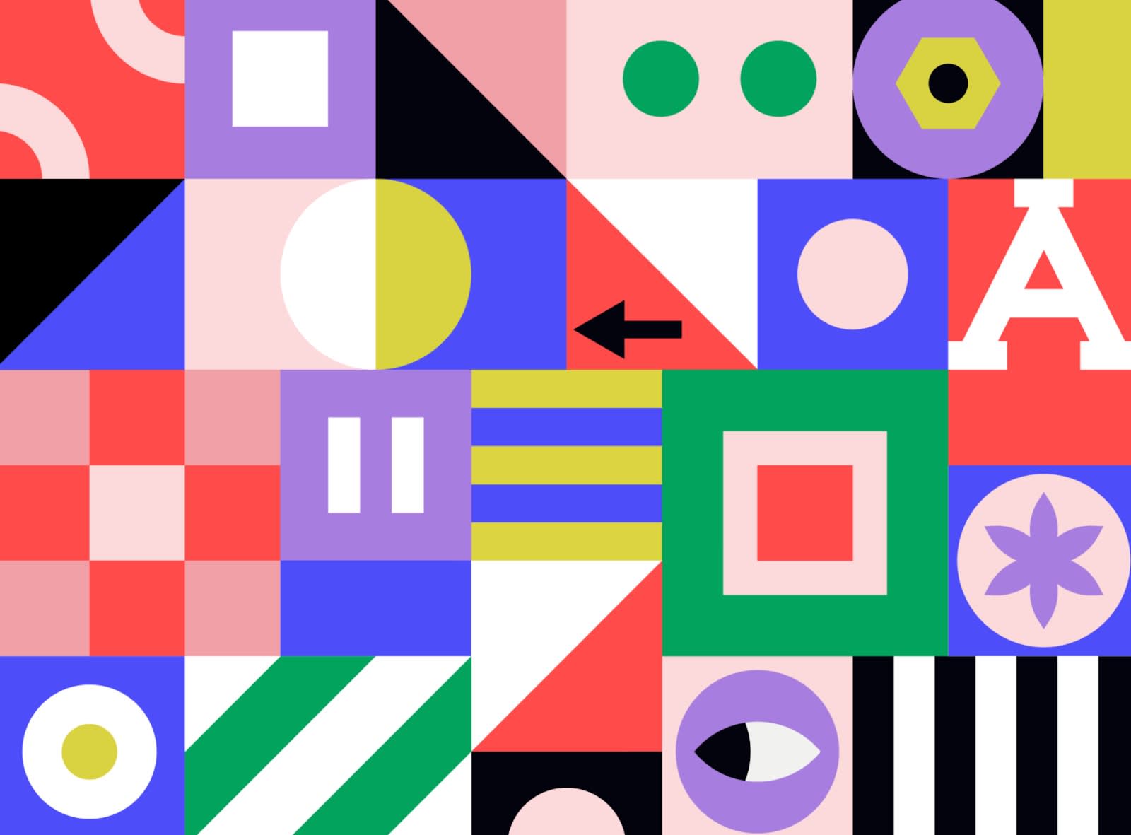
Image credit: Kemal Sanli
This complex design offers a smorgasbord of unique patterns within an asymmetrical medley of squares and rectangles. You’ve probably noticed some asymmetry in other examples. While our souls tend to smile at symmetry, there’s a lot to appreciate about its opposite. Asymmetry is also a strong way to make your design stand apart from others.
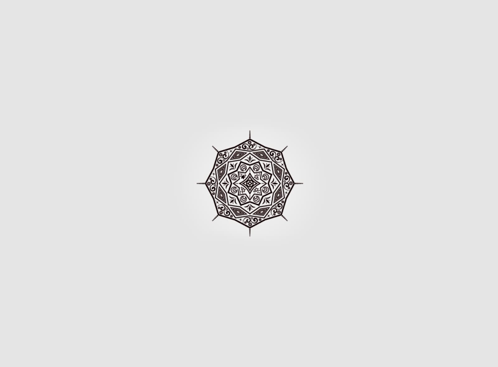
Image credit: MD ALI IMAM REZA
Henna mandalas have been incorporating patterns within patterns for thousands of years. In this example, the octagonal outline is infused with an eclectic mix of shapes and patterns.
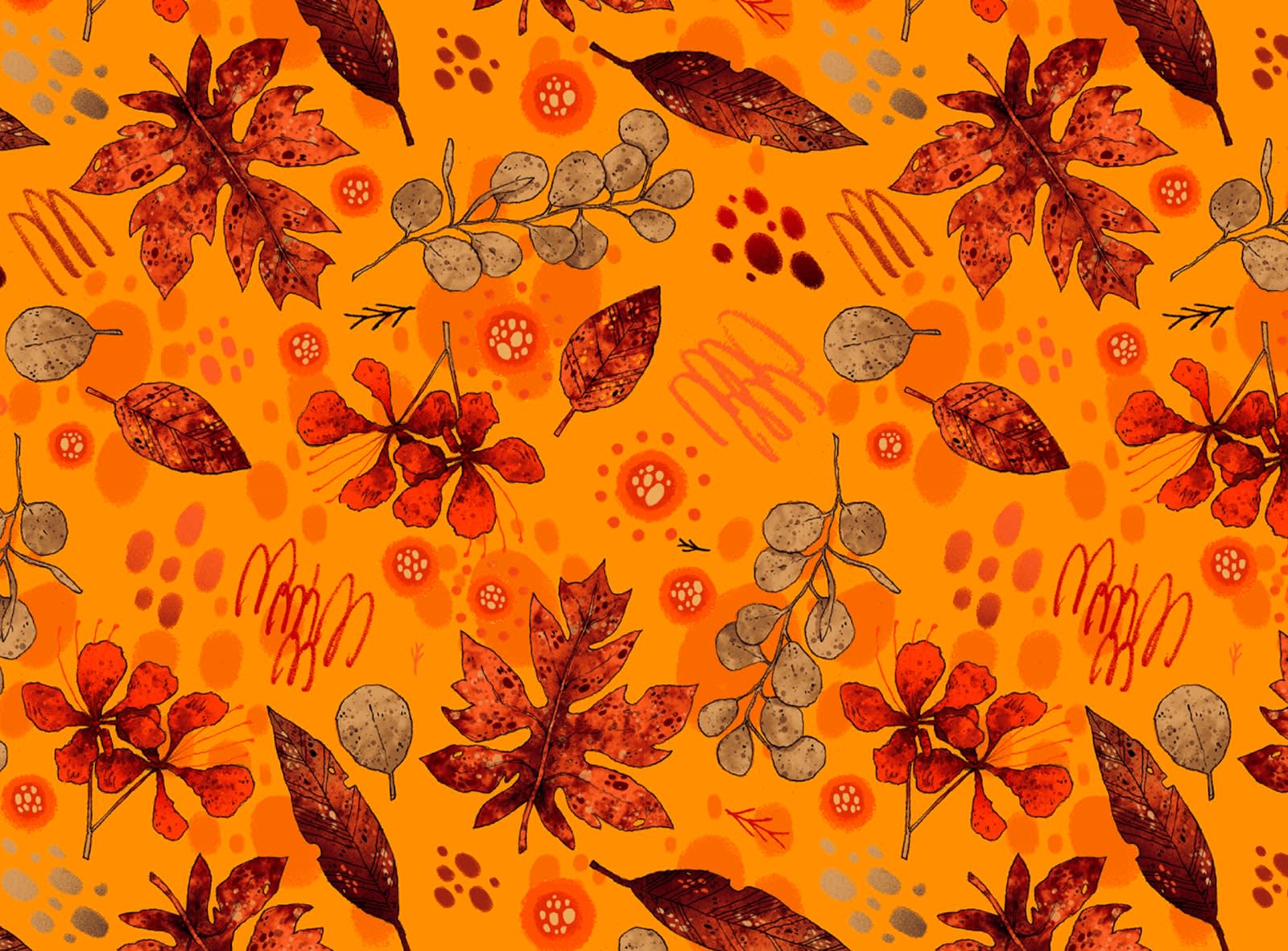
Image credit: Douglas Rodas
Leaves are geometric shapes in their own right, and each one of the featured drawings here has a unique pattern. Some of the leaves incorporate circles, while others have hand drawn lines across their bodies. If we wanted to take things a step further, we could also say that there are two macro patterns at play here: a top layer of leaves, accented by a background layer of circular splotches and lines.
Make geometric backgrounds
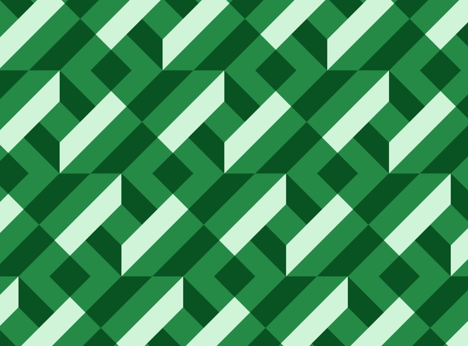
Image credit: Blankenship
Use geometric patterns for vibrant or subdued backgrounds. In this example’s case, colors and shapes work in tandem to produce something with texture and vibrancy. There’s an apparent 3D element to the design.

Image credit: Aleksander Savik
This background opts for minimalism, with small, refined shapes and lines. Its bright color choices help make it pop.
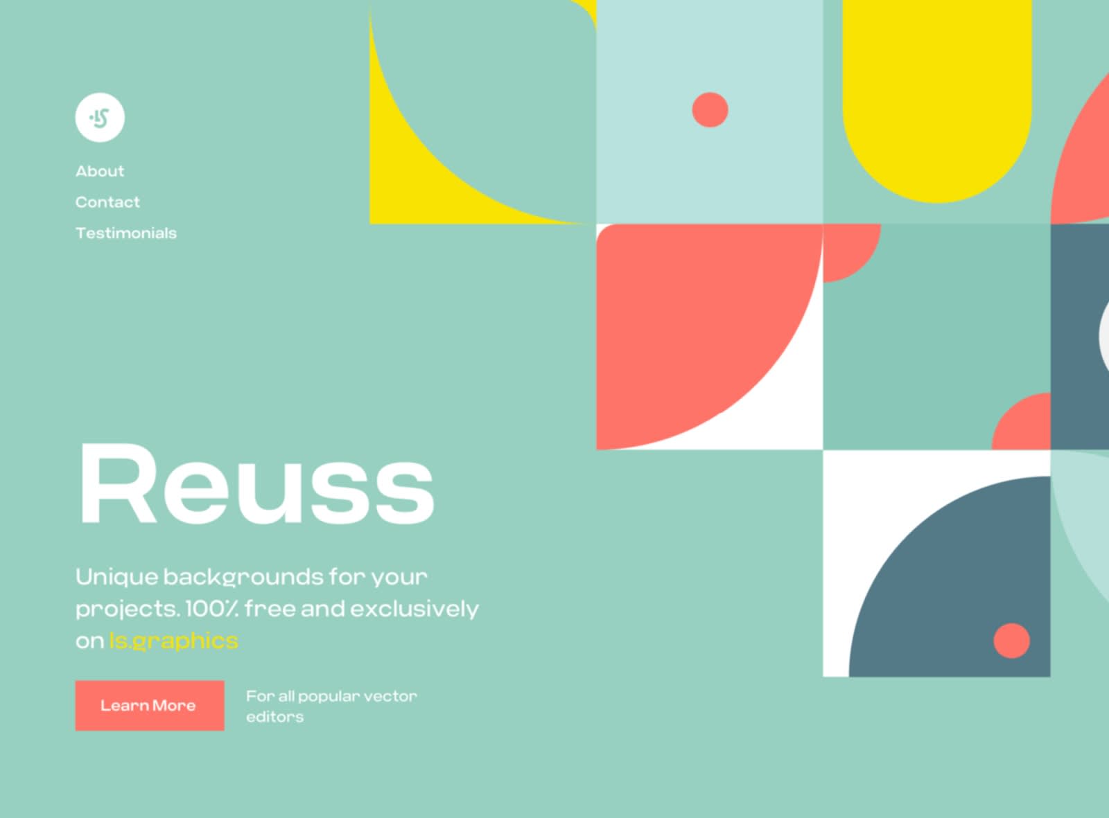
Image credit: Ruslanlatypov
Again, squares and rectangles perform admirably in this design, creating a layered look.
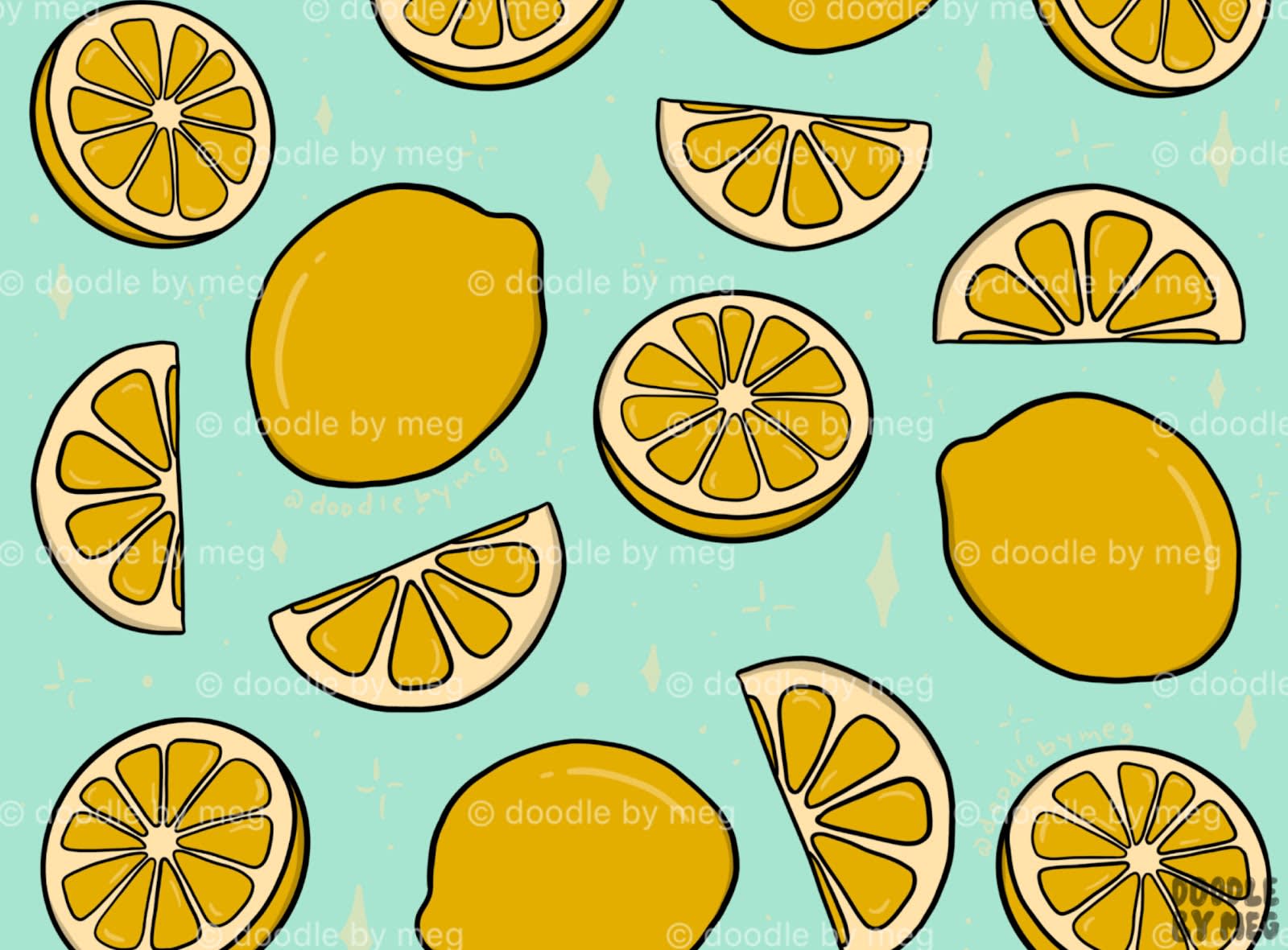
Image credit: Meghan Wallace
Earlier, we showed you a few examples of shapes forming images. Such is the case with this background of lemons. By nature, the fruit is shaped like an oval. Full and half circles create lemons that have been cut open. Rounded triangles add detail to each of the slices.
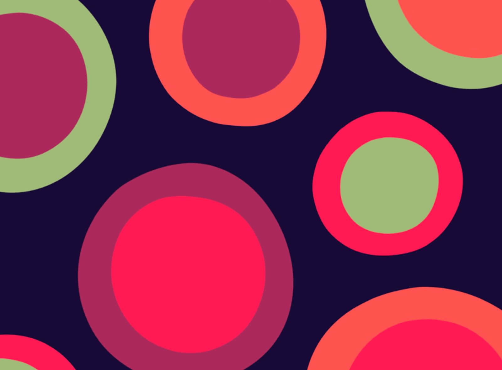
Image credit: Veronica Galbrait
Develop harmony and wholesomeness with a background of concentric circles. Or, if circles aren’t your thing, consider how you might pull off this same look with different shapes.
Design with wavy line patterns
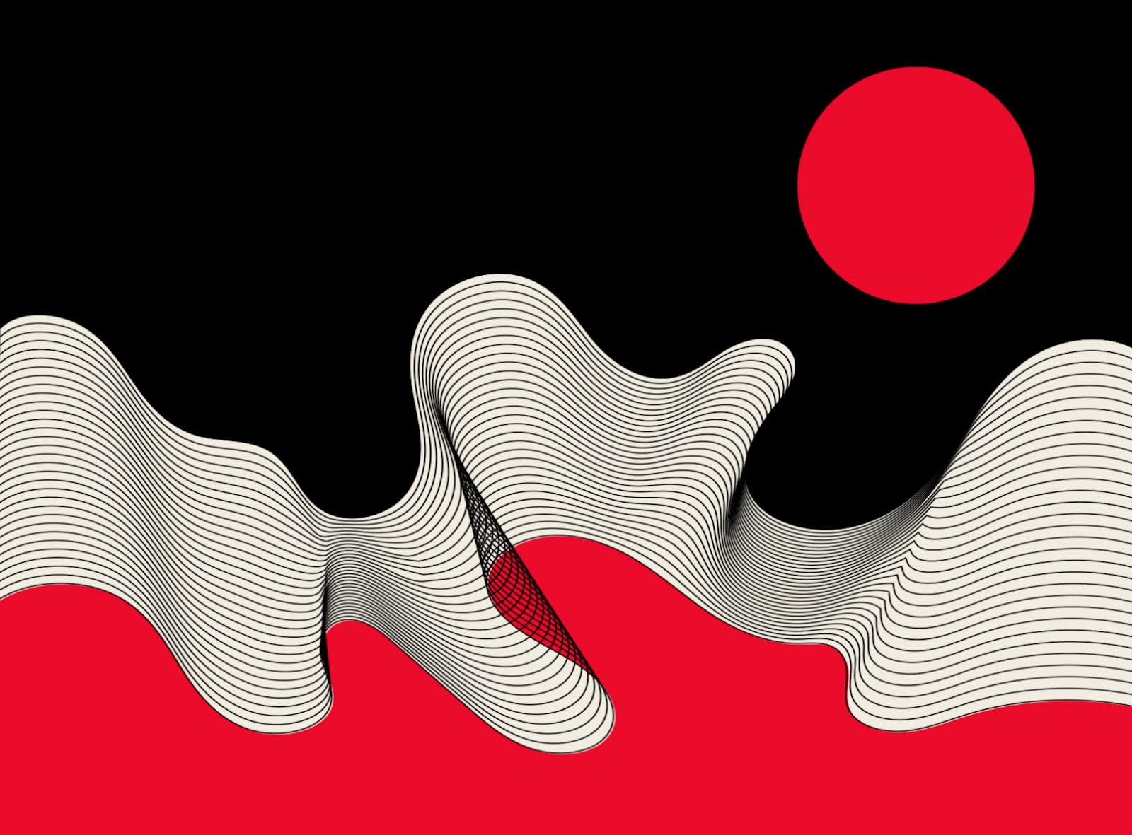
Image credit: TRÜF
Heatwaves are an uber-popular way to turn traditional lines on their heads and add a layer of creativity to your design. They’re also great for suggesting flexibility instead of straight lines’ natural rigidity.
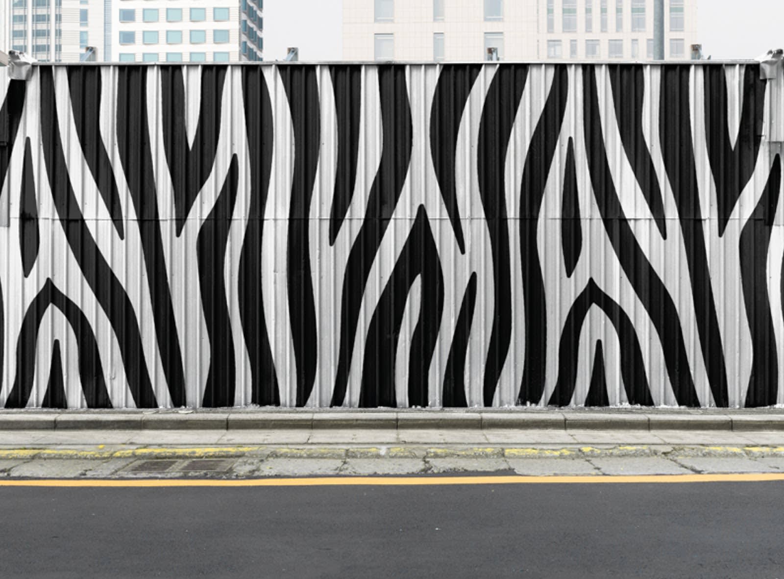
Image credit: Geometirca Bureau
Pair lines styles with a monochrome palette to achieve a sophisticated look.
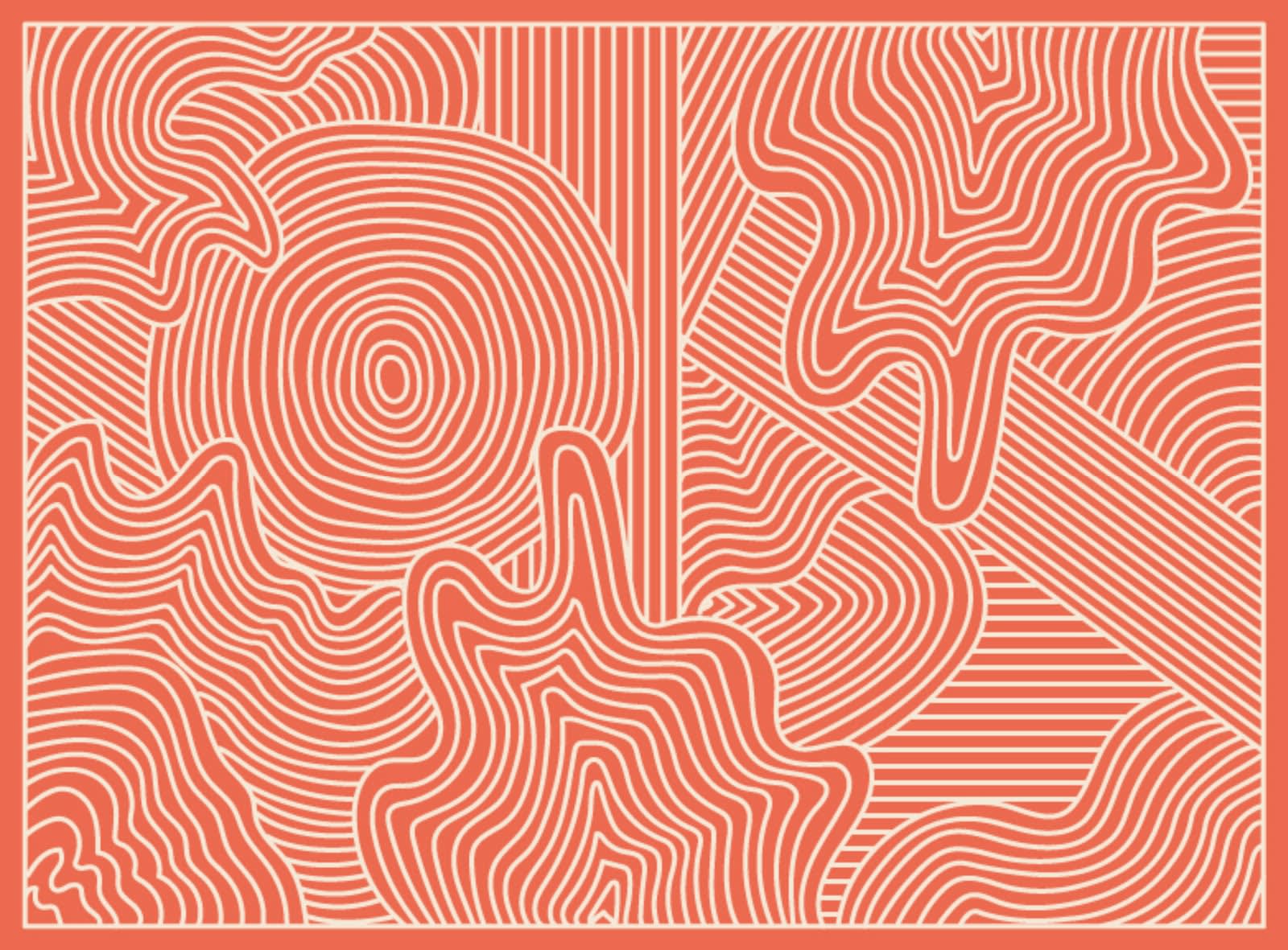
Image credit: Sumeet Ananad
While lines might seem simple, there’s a reason they’re used to make maze enthusiasts scratch their heads. This design effectively uses straight and wavy lines to create something complex.
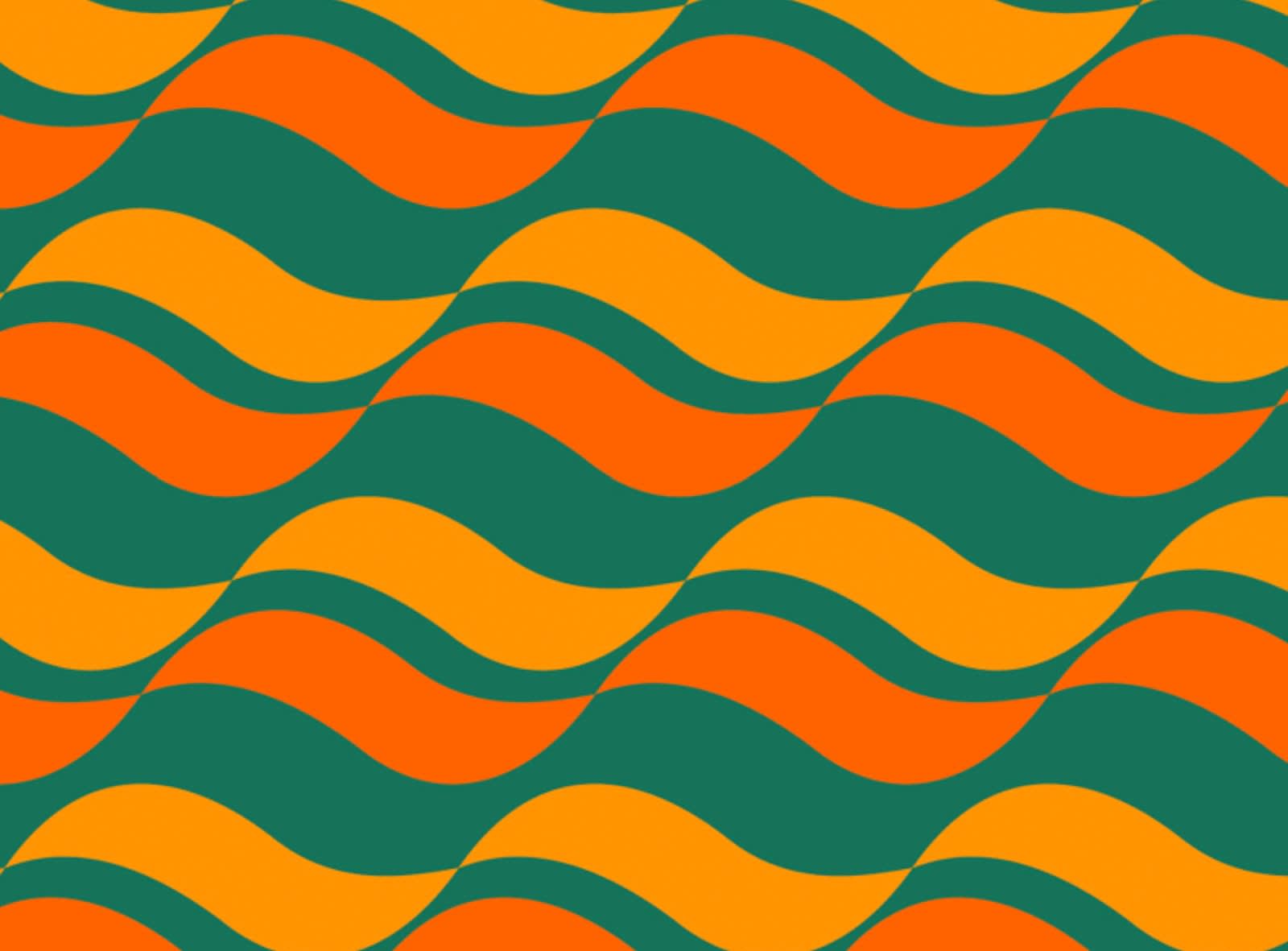
Image credit: Veronica Galbrait
In respect of waves, check out how this design uses thick, boldly colored lines to create a wavy effect.
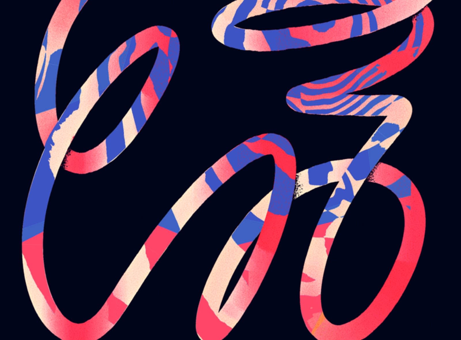
Image credit: Script & Seal
Squiggly lines are fun. They can be used for cursive fonts or just as an exciting design style, like in this image. Swooping loops are complemented by flavorful colors with geometric patterns of their own.
Embrace abstraction in geometric patterns
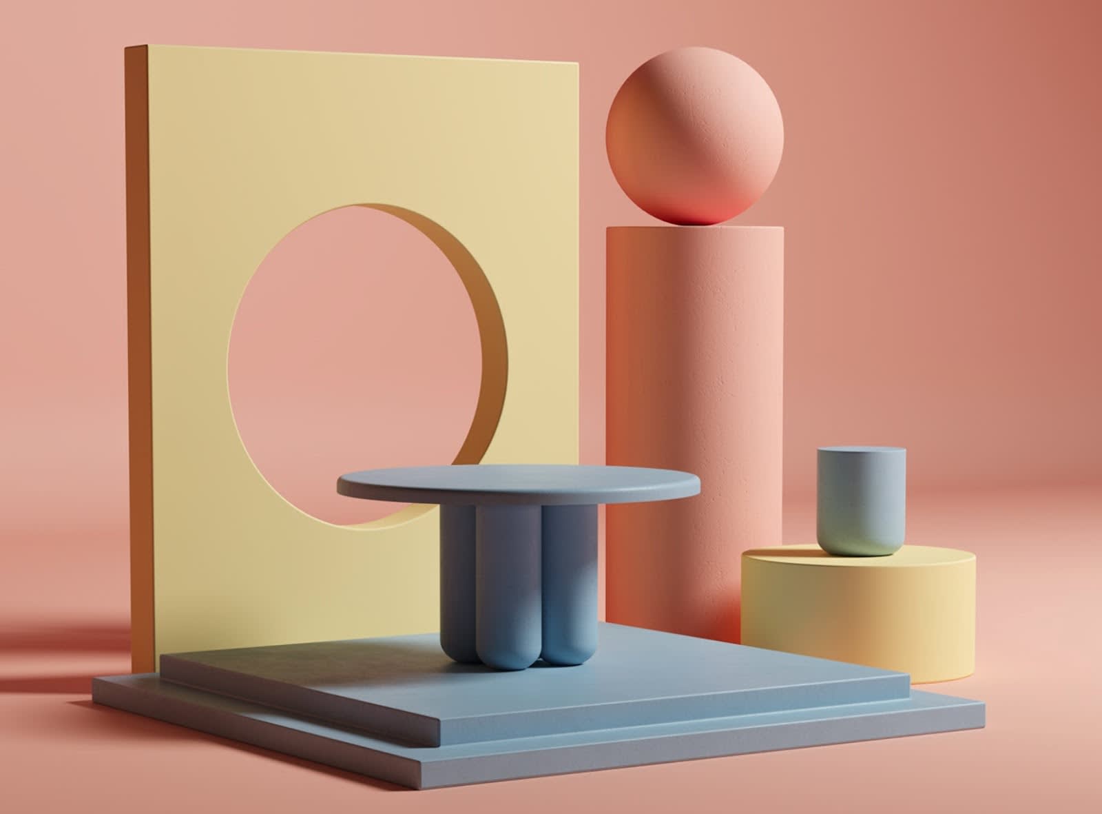
Image credit: Abduzeedo
Because geometric shapes can represent so much, they’re a great tool for abstract and outside-of-the-box designs. Here, geometric objects come together to assemble 3D living spaces. It’s a totally abstract way to visualize places that have ubiquitous familiarity.
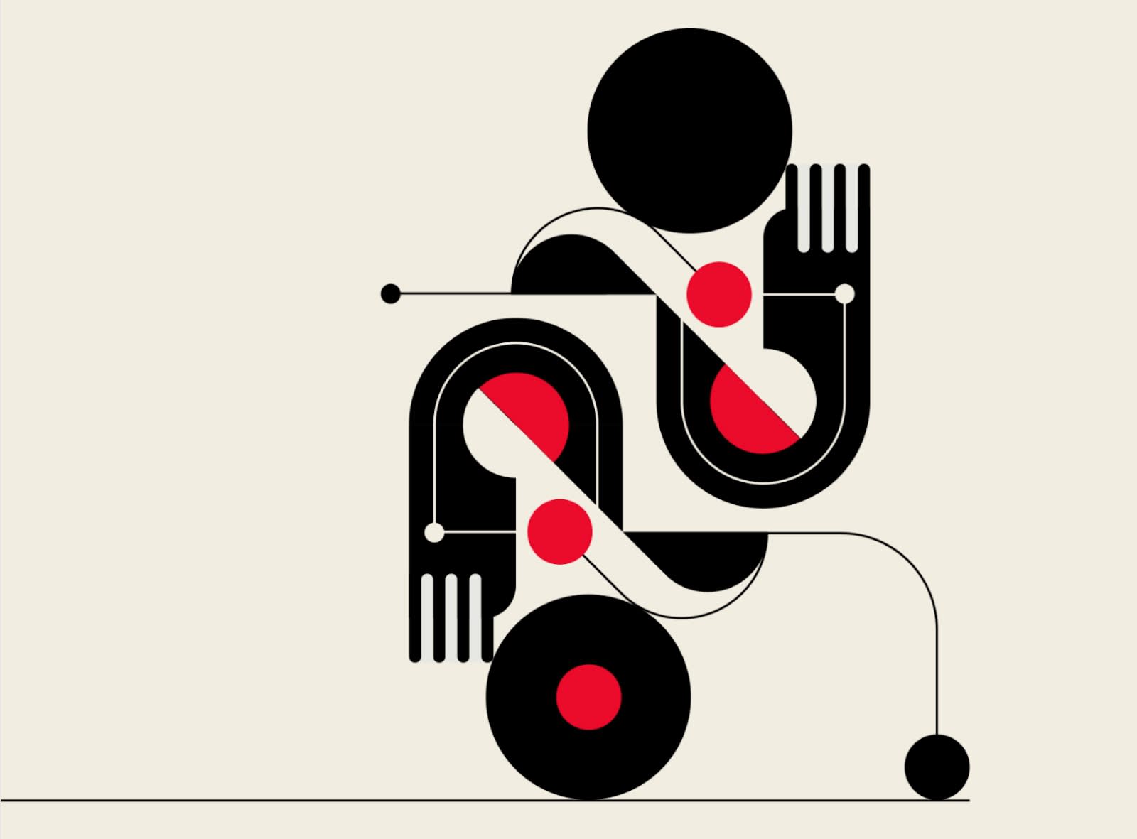
Image credit: TRÜF
I think this means...Well, it could be...I wonder if...It seems like the designer’s trying to say…
When it comes to abstract art, you want viewers to be thinking and questioning. Use geometric shapes and patterns to your advantage, creating imagery that sparks recognition, only to be surpassed by questions.
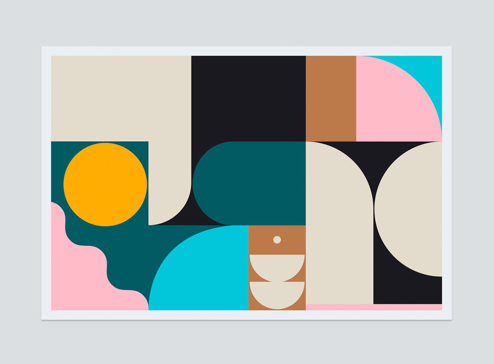
Image credit: Steve Wolf
Note the opportunity for creativity that abstract designs provide. There are at least 10 different variations of basic shapes in this image that, with intentional color choices, create a bold design.
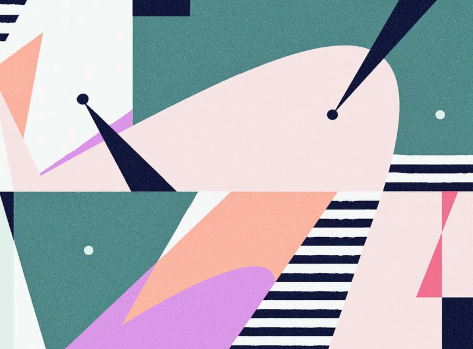
Image credit: Script & Seal
There’s an interesting juxtaposition of past and future in this design. Perhaps it’s because the elements feel very 1950s, which still stands as a kind of Golden Age for progress and futuristic thinking.
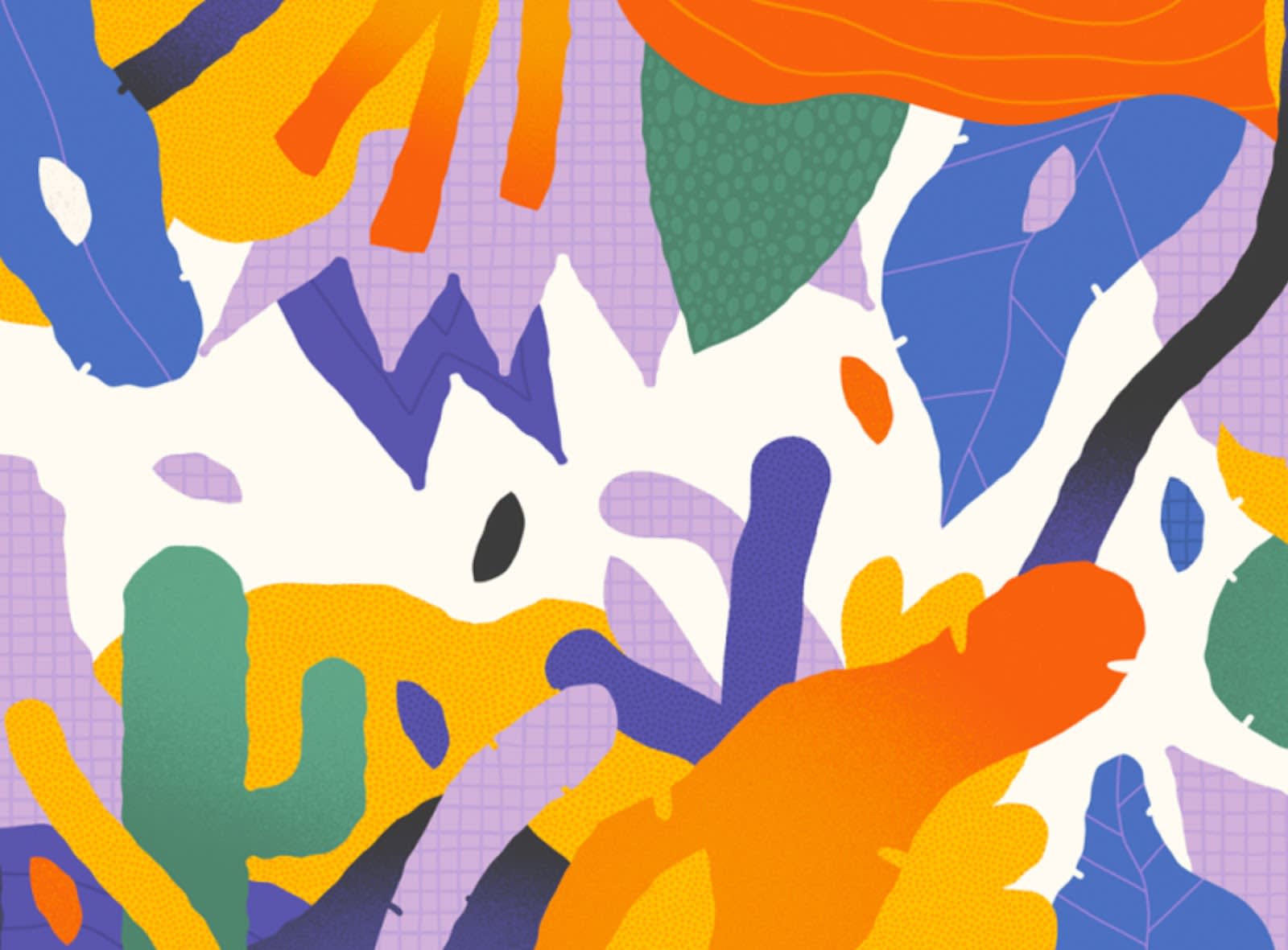
Image credit: Kelly Nichols
Bright and varied colors come together with a healthy mix of shapes to create this abstract jungle terrain.
Create text using shapes
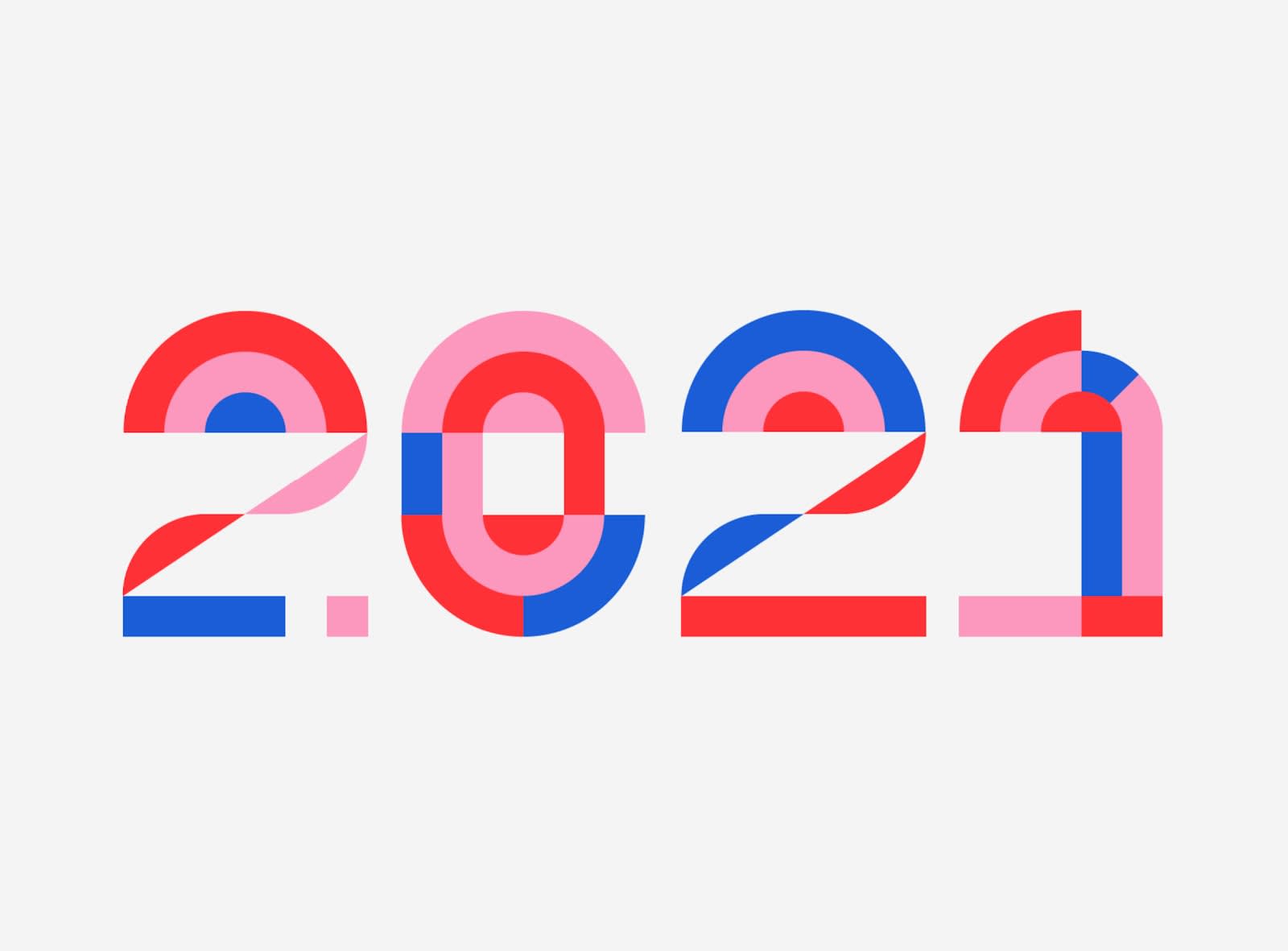
Image credit: Kemal Sanli
Build texts out of shapes and patterns like this clever representation of 2021.

Image credit: Fede Cook
Or use text as a shape, like Teen Design Lab does by arranging its font in a circle around its logo.
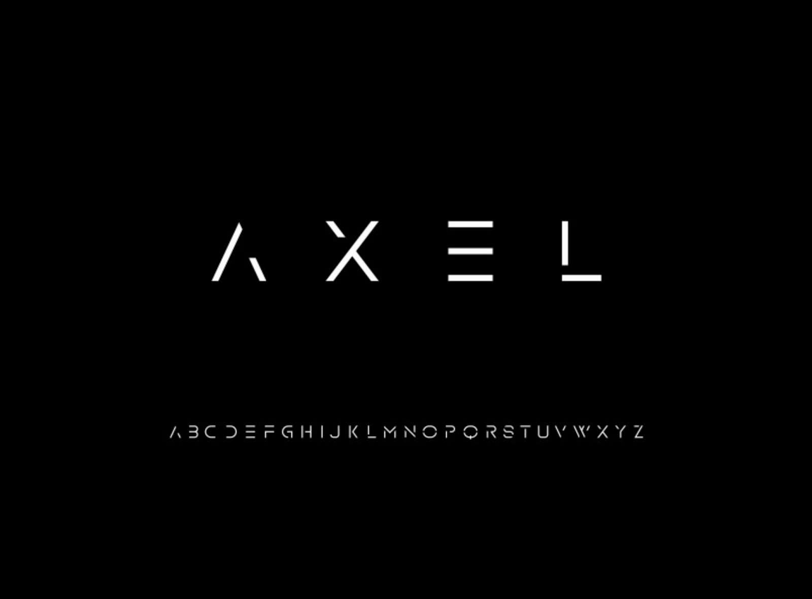
Image credit: Freepik
Hollywood loves using futuristic fonts like this in sci-fi films. There’s a great simplicity at play with the text. Its sleek design is merely a product of straight lines!
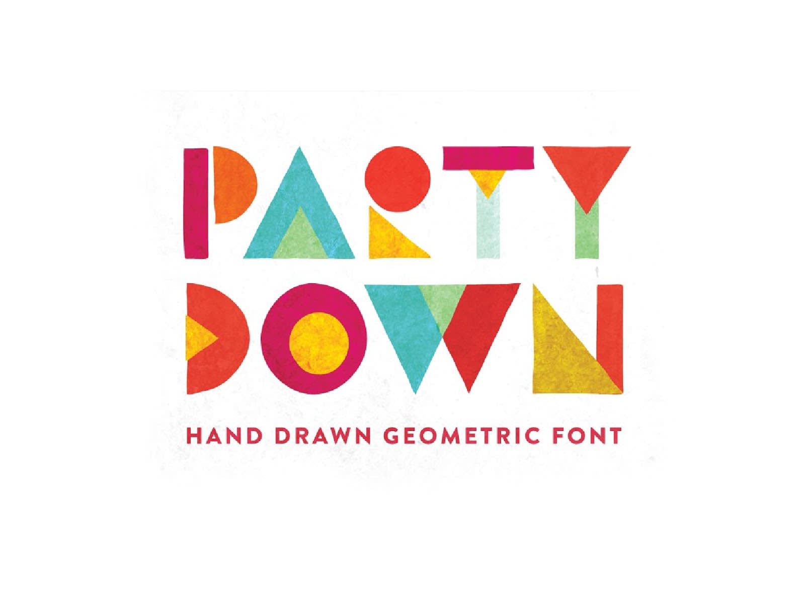
Image credit: Jordan Dale Young
“Party Down” this year with shapes. This is a perfect example of how you can use basic geometric objects to build a font.
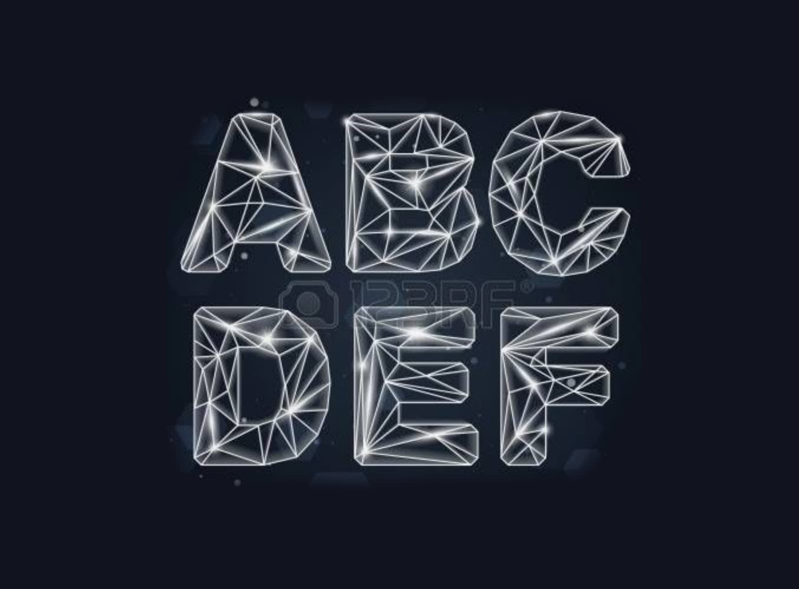
Image credit: 123RF
And last but certainly not least, you can give your font a constellation-type look by making use of lines and careful coloring.
How to create a design with geometric shapes in PicMonkey
Start with a blank canvas.
Browse basic geometric shapes and patterns and click to place them onto your canvas.
Customize colors, play with effects like outline or drop shadow. Try making a photograph show through the shape (called "masking").
Download, share, or print.
