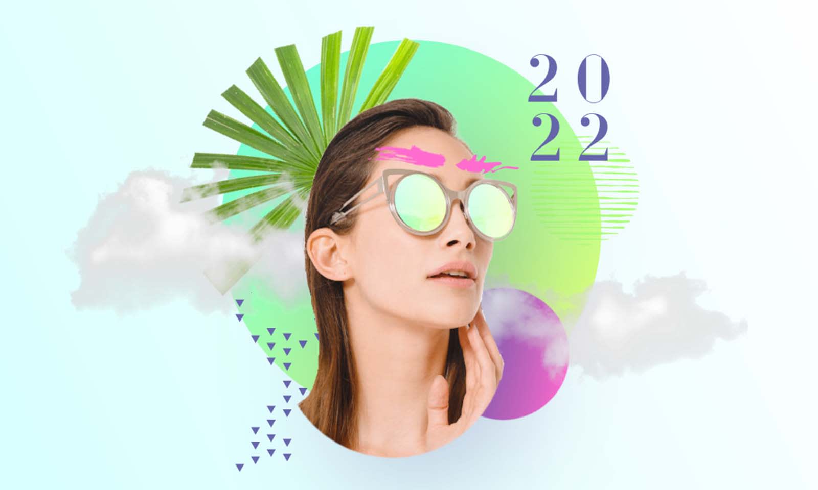
Ready to design great things in 2022? Our friends at Shutterstock have put together a list of 2022's graphic design trends. Get the scoop on what to expect, then check out these inspiring creations from PicMonkey's very own designers. Each one comes with its own set of instructions so that you can practice replicating the look yourself in PicMonkey, or use a few of the tools/techniques to make your own great design.
Oh, and by the way...we wanna see 'em all on Instagram @picmonkey!
Trend 1: Movement
Design by Natalie Wilson.
Get the look:
On the PicMonkey homepage, click Create new > Stock Photos. Search "iced coffee" and select your favorite image to open it in PicMonkey's editor.
Click Remove Bkgnd on the left Image Tools menu.
If your coffee cup has a straw in it, you can use the Color Changer tool to alter its color and match your own branding.
Add your logo (or a graphic) to the front of the cup.
Open the Text tab and click Add text to add a text layer onto your canvas. Do this four times and type your copy.
Next, click Touch Up on the left tabs menu and open the Sculpt tool. Use it to make your text layers squiggly.
For a layered look, use the Eraser tool on your bottom text layer in order to blend the word in and out of the cup's ice/straw.
To incorporate the trend itself, select each text layer and then click Animate on the Text Tools menu. Add the Drop Down effect to the first three lines, and Fade to the last.
Finally, open the Photos & Video tab back up and search for "clouds" in the stock video search bar. Drag your video of choice onto your canvas to set it as your background.
Your turn! // Designs by Natalie Wilson.
Trend 2: Gen Z in da house
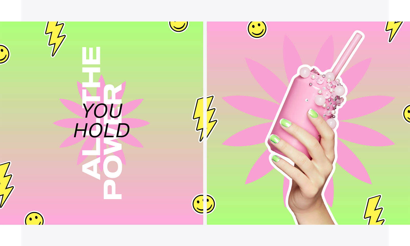
Designs by Natalie Wilson.
Get the look:
Open a blank canvas in whatever size you need.
Click Change color on the Background Tools menu. Open the Gradient tab and choose one of the available swatches, or create your own. Adjust the direction of your gradient however you want — this design uses a 90° angle (flip-flopped between versions).
Use the Text tab and Text Tools menu to add your text and adjust its font type(s), colors, and letter spacing.
Another option: Insert a brand or product photo to the canvas and remove its background.
Finally, pepper the canvas with graphics. Open the Graphics tab and search for "lightning bolt," "regular smiley face," and "petal star."
Want that sticker-y look and feel? Select a graphic layer and click Shadow & outline on the Graphic Tools menu. Add an outline. If you'd like to add more than one, right-click on your graphic after adding the first and select "Flatten." This locks design elements in place for that layer. Afterward, you'll be able to add another outline!
Trend 3: Eco-aesthetics
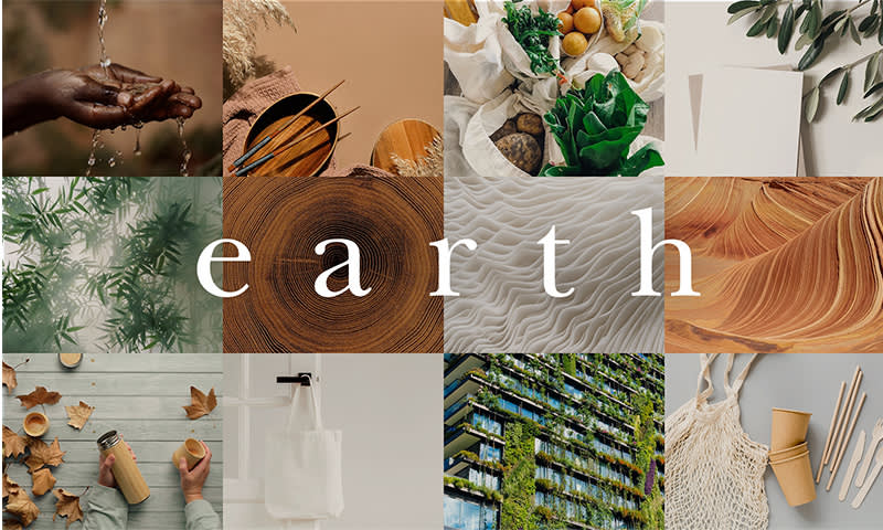
Design by Erin Oostra.
Get the look:
This design is alllll about our Collage tool. On the PicMonkey homepage, click Create new > Collage. Select your desired size and cell layout. (This one's a 4 x 3 grid).
Upload your images or choose from our stock library. Drag and drop each image from the left Photos & Video menu into your desired cells. Another way you can do this is to right-click each cell and select Replace image.
Open the Text tab and add a text layer in the center of your collage. Shift your images around and/or change the text's color if it's difficult to read.
Pro tip: If your text is still difficult to read, select it on your canvas and click Shadow & outline on the Text Tools menu. Add a subtle drop shadow to it in order to give some dimension.

Design by Natalie Wilson.
Get the look:
Open a blank canvas in whatever size you need/want.
Use the Graphics tab to add a rectangle and circle to your canvas. Make the edges line up, then click and drag your mouse across both shapes to highlight their layers. Click Group layers on the left tools menu. Now you have a brand new shape that'll be filled with your image.
Select your new graphic layer and click Fill with image. Choose your photo.
Like the motion trend example, you'll then want to add individual text layers — this time with individual letters — and use the Eraser tool to layer them within your image. You can also use the Layers panel to move one behind your graphic layer.
Speaking of layering — you can add other shapes behind your image based on how you want the design to look and feel. Similarly, the leafy elements of this design were created by searching for "tropical leaves" in PicMonkey's stock photo library, then removing the backgrounds from each leafy image and layering them above and below other design elements.
Add a few splotchy paint graphics to the edges in order to ground the image.
Finally, select your background layer and change its color to whatever complements the final design.
Trend 4: Eccentric Serifs
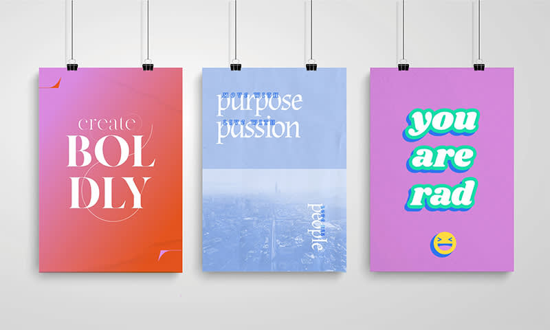
Designs by Erin Oostra.
Let's make some posters! By now you're probably familiar with a lot of the tools used in these three designs, so we'll keep the details to a minimum.
Create boldly:
Canvas: Blank poster
Background color: Gradient
Font: MADE Canvas
Extras:
Paper texture over gradient background
Circle outline graphics cropped in half and added as flourishes
Text layers with letter 'Ls' added in corners as flourishes
Purpose passion people:
Canvas: Blank poster
Background color: DIY
Font: Almendra
Extras:
Paper texture over background
Image of cityscape added to bottom half of poster and Blend mode changed to "lighten"
Smaller text layers added above larger text layers; each given a boldly colored outline, with Knockout effect selected (this "knocks out" the centers of the letters) and spaced out as desired
You are rad:
Canvas: Blank poster
Background color: DIY
Font: Shrikland
Extras:
Gradient outline (a new feature 😏) added to text layer
Drop shadow added to text layer
Smiley face graphic added to bottom, with colors adjusted to mesh with canvas background and text color; similar gradient outline added
Trend 5: Cyberpunk
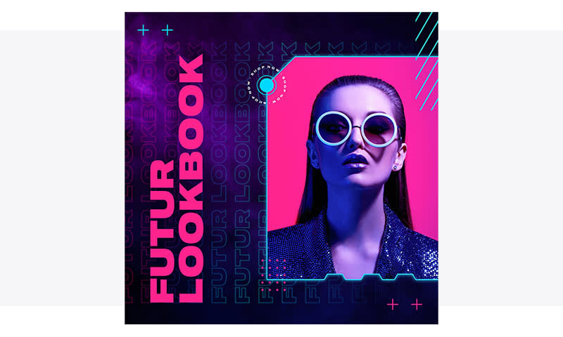
Design by Troy Coleman.
Get the look:
Open a blank canvas, sized 2000 x 2000 pixels.
Select your background layer, then click Add bg image on the Background Tools menu. Here's the photo used in this design.
Add a text layer. Adjust your letter spacing and rotate 90°. Add a gradient outline and use the Knockout effect. Add a drop shadow to soften the text and give it a neon glow. Then copy and paste the layer across your canvas.
Add another text layer to serve as your title line. Change its color and use the Eyedropper tool to pick a color from your image (this will help create cohesion across the design). Rotate the layer 90°.
Next, you'll want to create a frame for your second image. Open the Graphics tab and select a rectangle from the Basic category. Change its color to light gray.
Use the Eraser tool to create notches in your frame. This design used the Hexagon brush type. (Pro tip: Hold down shift while sliding the eraser across your frame...this will keep the brush straight).
Add an outline with a neon glow, followed by a drop shadow.
Select your graphic frame layer and click Add image fill on the Graphic Tools menu. Upload your image of choice, or pull from the stock.
Finally, add graphic accents from the Design > Geometric Patterns category. Change their colors to match your overall color scheme.
More specs:
If you're exploring PicMonkey's arsenal of design tools and really trying to nail this exact cyberpunk look, here are a few more specifics from the designer about what he used for fonts, colors, and effects.
Repeated text layer:
Font: Shapiro 97 Air Extended
Letter spacing: 1.05 / Line height: 1.20
Color gradient hex codes: #ff005c > #00d8ff > #00d8ff / Direction: 98°
Drop shadow:
Color: #FFFFFF
Angle / Distance / Intensity: 0
Scale: 100
Fade: 40% / Blur: 4
Title line text layer:
Font: Shapiro 95 Superwide
Size: 208
Color: (Pull from image with Eyedropper)
Frame outline:
Color: #2bd6ff
Thickness: 6
Intensity: 7
Scale: 100
Distance / Fade: 0
Frame drop shadow:
Color: #2bd6ff
Angle / Distance / Intensity / Fade: 0
Scale: 100
Blur: 28
Bonus! Pink all over the place
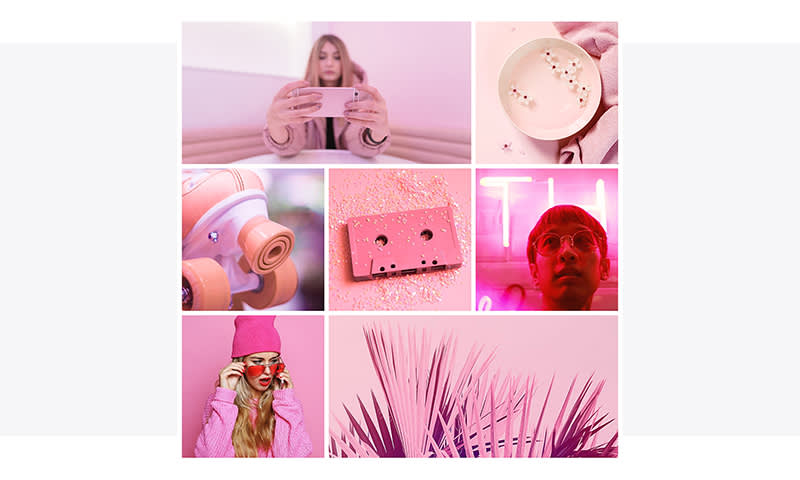
Your turn! // Design by Natalie Wilson.
More inspiring designs
Heads up — our designers have done this before on the Shutterstock blog. To see more design inspiration (with step-by-step instructions), check out 4 Ways to Reimagine and Transform Your Images. We hope these designs empower you to make your own work in PicMonkey!
