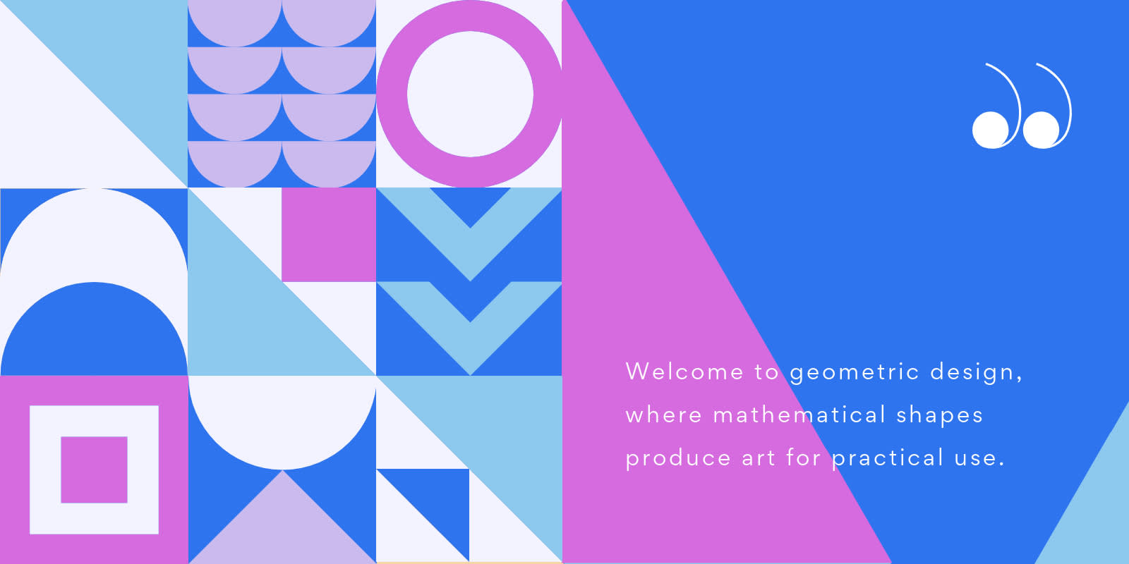
Every high schooler on the planet has been wondering about the real-world relevance of geometry since its inception. Well, this is it, folks. Welcome to geometric design, where mathematical shapes produce art for practical use.
Still – using digital geometric shapes for graphic design projects won’t require you to calculate the surface area of a rhombus. So, while we won’t be including terminologies in this piece like diameter, radius, or formula (you’re welcome), we will make sure you pass our geometric design course in a way that suits your needs.
Let’s get to it.
The significance of geometric design
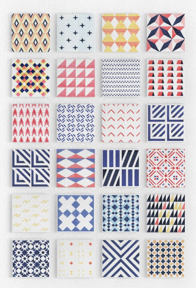
Photo cred: Creative Market
In retail, there’s a misconception that clothing can be either fashionable or functional. Similar to geometry, people misperceive that math is either scientific or creative. Welcome to geometric design, a perfect hybrid of the left and right brain.
Historically, geometric designs were symbolic and a way to communicate among Mesoamerican, Grecian, Egyptian, Persian, Iranian, and other distinct cultures.
Common geometric patterns included the eight-fold rosette, six-pointed stars, and even 16-pointed patterns. These designs can still be found in historic mosques today.
In the present day, people may recognize or use these patterns in the form of sacred mandalas, which are familiar to Chinese, Tibetan, and Japanese cultures, and the Buddhist religion.
While it may seem strange to go from sacred and historic uses to modern-day marketing purposes, the former informs the latter in a significant way. Since effective marketing stems from a balance of prime content, color, and design, it only makes sense that geometrics make your message pop.
So, without further ado, let’s jump into 22 geometric design examples to up your graphics game in 2022.
22 geometric design examples
1. Make curriculums cool again
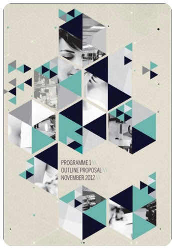
Photo Cred: UltraLinx
For teachers, professors, or entrepreneurs with a course to offer, why not sell your students with a captivating graphic? While it makes sense to pair geometric designs with art-related classes, they’re not limited to that.
Teach a topic that needs more engagement? Spruce things up with visuals for both elective and required courses.
2. Integrative infographics
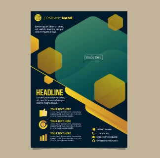
Photo Cred: pngtree
What better place is there for geometric designs than infographics? Whether you’re listing stats, giving company deets, or showcasing a timeline, geometric designs are the perfect way to do so. Consistent shapes can serve as bullet points for lists, or create a sense of 3D animation or movement on the page.
3. Au natural
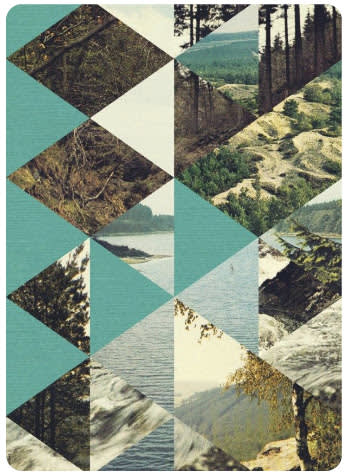
Photo Cred: Casual Optimist
Remember optical illusions, or peering into kaleidoscopes as a kid? This geometric design combines that effect in this collage format.
Breaking up pics of nature with solid colors helps the reader digest the entire image. Since this design example doesn’t include words, it’s open for interpretation – much like art.
4. Foodie fun

Photo Cred: Toshimi Sakuma
Geometric designs are sublime for restaurants, as these diamond shapes naturally evoke a sharp, polished image. Sport your top five dishes with pops of color and pro, high-res images.
5. Global attractions
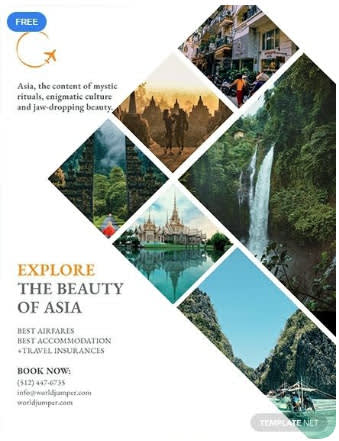
Photo Cred: Template.net
If you’re in the travel business or dig travel writing, using geometric patterns is a strong way to visually capture popular attractions. You can highlight anything from nature, hot tourist spots, activities, or must-see landmarks.
Note that each block can vary in shape. Some are diamonds, and some rectangular. While each stands on their own, together they compose a greater picture.
6. Sell, sell, sell

Photo Cred: LibroWorld.com
Real estate and architecture go hand-in-hand, so of course, geometry has a place at this table. Selling houses means selling structures, so why not use layered brick-like boxes to market how homes were built?
7. Viva la artista
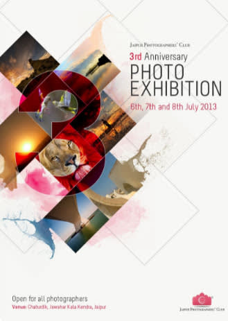
Photo Cred: Dyoel Dy
Photo exhibits, museums, art galleries, and fancy event centers are sure to sport geometric designs. If you need to highlight a diverse range of products, places, or photos, or art pieces, this format is for you.
Layering shapes as shown above creates an impactful blending effect, similar to a piece of art. This method evokes curiosity, mystery, and intrigue for prospective attendees.
A geometric design not only promises captivating marketing visuals, but it conveys what guests can expect to feel at the actual event.
8. Swanky night out
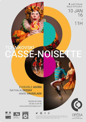
Photo Cred: Oswaldo ROSALES
Operas, theater, and movie screenings are also creative outlets that align with geometrics. While it’s true a geometric design can enrich any flyer, no one will question its use on one like this.
Pro Tip: When marketing your event, see how you can match an element of the images with the supporting shapes and colors. While these green and pink shades could be considered contrasting colors, they complement the costumes. Symbolically, the circular shapes also mirror the lollipop design. The subtle details keep prospective guests engaged longer. And the longer they’re engaged, the more likely they are to attend!
9. Sights unseen

Photo Cred: BlogDuWebDesign
Consider this image without the geometric design for a moment. It would still be stunning, but it would also give a different experience. Ask yourself, what does the geometry provide that otherwise wouldn’t be there? Answering this question can guide your intuitive stylistic choices.
Also, segmenting photos in this way leaves space for other details. Plus, the smooth, linear sides of these triangles create a polished, yet soft energy.
10. Nightclub shenanigans
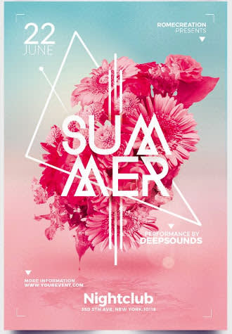
Photo Cred: Creative Market
Advertising a local event, concert, or club opening? Notice how these floral graphics inside the triangle create multidimensionality. For long-lasting impressions, blast your audience with color gradients that make for a can’t-miss event!
11. The more abstract the better
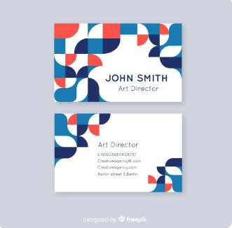
Photo Cred: Freepik
Work in the art biz? Then this is your element! Build your business cards, email signature, stationery, business proposals, and formal documents with funk-itized geometric designs. Feel free to switch up the colors throughout, but keep your general concept consistent. And don’t hold back, because other professions wish they could be as artistic with their marketing the way you can!
12. Art for art’s sake
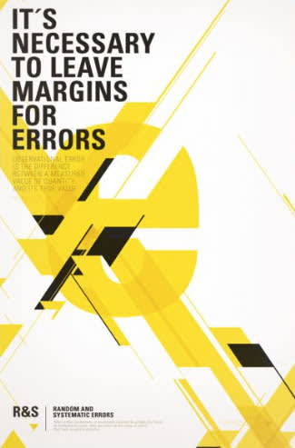
Photo Cred: Tristan Bowersox McQueen
Whether you sell art or make it for fun, pair a geometric design with an inspired message! This format makes it easy to sport a collection on your website or socials to gain notoriety.
While black and yellow are a simple color combo, they balance out the complexity of the design well. Manage each variable (shape, color, text, etc.) with intention so as not to overwhelm or confuse the viewer.
13. Pro portfolio
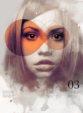
Photo Cred: Brunna Mancuso
Whether you’re a photographer, event marketer, model, or graphic designer, compile a standout portfolio and rock your raddest geometric designs.
It’s evident the creator of this piece chose orange for a reason, supported by geometric shapes to highlight the eyes and the third eye center. The audience of this piece can interpret the significance of ovals, infinity symbols, hearts, and diamonds to achieve greater understanding.
14. Minimalist moments
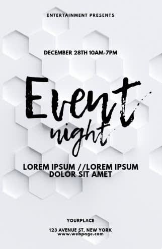
Photo Cred: PosterMyWall
Having just one geometric shape (instead of multiple) communicates a message, as does a classic black and white color combo. The geometric design of choice creates a distinct bee-hive texture, sparking curiosity and intrigue for its viewers.
15. Splash o’ color
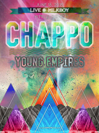
Photo Cred: Goon Brigade
Oppositely, why go black-and-white when you can use every color of the rainbow all in one place? Plus, this skilled graphic design uses shapes to double as objects. Here, the triangles complement the mountain terrain. The splatter-paint effect also gives off galactic, astronomic vibes. Sign us up!
16. College culture
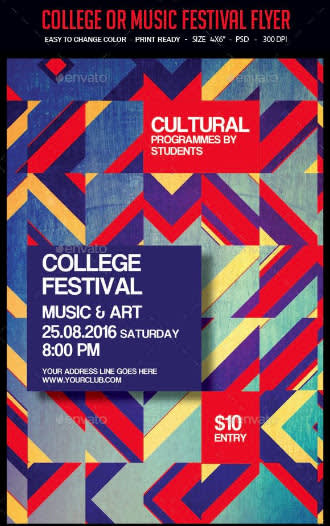
Photo Cred: María Duran
Nothing reroutes students on their way to class like vibrant geometric announcements. Remember college bulletin boards? Post your local events there. Attract an audience with erratic shape directions and solid-colored boxes for the deets.
17. Moody broody
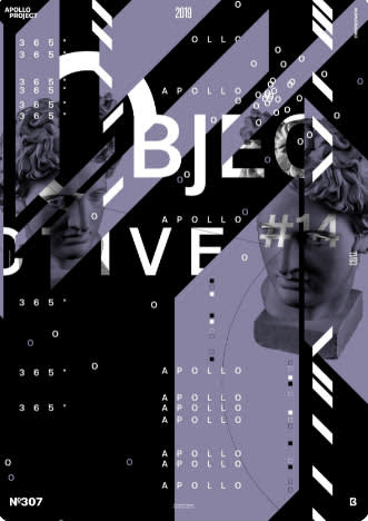
Photo Cred: Severino Canepa
Whether you’re making your next album cover, book design, or pitching a philanthropic project, this slicing effect is sure to draw in a crowd. While the color palette may be subtle, its layout isn’t – and that’s why it works! Ask yourself which element of your design you want to highlight and go from there.
18. Sacred geometry
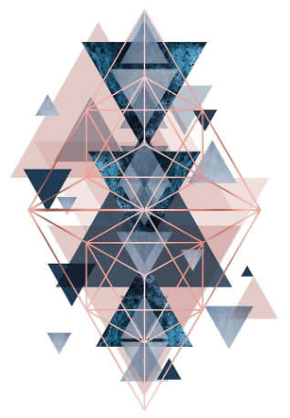
Photo Cred: Redbubble
Not only does sacred geometry support the interconnectivity of all things, but it’s a mathematical and spiritual foundation for meditation sessions, murals, architecture, and more! People who study and practice sacred geometry understand the common phrase as above, so below – and therefore – as without, so within. Who knew geometric designs reflected our internal nature?
19. Oh-la-la fashionista
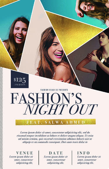
Photo Cred: Aleena Khan
Since geometric designs can overwhelm an entire piece, it’s smart to designate a specific section to them. Consider going half ‘n half: geometrics on top and deets on the bottom, like this one. Then, couple the art with big ‘n bold text to flash your offering to the world.
20. Sweet stationery shapes
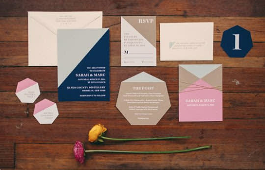
Photo Cred: 100 Layer Cake
In addition to using geometric shapes in your stationery, why not make its actual shape geometrical? Since certain event invites like weddings, birthdays, and holiday gatherings can include multiple inserts, bust out that hexagon or octagon you never thought you’d need for some top-notch RSVPs.
21. You’re invited!
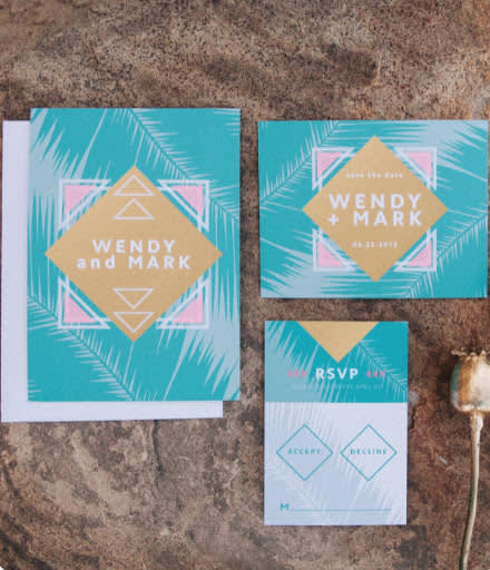
Photo Cred: Basic Invite
Why does flipping a square on its side create such a fresh & sophisticated feel? If you’re celebrating a new diamond on your finger, why not use diamond shapes symbolically in your invites? Live your best life with poppin’ colors and an exotic, tropical theme.
22. Livin’ la vida logo
Make this design your own in PicMonkey.
Here’s the tea. You don’t have to wait to use a geometric design on a flyer or poster when you can use them for your logo! Sport your funkiest, signature shapes and plaster ‘em shamelessly on your daily branding materials.
At the end of the day, the art of geometric design is trendy and universally recognized. Since it combines basic shapes, free-form lines, and curves to make simple and sophisticated designs, there’s no one who can’t benefit from these tools. Plus, using geometry in this way might harmonize some academic trauma for good!
So? Go on and master the infinite ways to make a geometric design in PicMonkey. Soon before long, you’ll have created your first (or best) geometric design yet!
